

- +9,2%conversion rateQuiz started in the buy box
- +18,6%quiz starts"How do you sleep?" as three photo cards
- +3,1%average order valueOne add-on instead of four offers
The first screen asked for a click without showing the product
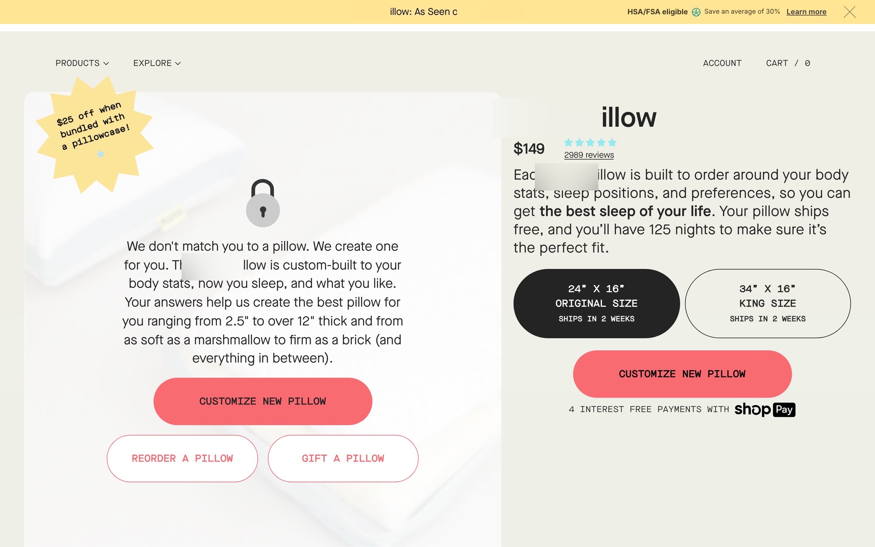
The product is the quiz: answer a few questions and a pillow is built for you. The page's first screen was a card of text over a faded pillow ("We don't match you to a pillow. We create one for you.") with three buttons: customize a new pillow, reorder, gift. The price, sizes and rating came after it.
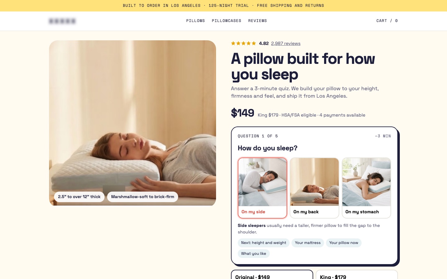
I started the quiz in the buy box, with three photo cards
A photo of someone asleep on the pillow takes the first slot, with two chips: 2.5" to over 12" thick, marshmallow-soft to brick-firm. The headline is about the shopper: "A pillow built for how you sleep." The 4.82 rating from 2,987 reviews sits above it.
Instead of a "Customize" button, the buy box contains question 1: "How do you sleep?", answered by tapping one of three photos (side, back, stomach). Each answer shows a one-line reason ("Side sleepers usually need a taller, firmer pillow…"), and the next topics are listed so nothing surprises anyone: height and weight, your mattress, your pillow now, what you like.
Conversion principleMake the first step effortless and show what's next (foot-in-the-door + transparency). One tap on a photo starts the quiz that sells the product.
A/B test result: +18,6% quiz starts and +9,2% conversion rate from this change, tested against the original page
I replaced four offers with one optional add-on
Offers were stacked across the page: a bundle discount in three places, plus "10% off" and "save 30%". The buy box now has one optional checkbox, a matching pillowcase with $25 off, under the two sizes. Shipping and the 125-night trial sit under the button.
Conversion principleOne relevant offer beats four competing ones (choice overload). A pillowcase that matches the pillow is an easy yes.
A/B test result: +3,1% average order value from this change, tested against the original page
I moved "why custom" up and kept the comparison
The comparison table was the most persuasive part of the old page; it stays, with "why custom" moved before it: side, back and stomach sleepers need different heights. Then what happens after the quiz, reviews with video, questions, a closing call to action with the three sleep positions as buttons, and a full footer.
Conversion principleExplain the problem before the solution (problem-agitation). Once shoppers see why their pillow fails, a custom one makes sense.
 BeforeAfter↔
Why these changes worked
The quiz is the product, and the old page hid it behind a text card and a button. Putting question 1 in the buy box as three photos made starting it a single tap: quiz starts rose 18,6% and conversion 9,2%.
One matching pillowcase instead of four competing offers was easier to say yes to, and average order value rose 3,1%.