
Case studies
Redesigns, step by step.
What was wrong, what I changed and what the A/B test showed. Product pages, SaaS homepages and demo pages, and local landing pages, most of them shown the way their buyers saw them: on a phone.
16 case studies
 After
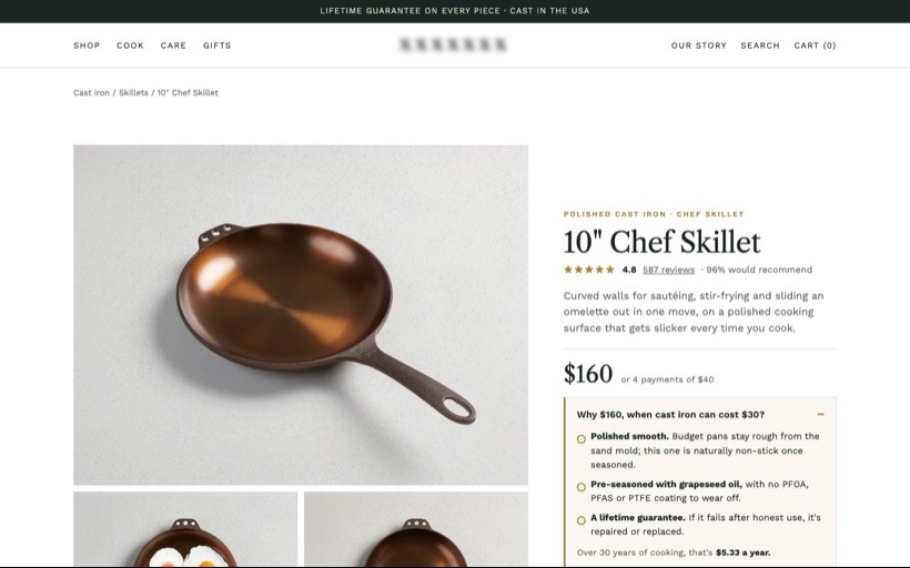
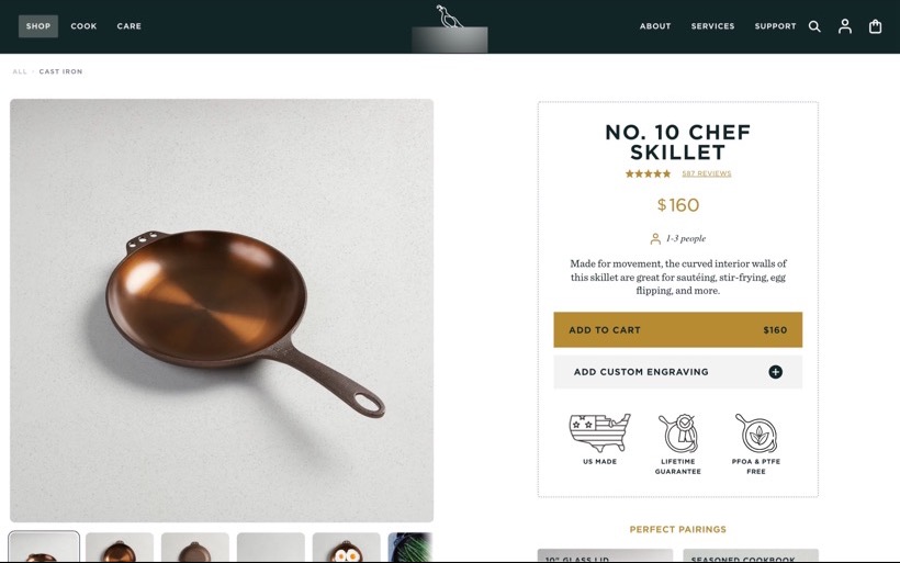
Cast Iron Skillet
A $160 cast iron skillet sat next to $30 alternatives with no reason at the price, behind an email popup. I put the pan first, answered "why $160?" under the price and added delivery, returns and the guarantee by the button.
 After
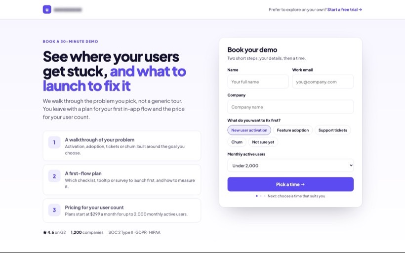
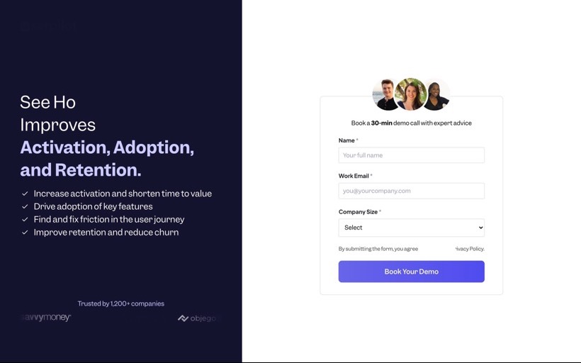
Product Adoption SaaS
A B2B product adoption platform sent every visitor to a three-field demo form that never said what the call covers. I tested three new demo pages against it; the winner explains what you get from the 30 minutes.
 After
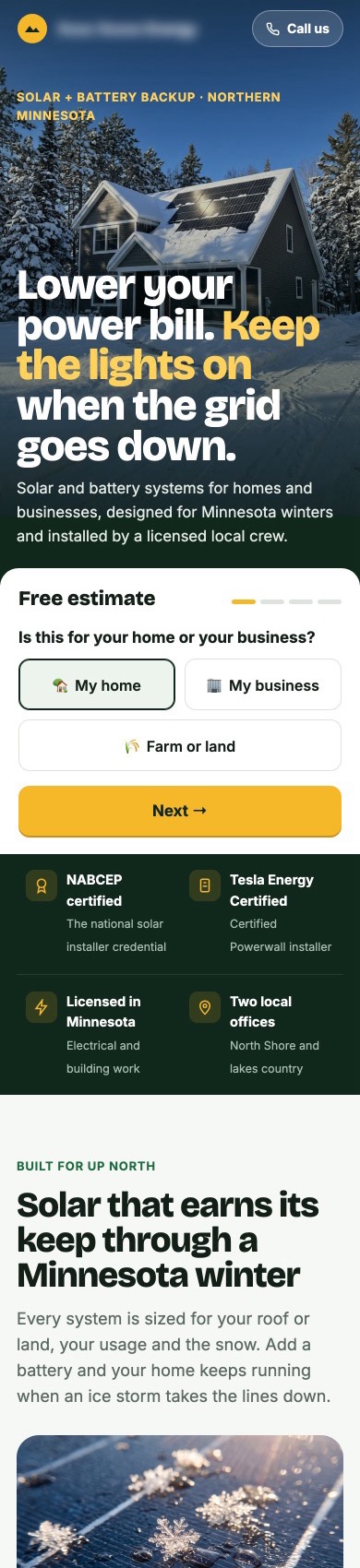
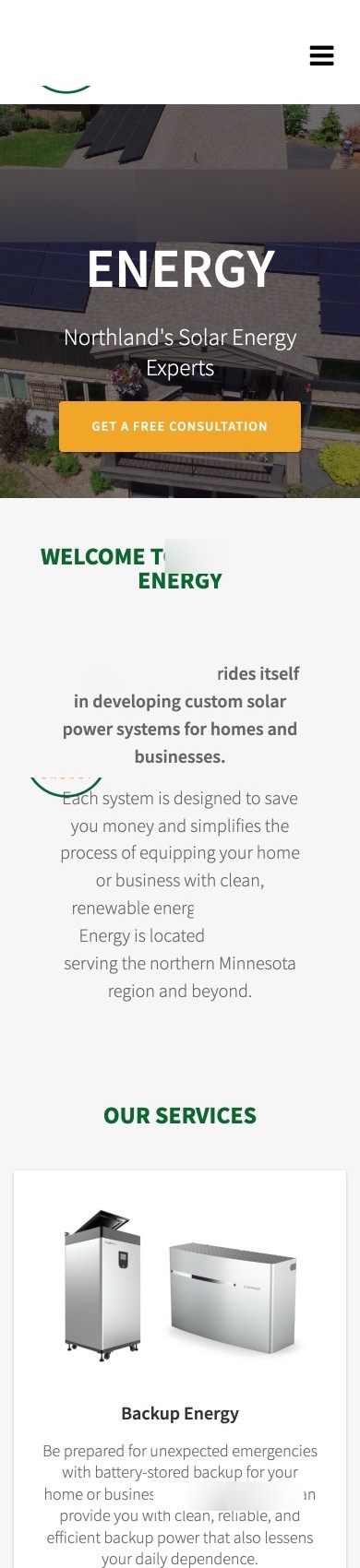
Solar Installer
A northern Minnesota solar installer sent Meta ads to a homepage that led with its name and kept its only form at the bottom. I put a four-step estimate on the first screen and built the page around winter, outages and rebates.
 After
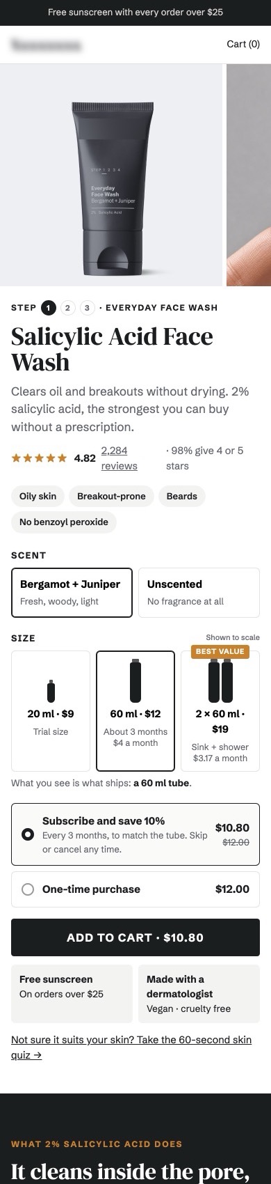
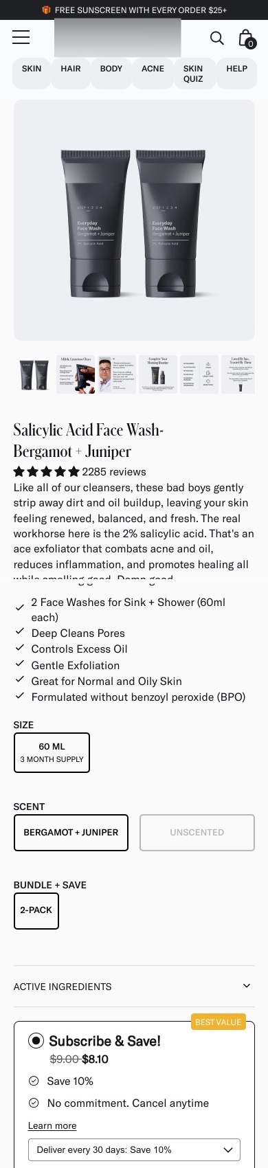
Men's Face Wash
A men's face wash page showed a 60 ml two-pack at the price of a 20 ml trial tube and put an Amazon button under Add to Cart. I showed every size to scale with its cost per month, took Amazon out of the buy box and built out the page.
 After
Interactive Proposals
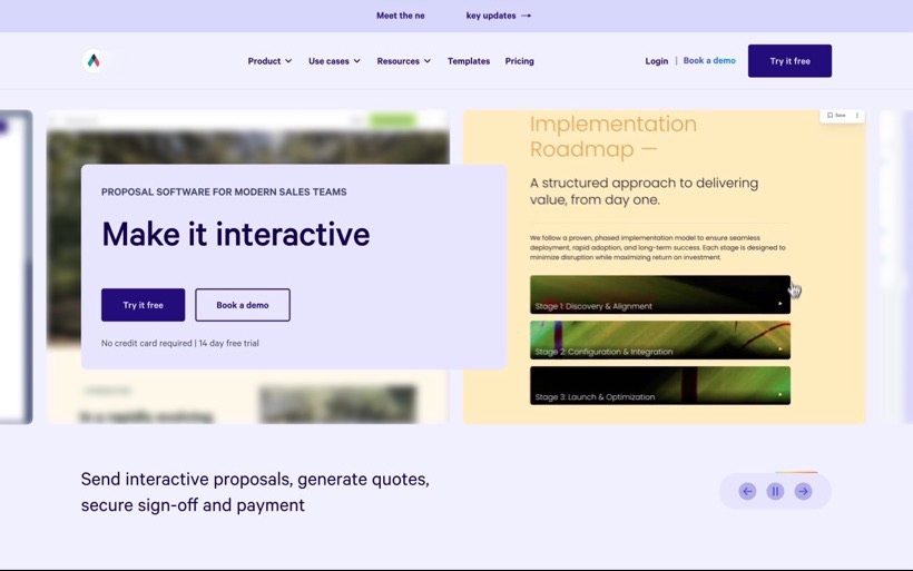
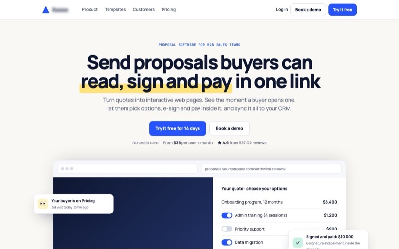
A proposal software homepage said "Make it interactive" in a rotating carousel. I rewrote the first screen to say what the product does, with a working proposal you can click, the price and the rating under both buttons, and rebuilt the signup page around the first ten minutes.
 After
Spore Probiotic
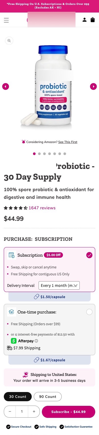
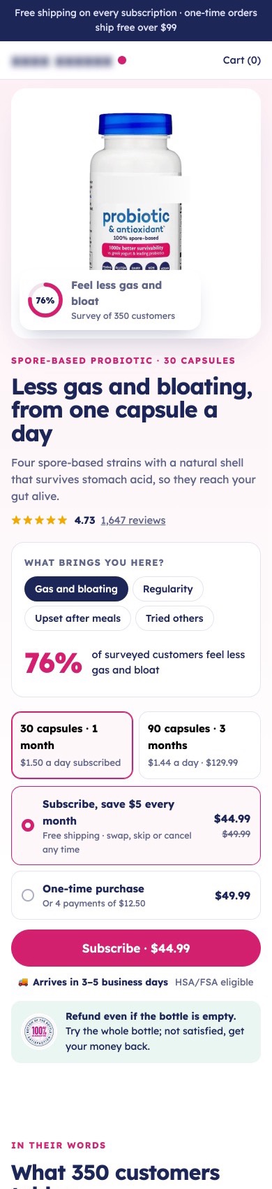
A spore probiotic had survey results most brands would lead with, 2,800 pixels down. I made them the headline, added a symptom picker that shows the result for each shopper's problem, and cleaned the buy box to one rating and one shipping line.
 After
Air Purifier
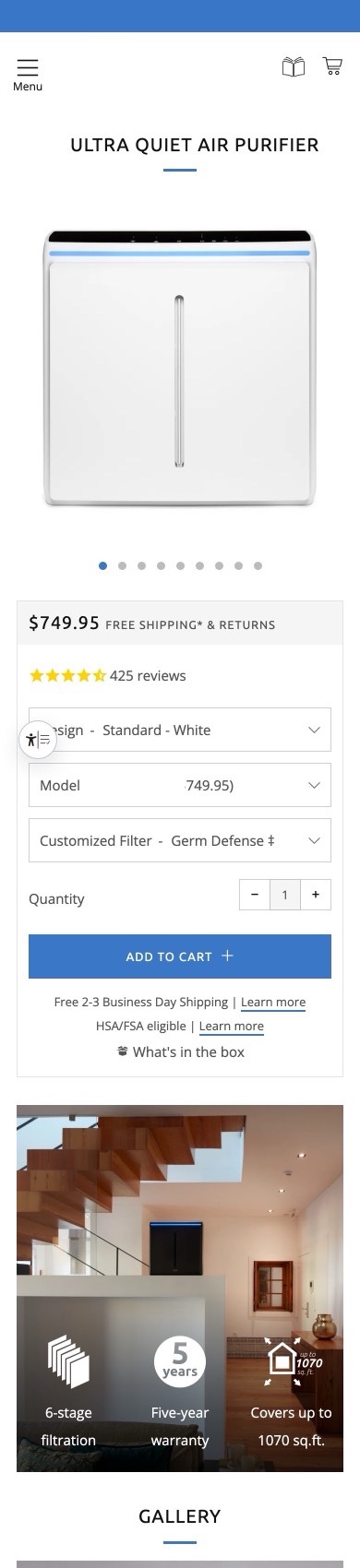
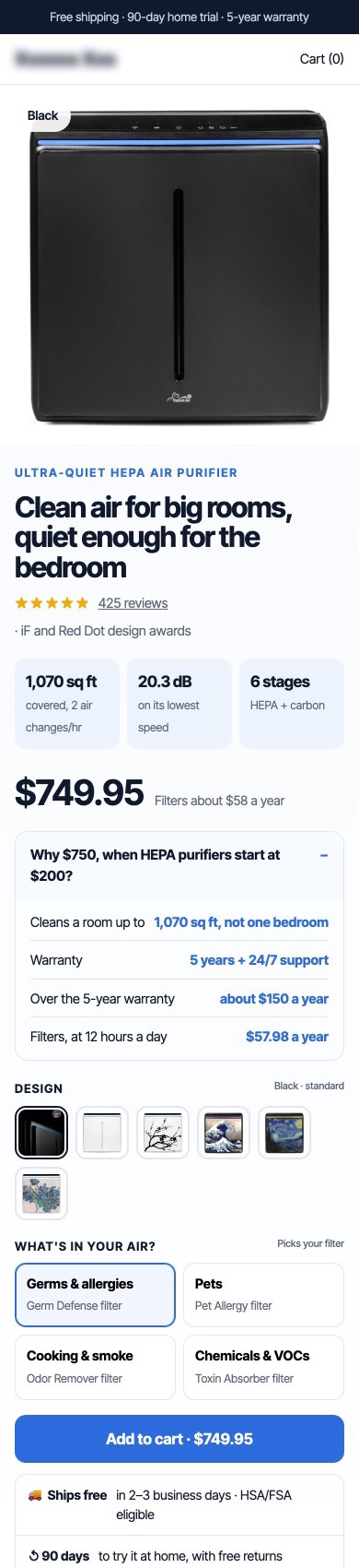
A $750 air purifier explained its price 8,000 pixels down and hid its art editions in a dropdown. I answered "why $750?" at the price, showed the art editions as swatches, and added a room-size check and a filter picked by what's in your air.
 After
Proposal Software
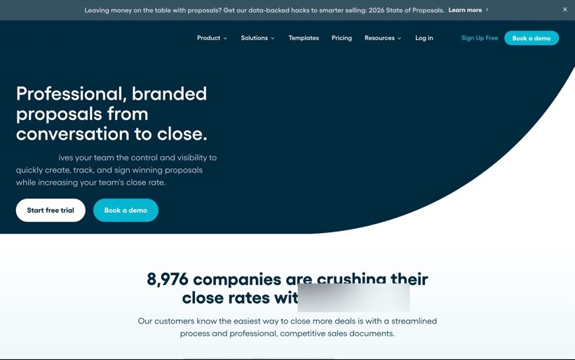
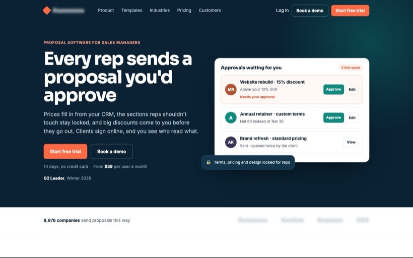
A proposal software homepage spoke to reps while managers sign the contract, and its trial signup asked for six fields and a reCAPTCHA. I rewrote the homepage for the manager, with an approval queue on the first screen, and cut signup to two fields.
 After
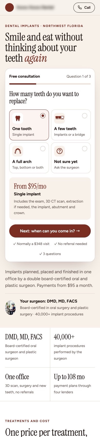
Dental Implant Practice
An implant practice sent paid ads to a 24,500-pixel page with its pricing questionnaire 13,000 pixels down. I moved a three-question consultation quiz to the first screen and gave every treatment one checkable price.
 After
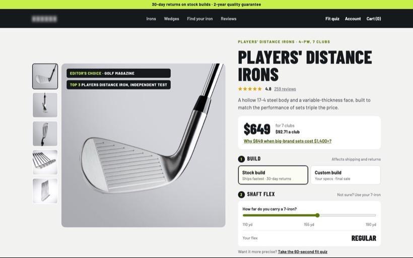
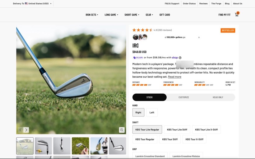
Golf Irons
A $649 iron set from a brand golfers may not know put its proof below the configurator and listed six shaft names with no help. I put the comparison at the price and let golfers pick a shaft flex by how far they hit a 7-iron.
 After
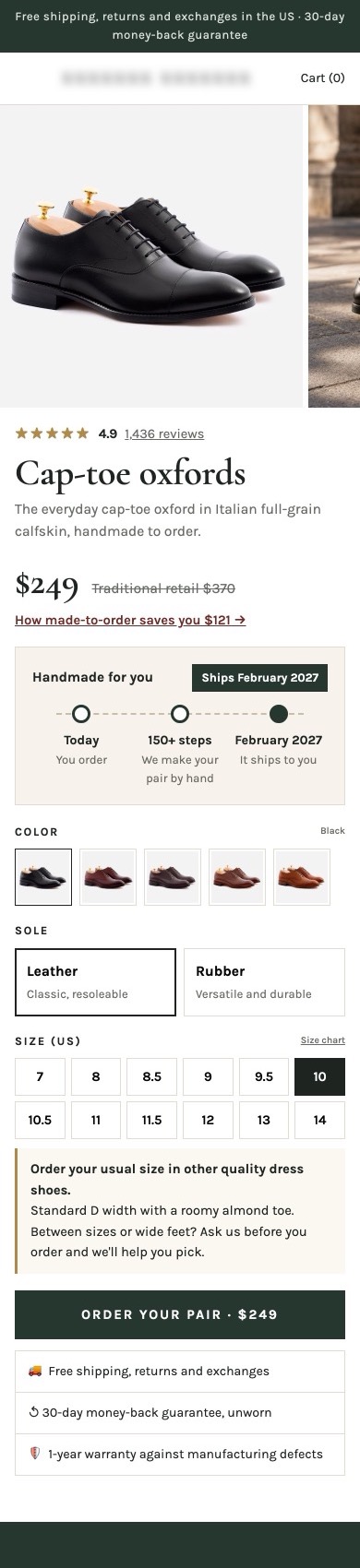
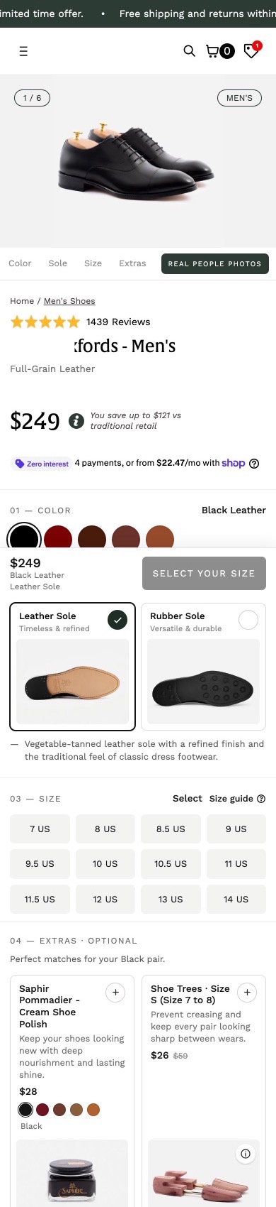
Made-to-Order Oxfords
A made-to-order oxford ships months after you buy it, and the page said so 7,700 pixels down. I put the ship date and a three-step timeline in the buy box, explained why made-to-order costs less, and added fit advice under the sizes.
 After
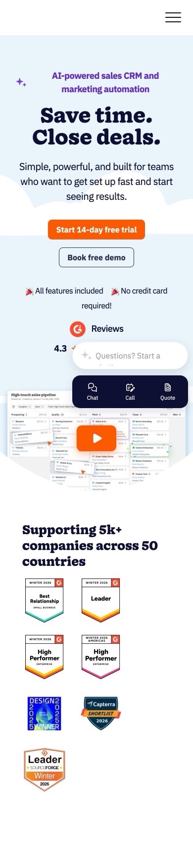
Small Business CRM
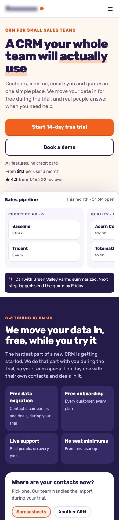
A small-business CRM opened with "Save time. Close deals." and hid free migration and live support 10,000 pixels down. I led with the team-adoption worry, put free switching right after the hero, and rebuilt the signup around "what happens to my data?".
 After
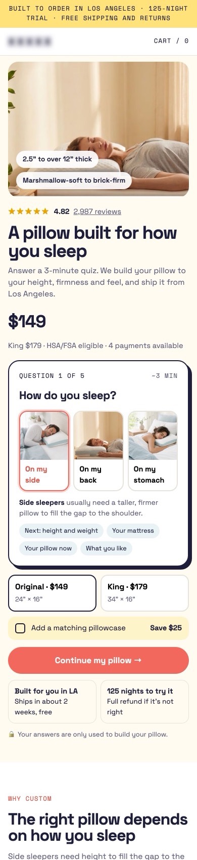
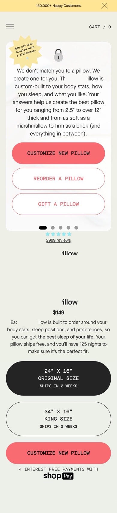
Custom Pillow
A custom pillow page put a text card with three buttons where the product photo should be and started its quiz on another screen. I started the quiz in the buy box with three photo cards for how you sleep, and cut four offers to one add-on.
 After
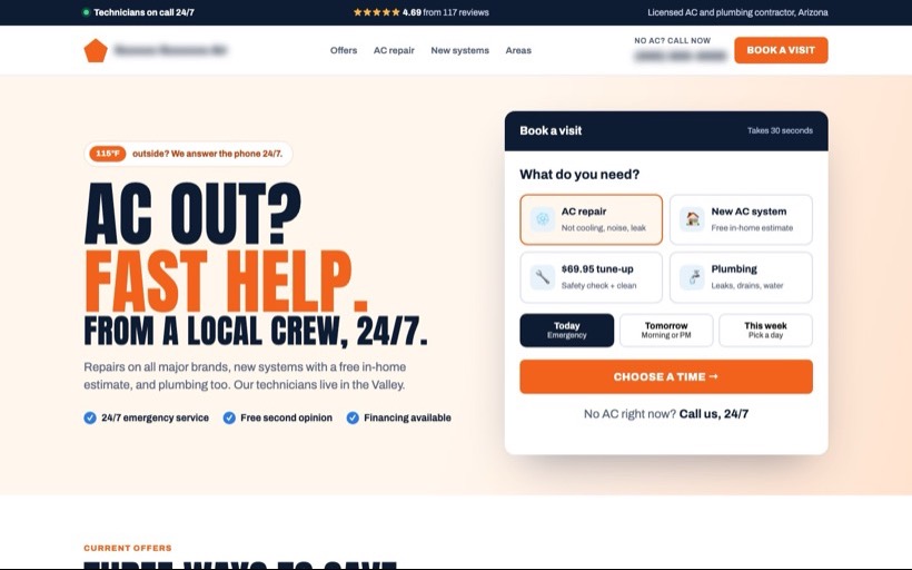
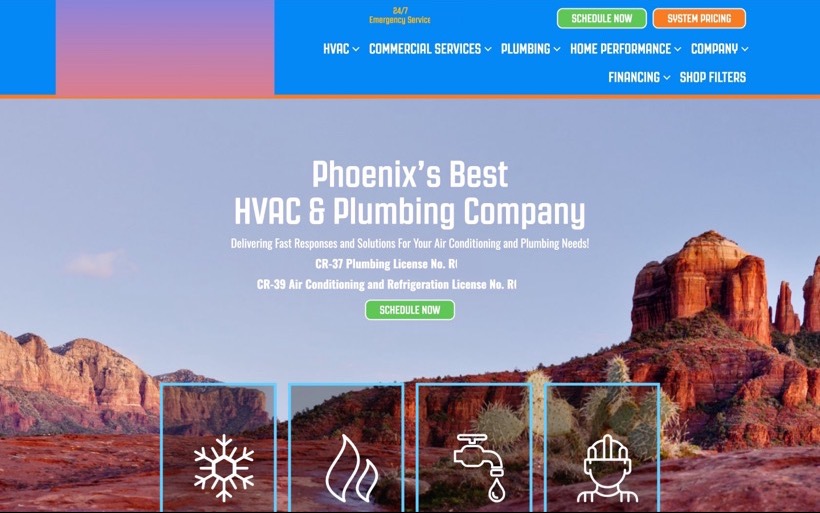
HVAC Company
A Phoenix AC and plumbing company opened its homepage with "Phoenix's Best" and hid its offers and 4.69 rating far down. I built the page around the person whose AC just died: a booking picker, the offers as coupons and the rating up top.
 After
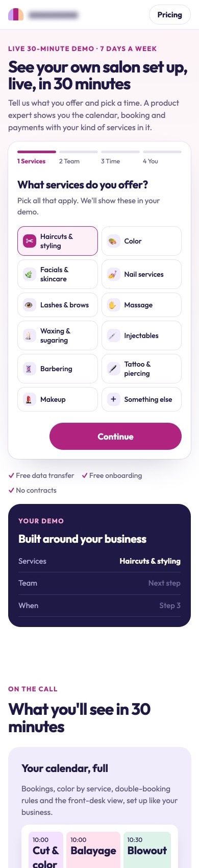
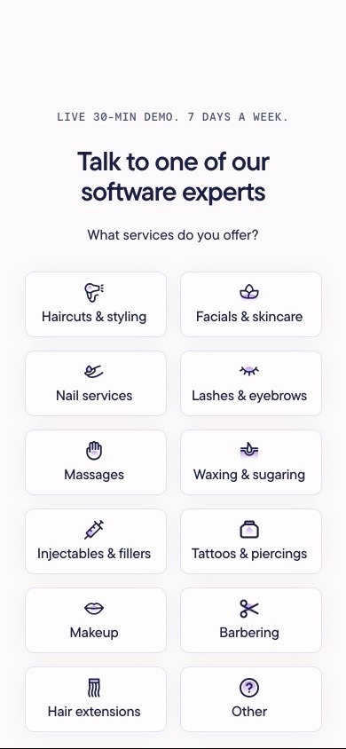
Salon Software
A salon software company sells only through live demos. I rewrote the homepage first screen around the outcome and the price, and rebuilt the demo booking as four labeled steps with a live preview of the demo and the calendar on the page.
 After
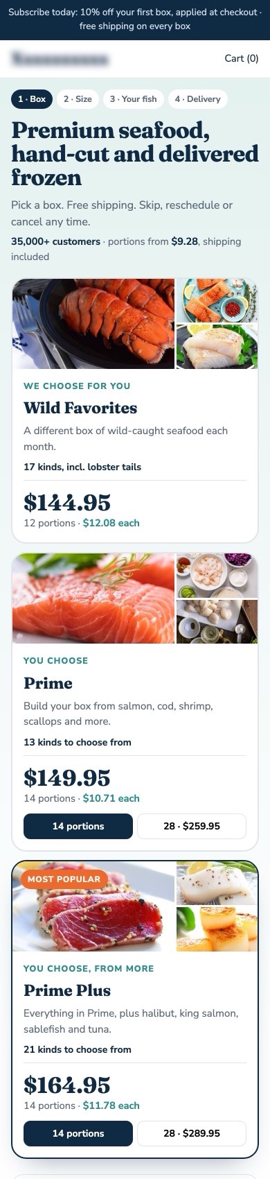
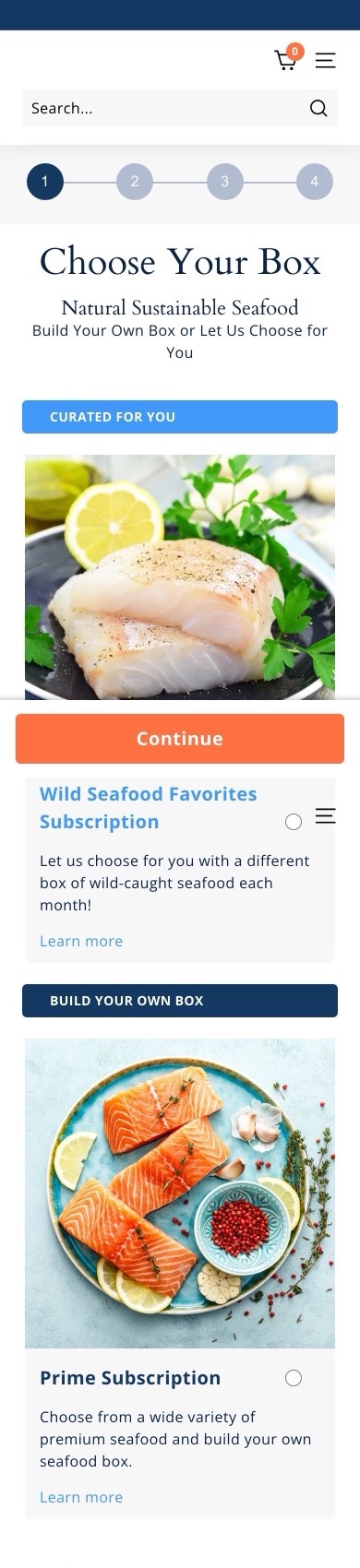
Seafood Subscription
A seafood subscription asked shoppers to choose a box with no price, portion count or fish on the cards. I put all three on every card, added the fish each box includes and a price-per-portion chart.
No case study matches both filters yet.
Short answer
What results have these redesigns had?
Across 16 A/B-tested redesigns, product pages gained 8,1% to 16,1% in conversion rate, revenue per visitor or subscriptions, SaaS homepages and demo pages gained 12,1% to 19,8% in trial starts and demo bookings, and local ad landing pages gained 27,4% to 57,3% in leads and bookings.
Quick facts
- Pages
- 8 ecommerce product pages, 5 SaaS homepages and demo pages, 3 local ad landing pages
- Testing
- Each redesign A/B tested against the original page
- Each case shows
- The problem, every change, and the A/B test result for each change
- Brand names
- Hidden at the clients' request
Let's talk
Let's find out why your visitors aren't buying.
Send me the page. On the call I'll tell you what I'd fix first, what it could move, and whether I'm the right person for it.