
- +19,8%trial startsBoth changes below together
- +7,9%homepage → signupA headline for the manager, with the approval queue
- +11,0%signup completionSix signup fields cut to two
The page spoke to reps, and the signup asked for everything
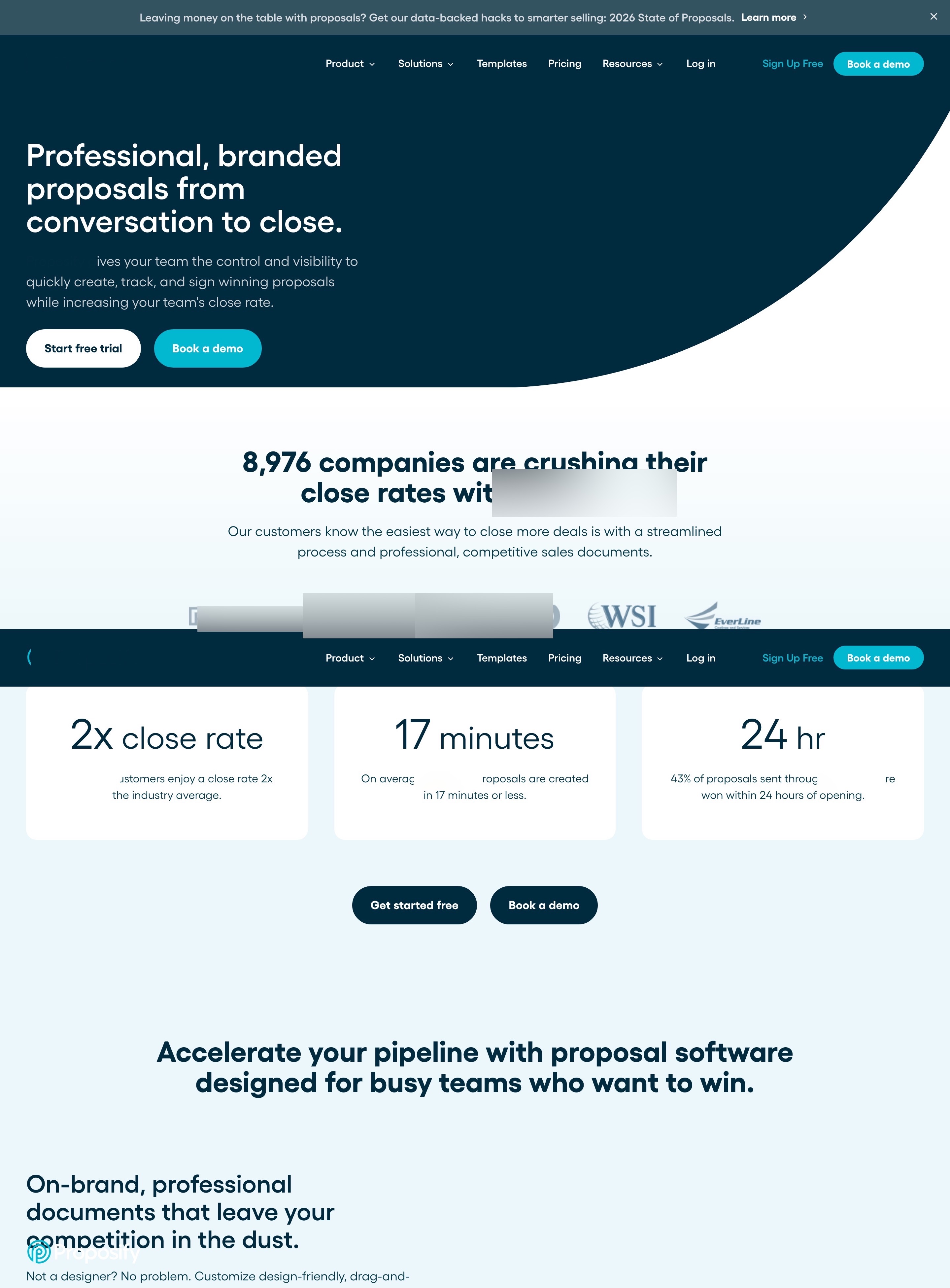
A rep might find this tool, but a sales manager buys it: someone who has watched a rep send last quarter's price or a 20% discount nobody approved. The homepage talked about "professional, branded proposals", which every proposal tool promises. The control a manager wants was spread over six feature sections below.
I wrote the first screen for the sales manager, with an approval queue
The headline now speaks to the manager: "Every rep sends a proposal you'd approve." The subhead names the controls in one sentence: prices from the CRM, locked sections, big discounts routed for approval, online signing and read tracking.
"Start free trial" and "Book a demo" stay side by side. Under them: 14 days with no credit card, from $39 per user a month, and the G2 Leader badge. On the right, the product shows the moment a manager cares about: an approval queue with a 15% discount above the 10% limit, waiting for approve or edit.
Conversion principleWrite for the person who signs (buyer persona). Control is what a manager pays for; "professional" is what every tool claims.
A/B test result: +7,9% homepage → signup from this change, tested against the original page
I cut the trial signup from six fields to two
The old signup asked for work email, first name, last name, phone number and password, then a marketing checkbox and a visible reCAPTCHA. The new step 1 has two fields, work email and password, with Google above them. Name and company come on step 2, and phone is optional.
The left side keeps the reasons to finish: unlimited proposals and e-signatures, branded templates, CRM integrations, read tracking, no credit card, and a sales manager's quote about 20 proposals a week.
Conversion principleEvery field costs completions; ask for the rest after the commitment (form friction + foot-in-the-door).
A/B test result: +11,0% signup completion from this change, tested against the original page
I turned six feature sections into four ways a proposal loses a deal
The six feature sections became one grid a manager reads in seconds: the wrong price, off-brand edits, unapproved discounts and old content, each next to its fix and the plan it's on. Then the company's own numbers (17 minutes to create a proposal, 43% won within 24 hours of opening), build, track and sign, industry templates, three reviews, the plans with prices, a closing call to action and a full footer.
Conversion principleFrame features as the problems they prevent (loss aversion). "Stop the 20% discount on a Friday afternoon" lands harder than "approval workflows".
Why these changes worked
The manager who signs the contract wants control, and the old headline promised what every tool promises. A first screen written for the manager, with an approval queue doing its job, sent 7,9% more visitors to the signup page.
Signup asked for six fields and a reCAPTCHA before a free trial. Two fields on step 1 lifted completion 11,0%. Together, trial starts rose 19,8%.