

- +12,1%trial startsHomepage +7,4%, signup completion +4,4%
- +7,4%homepage → signupFree switching right after the hero
- +3,9%trial-to-paidMigration started during the trial
A small team switching CRMs fears two things, and the page answered neither up top
A small business looking at a new CRM usually has one already, or a spreadsheet. The two fears are "my team won't use it" and "I'll lose my data moving over". This company answers both well: free migration and live support for every customer. The homepage said so near the bottom.
I led with the team-adoption worry and kept both buttons
The headline names the reason small teams abandon CRMs: "A CRM your whole team will actually use." The subhead says what's in it and adds the two promises: we move your data in free during the trial, and real people answer when you need help.
Both buttons stay, in the same order as the original: "Start 14-day free trial" first, "Book a demo" second. Under them: every feature with no credit card, from $13 per user, and the 4.3 rating from 1,462 G2 reviews. A swipeable pipeline shows the product a rep will use.
Conversion principleName the buyer's real objection in the headline (objection-led messaging). "Will my team use it?" is the question that loses CRM deals.
I moved free switching right after the hero, as something you can see
The section right after the hero says it plainly: we move your data in, free, while you try it. Four promises sit under it: free data migration, free onboarding, live support on every plan, no seat minimums. Beside them, a small import panel asks where the contacts are now (spreadsheets, another CRM, email only, starting fresh) and shows contacts, companies and deals arriving.
Conversion principleRemove the switching cost before asking for the switch (risk reversal). Showing the import makes "free migration" concrete.
A/B test result: +7,4% homepage → signup from this change, tested against the original page
I rebuilt the signup page around "what happens to my data?"
The old signup page was tidy: Google, Microsoft, name, email, password. It just didn't repeat the reason to sign up now. The new one asks where the visitor's data lives (spreadsheets or another CRM) and answers right there: we import it for you, free, during the trial, and check it with you at onboarding.
Teams that start the import during the trial try the CRM with their own contacts and deals, not an empty demo account. More of them stayed after 14 days.
Conversion principleA trial with your own data is a different product from an empty trial (endowment effect). Starting the migration during the trial gets teams invested early.
A/B test result: +4,4% signup completion and +3,9% trial-to-paid from this change, tested against the original page
I cut the feature list to three things reps use daily
Instead of a long feature list, the page shows the three things a small team uses every day: a pipeline you can see, email that logs itself, and calls that take their own notes. The rest is one line of chips. Then the results the company reports from customers who switched, two reviews, the five price tiers in a swipeable row, a closing call to action and a full footer.
Conversion principleFewer, more relevant features beat a complete list (choice overload).
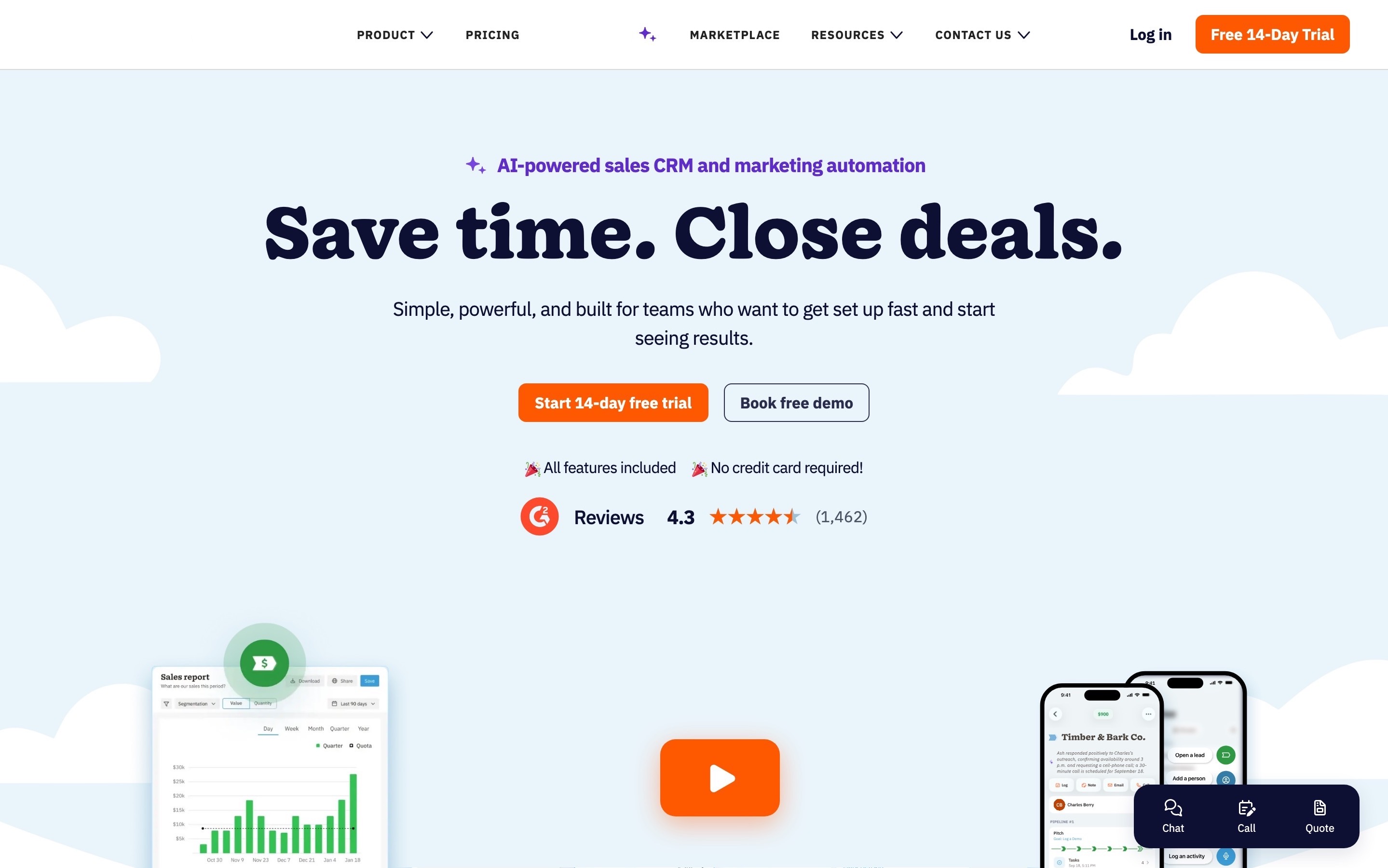
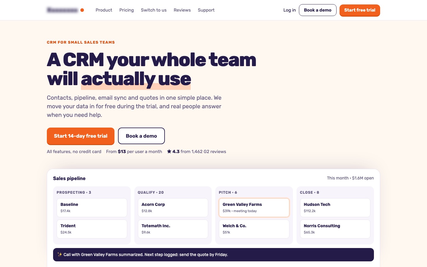 BeforeAfter↔
Why these changes worked
Small teams switching CRMs worry about adoption and about losing their data. The old page opened with a slogan and answered both fears 10,000 pixels down. Leading with adoption and putting free switching right after the hero sent 7,4% more visitors to the signup page.
On the signup page, asking where the data lives and promising the import during the trial lifted completion 4,4%. Together, trial starts rose 12,1%, and teams that tried the CRM with their own data converted to paid 3,9% more often.