
- +16,8%demo bookingsBoth changes below together
- +10,2%homepage → demo pageOutcome, price and switching on the first screen
- +6,0%demo form completionLabeled steps and a live preview of the demo
A demo-only business with a homepage and a booking flow that hide the essentials
For a company that sells only through demos, two pages carry the whole funnel: the homepage that sends people to "Book a Demo", and the demo page that books the call. Both made the visitor work.
I rewrote the homepage first screen around the outcome, the price and switching
The headline now says what the software does for an owner: "Keep your book full, even when nobody picks up the phone." It covers the booking calendar and the AI receptionist in one line. "Book a live demo" stays the main button, because demos are how this company sells; "Watch a video tour" sits under it for people not ready to talk.
Under the buttons, one line answers the two questions that stop owners from booking: "$120 a month per location · free data transfer · no contracts". A phone mock shows a booking the AI receptionist made from a missed call.
Conversion principleLead with the outcome and remove the two biggest fears, price and switching, before asking for anything (risk reversal).
A/B test result: +10,2% homepage → demo page from this change, tested against the original page
I rebuilt the demo booking as four labeled steps with a live preview and the calendar on the page
The old flow started with twelve service options and no step count, then said "Step 1 of 5" on the second screen. Owners couldn't tell how long it would take, and the calendar came last.
The new flow has four steps, labeled from the first screen: services, team, time, you. Services are compact multi-select chips. Team size is four big buttons. The calendar is step three, on the page, with today's times first, because demos run seven days a week. Name, business and email come last.
Beside the steps, a dark card fills in as the owner answers: "Your demo: Haircuts & styling · 2–4 providers · Today, 1:00", with what the demo will cover. On a phone it sits right under the form.
Conversion principleShow progress honestly and reflect the visitor's answers back (goal gradient + personalization). People finish forms faster when they can see the end and see that their answers are used.
A/B test result: +6,0% demo form completion from this change, tested against the original page
I gave the demo page the answers an owner wants before the call
The old demo page was the form and nothing else. The new one continues for owners who scroll first: what the 30 minutes cover (the calendar, the AI receptionist, what switching looks like), the price with every core feature listed, owner stories, four questions, a closing call to action and a full footer.
Conversion principleAnswer the price question before the sales call (transparency). Owners who know the price book calls to buy, not to find out.
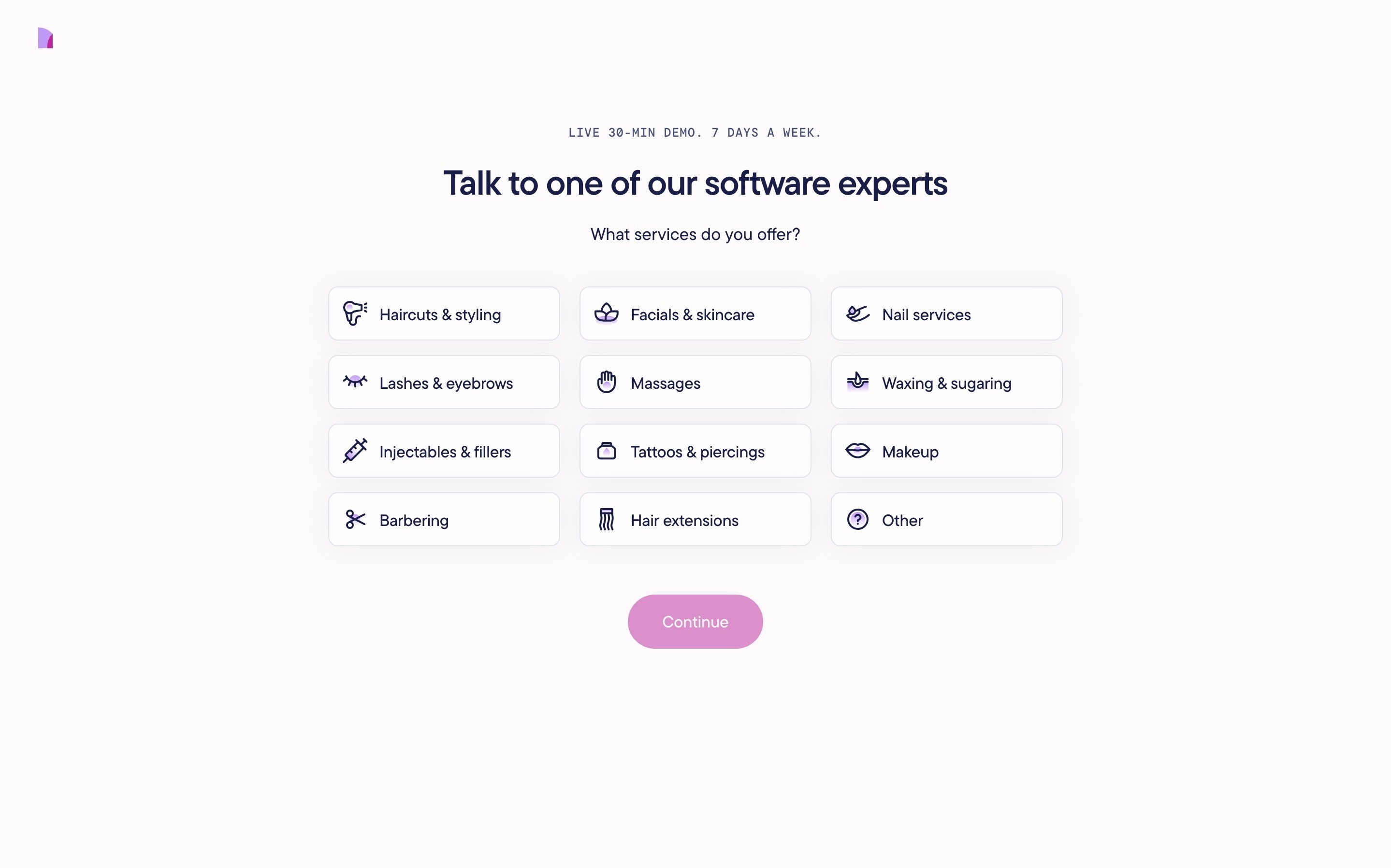
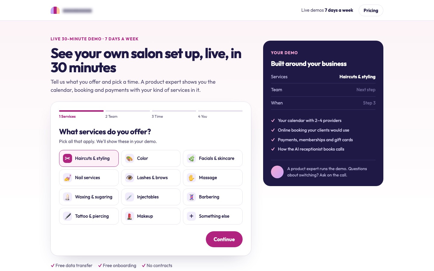 BeforeAfter↔
Why these changes worked
This company sells only through demos, so the homepage's job is to get an owner to the demo page. A first screen that named the outcome and answered price and switching sent 10,2% more visitors there.
On the demo page, an honest step count from the first screen, a live preview of the demo and the calendar on the page lifted form completion 6,0%. Together, demo bookings rose 16,8%.