

- +57,3%leadsFour-step estimate on the first screen
- −36,4%cost per leadSame ad spend, more leads
- +9,4%lead-to-appointment rateThe form asks for phone and address
A company brochure where an ad landing page should be
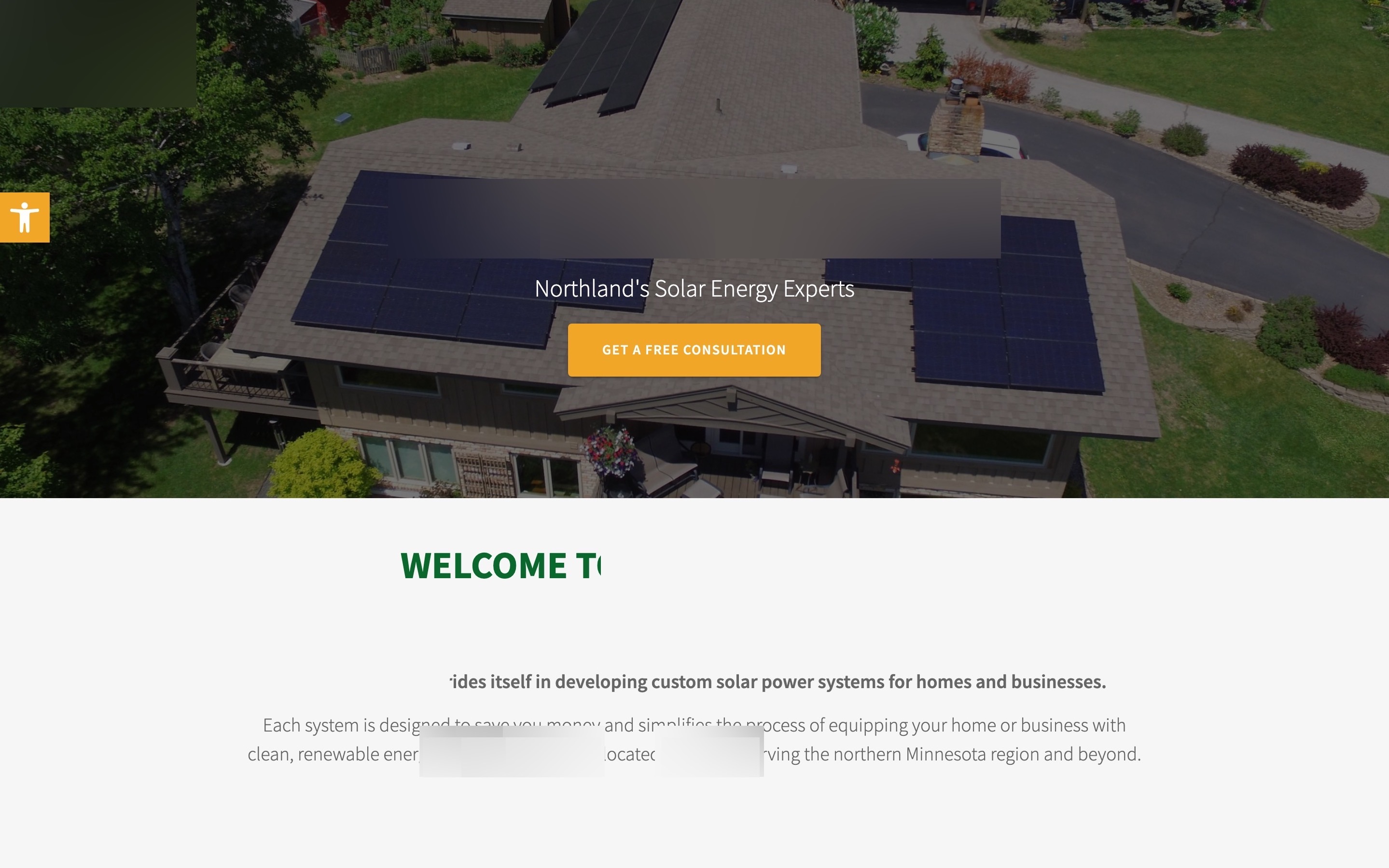
Someone who taps a solar ad wants two answers fast: can this lower my bill, and how do I get a number? The first screen answered neither. It showed the company name, "Northland's Solar Energy Experts" and one button.
I put a four-step solar estimate on the first screen
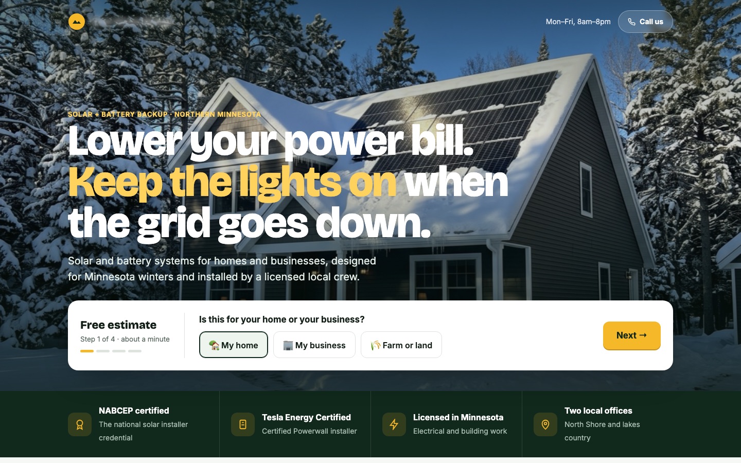
The new headline says what a homeowner here wants: "Lower your power bill. Keep the lights on when the grid goes down." It covers solar and battery backup in one line, which is what this installer sells. A snowy roof with panels replaces a generic summer roof.
The estimate starts with the easiest question: is this for your home, your business or a farm? Then the monthly bill on a slider, then battery backup, and only then the address and phone number. A progress bar shows four short steps.
Conversion principleMatch the ad's promise on the first screen and ask the easiest question first (message match + foot-in-the-door). A visitor who has tapped one answer keeps going.
A/B test result: +57,3% leads and −36,4% cost per lead from this change, tested against the original page
I labeled the credentials and answered the winter and rebate questions
The installer's credentials are real and strong: NABCEP certified, a Tesla Energy Certified installer, licensed for electrical and building work in Minnesota. They now sit right under the estimate, each with a plain label, plus the two local offices.
Two questions every Minnesota homeowner has were missing: does solar work with our snow, and what happens in an outage? A section answers both with photos, before the page lists what the crew installs.
The rebate information was in two blog posts near the bottom. It's now a section of its own, and the estimate lists the rebates each household qualifies for.
Conversion principleAnswer the local objection before it's raised (objection handling). Labeled, checkable credentials build trust faster than logos a visitor has to decode.
I rebuilt the form to ask for what an installer needs
The old form asked for a required "Subject" and a message, and never for a phone number or an address. The installer needs both to look at a roof and call back. The new form asks for name, phone, email and street address ("to check your roof"), plus one tap for solar, battery or both.
The $500 referral offer and a simple map of the two offices sit beside it, and the page ends with a closing call to action and a full footer.
Conversion principleAsk only for what the next step needs, and say why (form friction). "Street address, to check your roof" explains itself.
A/B test result: +9,4% lead-to-appointment rate from this change, tested against the original page
 BeforeAfter↔
Why these changes worked
People who tap a solar ad want to know whether it lowers their bill and how to get a price. The old page answered with the company name, and its only form was 10,300 pixels down. A four-step estimate that starts with one easy tap lifted leads 57,3%, and cost per lead fell 36,4% on the same ad spend.
The old form never asked for a phone number or an address, so many leads couldn't be reached or quoted. Asking for both, with a reason, raised the share of leads that became appointments by 9,4%.