

- +41,8%consultation requestsConsultation quiz on the first screen
- −29,5%cost per leadSame ad spend, more requests
- +22,6%calls from the pageOne price per treatment, checkable facts, a call button that stays
The questionnaire that books consultations was 13,000 pixels down
The page had every ingredient a patient needs: a double board-certified surgeon, three treatments with monthly prices, patient videos and a pricing questionnaire. On a phone they came in fourteen sections, and the one that turns a click into a consultation came eleventh.
I started the consultation quiz on the first screen
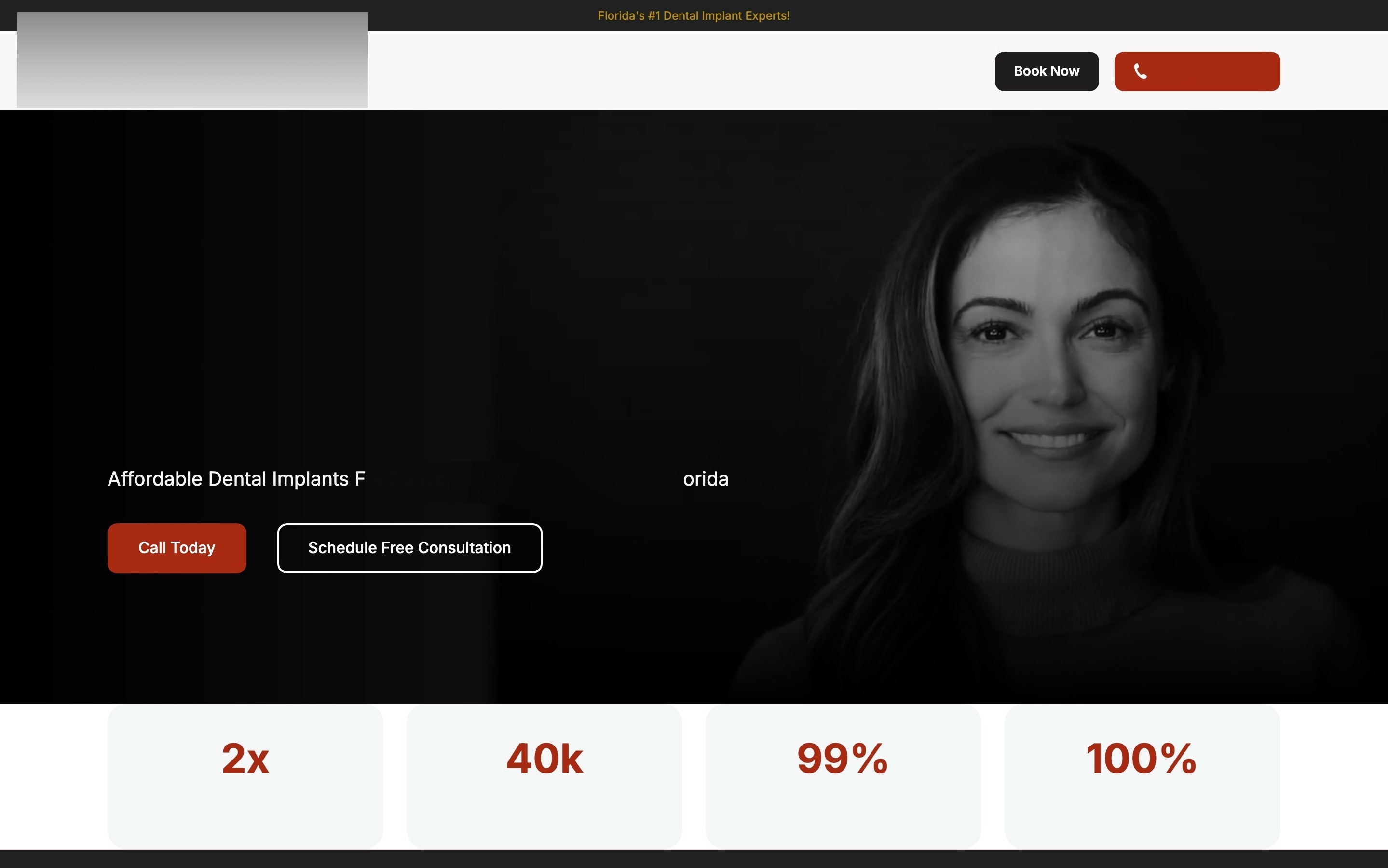
The old first screen was a headline about pain and embarrassment over a dark portrait, then two buttons: "Call Today" and "Schedule Free Consultation". The questionnaire that explains the options was 13,000 pixels further down, inside a picture of a tablet.
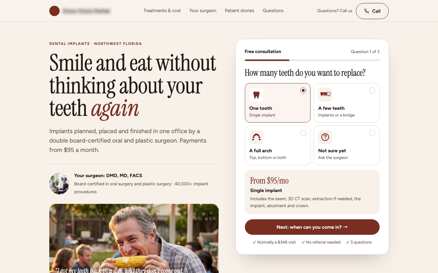
The new headline describes life after treatment: "Smile and eat without thinking about your teeth again." Right under it comes the first of three questions, the one a patient answers without thinking: how many teeth do you want to replace? Four cards with simple drawings: one tooth, a few teeth, a full arch, not sure yet. The two strongest facts (a double board-certified surgeon, payments from $95 a month) and the surgeon follow under the quiz.
Each answer shows the matching treatment and its starting price right away, before any personal details. Question two is when they can come in. Name and mobile number come last, on question three.
Conversion principleStart with the easiest question (foot-in-the-door). A patient who has answered one easy question is far more likely to finish than one asked for a phone number first.
A/B test result: +41,8% consultation requests and −29,5% cost per lead from this change, tested against the original page
I gave each treatment one price and replaced 99% and 100% with facts a patient can check
A single implant was "from $95 per month" on its card and "as little as $100 per month" in the payment section further down. The hero claimed a 99% success rate and 100% satisfaction, with nothing behind either number.
Now each treatment has one monthly price, a plain list of what the fee includes, and one line that says what it doesn't: bone grafts and sedation, if the scan shows you need them. The four unsourced numbers became four facts a patient can check: DMD, MD, FACS; 40,000+ implant procedures; scan, surgery and teeth in one office; payment plans up to 108 months.
On a phone, a bar with Call and Free consultation slides up as soon as the quiz scrolls out of view, so the number is never more than a thumb away.
Conversion principleSpecific, checkable claims beat big unsourced ones (credibility). A patient who sees two prices assumes the higher one; one honest price with the fine print in normal-size type removes the reason to hesitate.
A/B test result: +22,6% calls from the page from this change, tested against the original page
I put the surgeon, the free visit and patient stories in the order patients ask about them
The surgeon's background is the practice's strongest argument: more than 35% of his work is corrective surgery for patients unhappy with implants done elsewhere. It now has a full section. The free consultation (normally a $348 visit) says exactly what a patient leaves with: a 3D scan, the options side by side and the price in writing.
The page closes with three steps from the first call to new teeth, patient stories, financing, five questions, a final call to action and a full footer with the office details.
Conversion principleAnswer objections in the order the visitor raises them (message sequencing): is it for me, what does it cost, who does it, what happens at the visit, did it work for people like me.
 BeforeAfter↔
Why these changes worked
Implant patients are anxious and price-sensitive, and the ad sent them to a 24,500-pixel page. The questionnaire, the tool that turns a click into a consultation, sat 13,000 pixels down. Starting it on the first screen with one easy question lifted consultation requests 41,8%, and cost per lead fell 29,5% on the same ad spend.
The page said "$95" in one place and "$100" in another and claimed 99% success with no source. One monthly price per treatment, four facts a patient can check, and a call button that stays in reach removed the reasons to hesitate. Calls from the page rose 22,6%.