

- +8,6%subscription conversion rateSurvey results on the first screen
- +6,4%add-to-cart rateA symptom picker that matches the proof to the shopper
- −11,2%bounce from the buy boxOne rating, one shipping message
The best proof on the page was 2,800 pixels down
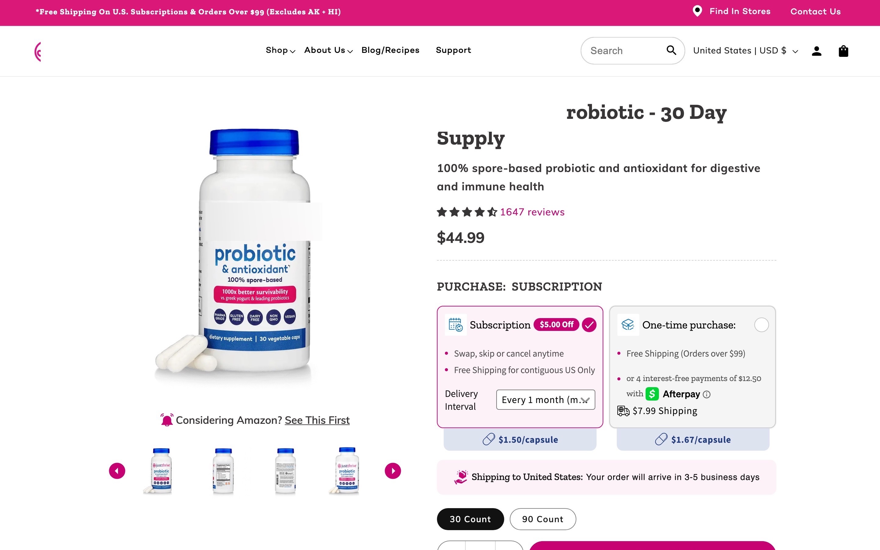
Most people buying a probiotic have tried one and felt nothing. This brand had the answer: a survey of 350 customers, with 76% reporting less gas and bloating and 80.9% saying it beat their last probiotic. The page opened with "Probiotic - 30 Day Supply" and a price, and the survey came after the accordions, a video and an expert banner.
I made the survey result the headline
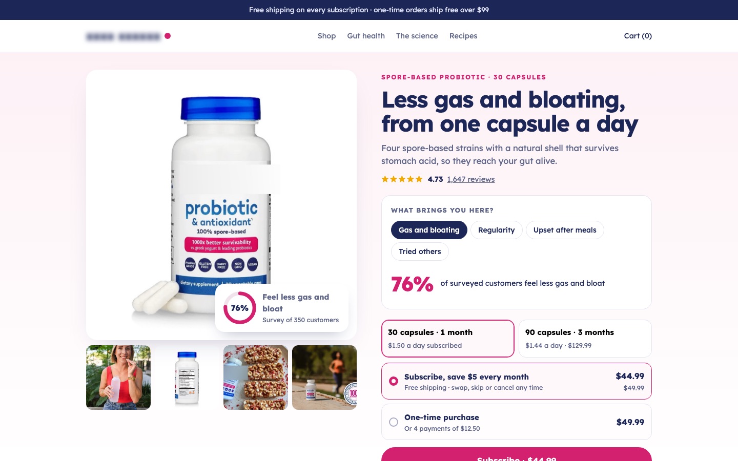
The headline now says what customers felt: "Less gas and bloating, from one capsule a day." The subhead explains why spores are different in one sentence. A small ring on the product photo shows 76%, labeled as a survey of 350 customers, and the full results follow as the first section after the buy box.
Conversion principleLead with the customer's outcome, backed by your own data (social proof + specificity). "76% of 350 customers" is more believable than "clinically proven".
A/B test result: +8,6% subscription conversion rate from this change, tested against the original page
I added a symptom picker that shows the result for each shopper
Above the supply options, the buy box asks "What brings you here?" with four chips: gas and bloating, regularity, upset after meals, tried others. Each one swaps in the matching survey number: 76% feel less gas and bloat, 74% are more regular, 75% say digestion feels smoother, 80.9% say it beat their last probiotic.
Conversion principlePersonalize the proof (relevance). A shopper with bloating cares about the bloating number, not an average of everything.
A/B test result: +6,4% add-to-cart rate from this change, tested against the original page
I cleaned the buy box to one rating and one shipping message
The old buy box mentioned shipping three ways and added a bundle offer in the middle. The new one has the supply (30 or 90 capsules, with the price per day), subscribe or one-time, one button, one line ("Arrives in 3–5 business days · HSA/FSA eligible") and the bottom-of-the-bottle guarantee: a refund even if the bottle is empty.
The rest of the page follows the questions in order: what to expect week by week, why spores survive stomach acid, the four strains, how to take it, reviews, the guarantee, questions, a closing call to action and a full footer.
Conversion principleReduce noise at the decision point (cognitive load). Three shipping messages read like a catch.
A/B test result: −11,2% bounce from the buy box from this change, tested against the original page
 BeforeAfter↔
Why these changes worked
Probiotic shoppers are skeptics who've tried products that did nothing. This brand had survey results from its own customers, buried 2,800 pixels down. As the headline, with a symptom picker that shows each shopper their own number, they lifted subscription conversion 8,6% and add-to-cart 6,4%.
A buy box with one rating, one shipping line and one guarantee gave people fewer reasons to hesitate, and bounces from the buy box fell 11,2%.