
- +12,6%demo requestsVersion B: what you get from the 30 minutes
- +11,8%demo show rateAn agenda built around your goal, in the invite
- +8,9%demos heldShow rate up, bookings −2,6% from the two extra questions
Every button leads to a demo page that doesn't sell the demo
On the homepage, "Get a Demo" is the main button in the header, the hero and three more sections. The free trial is a text link in the menu. So the demo page is where this company's pipeline starts.
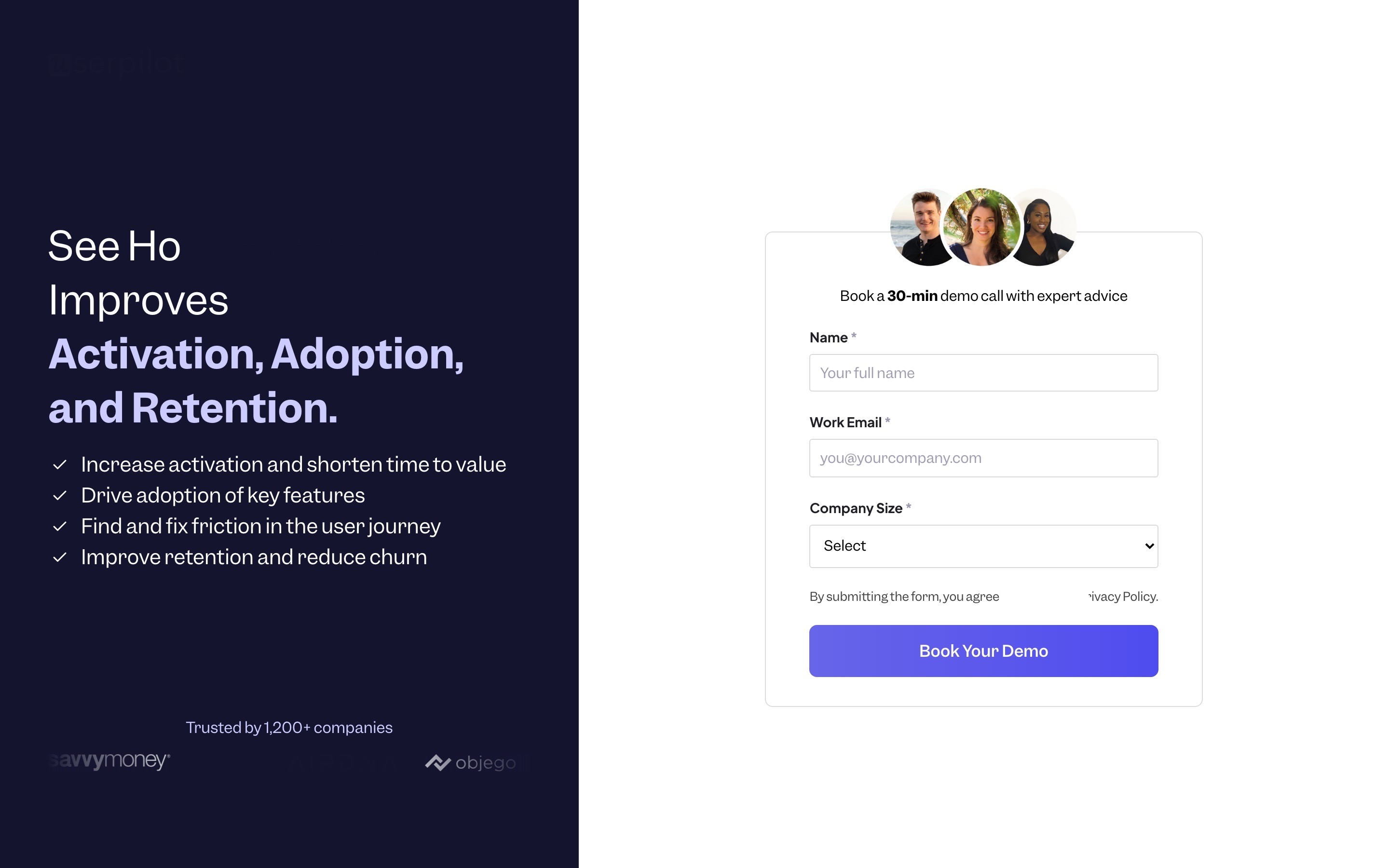
The demo page asked for name, work email and company size, under "Book a 30-min demo call with expert advice". It didn't say what the 30 minutes cover, who it's for, or what the product costs. A product manager deciding whether to give up half an hour had nothing to go on.
I designed three demo pages and tested them against the original
Each version answers the missing questions a different way. All three use the same two-step form: details and the goal first, then a calendar. Everything below the first screen is the same, so the test isolates the first screen.
Version A puts the form over a blurred screen of the product, so the visitor sees what they're booking. Version B lists the three things you leave the call with: a walkthrough of your problem, a first-flow plan, and pricing for your user count, with the starting price on the page. Version C puts a customer result, the G2 rating and the security badges beside the form.
Version B won. A visitor deciding whether to give up 30 minutes wants to know what they get, and B is the only version that says it in plain words.
Conversion principleSell the outcome of the call, not the call (value proposition). "A first-flow plan and your price" is a reason to book; "expert advice" is not.
A/B test result: +12,6% demo requests from this change, tested against the original page
I made the demo about the visitor's goal, and told them the agenda
In a second test I changed what happens around the booking. The form asks two new questions: what do you want to fix first (activation, adoption, support tickets, churn) and how many monthly active users you have. Then a calendar, on the page. The confirmation and the invite list a 30-minute agenda built around the goal they picked.
Two extra questions cost a few bookings: demo bookings fell 2,6%. But more of the people who booked actually turned up, because the call was now about their problem and they knew what to bring.
Conversion principleA specific agenda creates commitment (commitment and consistency). People keep appointments that feel made for them.
A/B test result: +11,8% demo show rate and +8,9% demos held from this change, tested against the original page
I gave the demo page a full page below the form
The original demo page was one screen. The new one continues for people who scroll before they book: how the demo works, three customer results, what you'll see on the call, four questions (including "can I just try it instead?", with a link to the free trial), a closing call to action and a full footer.
Conversion principleKeep the main action the same as the page that sent the visitor (consistency). The homepage sells a demo, so the demo page does too; the trial stays a secondary link for people who prefer it.
Why these changes worked
A demo request asks a busy product manager for 30 minutes. The original page offered "expert advice" and nothing else. Of three new versions, the one that listed exactly what you leave with, including the price for your user count, won: demo requests rose 12,6%.
Asking for the goal and the user count cost 2,6% of bookings, but the call became about the visitor's own problem, with the agenda in the invite. Show rate rose 11,8%, and demos held, the number sales cares about, rose 8,9%.