Homepage and navigation · Article 1 of 4
Ecommerce homepage design: 8 tips for a homepage that leads to products
A good ecommerce homepage says in the first screen what you sell and why buy it here, shows the full range of products (not just this week's campaign), and makes every tile obviously clickable. Avoid autoplay carousels and third-party ads, offer a guided way in like shop-by-need or a quiz, and show the right country and currency.
In this article · 8 tips
- What the homepage has to do
- 1Show the full range of what you sell, not only this week's campaign
- 2Say in the first screen what you sell and why buy it here
- 3Let brand photography support the products, never replace them
- 4Avoid autoplay carousels, and give carousels visible controls
- 5Make every image and tile obviously clickable, and say where it goes
- 6Keep ads and other brands' promotions off the homepage
- 7Offer a guided way in: shop by need, room, occasion, or a quiz
- 8Pick the shopper's country, currency and language for them, and let them change it
- FAQ
In short
- Many visitors land on product or collection pages, not the homepage. Those who do arrive there need to know quickly what you sell.
- A homepage that only shows one campaign hides the rest of your range.
- Carousels hide most of their slides. Autoplay makes it worse, especially on phones.
- Every image should be a clear link to products.
What the homepage has to do
On most stores, many visitors arrive straight on product or collection pages from ads and search. The ones who land on the homepage are often new to the brand, or returning to browse. Either way, the homepage has three jobs: say what you sell and why it's worth buying here, show the range, and get people to the right products fast.
1Show the full range of what you sell, not only this week's campaign
Show all your main categories near the top. A homepage that only shows this week's offer hides the rest of the store.
✕ Avoid
✓ Do this
Shop by category
Why it matters
A homepage filled with one new launch tells first-time visitors that's all you sell. Shoppers looking for something else don't see it, and assume you don't have it.
How to do it
- Show all your main categories on the homepage, as tiles with photos, near the top.
- Feature a representative mix of products (best sellers across categories), not only new arrivals.
- Keep campaigns, but give them one block rather than the whole page.
On ShopifyTheme setting
Use a "Collection list" section for categories and a "Featured collection" section for a best sellers collection.
Quick test: Can a first-time visitor see the full range of what you sell from the homepage?
2Say in the first screen what you sell and why buy it here
In the first screen, say what you sell, for whom, and why buy it here. A slogan isn't enough.
✕ Avoid
✓ Do this
Why it matters
A big lifestyle photo with "New season, new you" doesn't tell a new visitor what the store sells or why it's different. They need that in seconds to decide whether to stay.
How to do it
- Use a headline that says what you sell, for whom, and the main reason to buy ("Cast iron cookware, made in Ohio, guaranteed for life").
- Add two or three short proof points: free returns, reviews, guarantee, made in.
- Show real products in the first screen, not only mood images.
- Give one clear button to the main category or best sellers.
On ShopifyTheme setting
Edit the hero ("Image banner" or "Slideshow") heading and text, and add a "Multicolumn" or icon row section for proof points.
Quick test: Does the first screen say what you sell, for whom, and why buy it here?
From my work · +14.2% trial starts
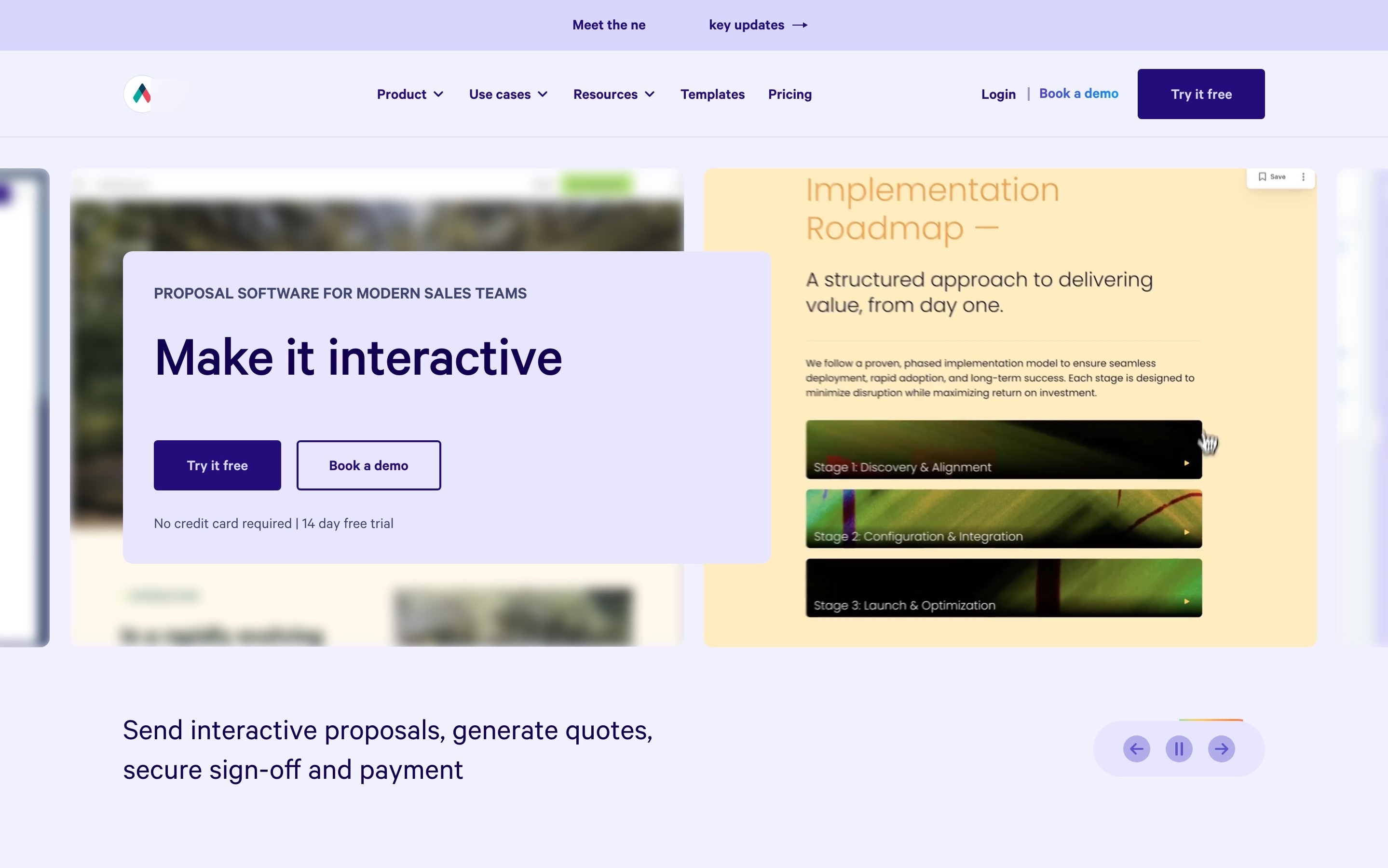
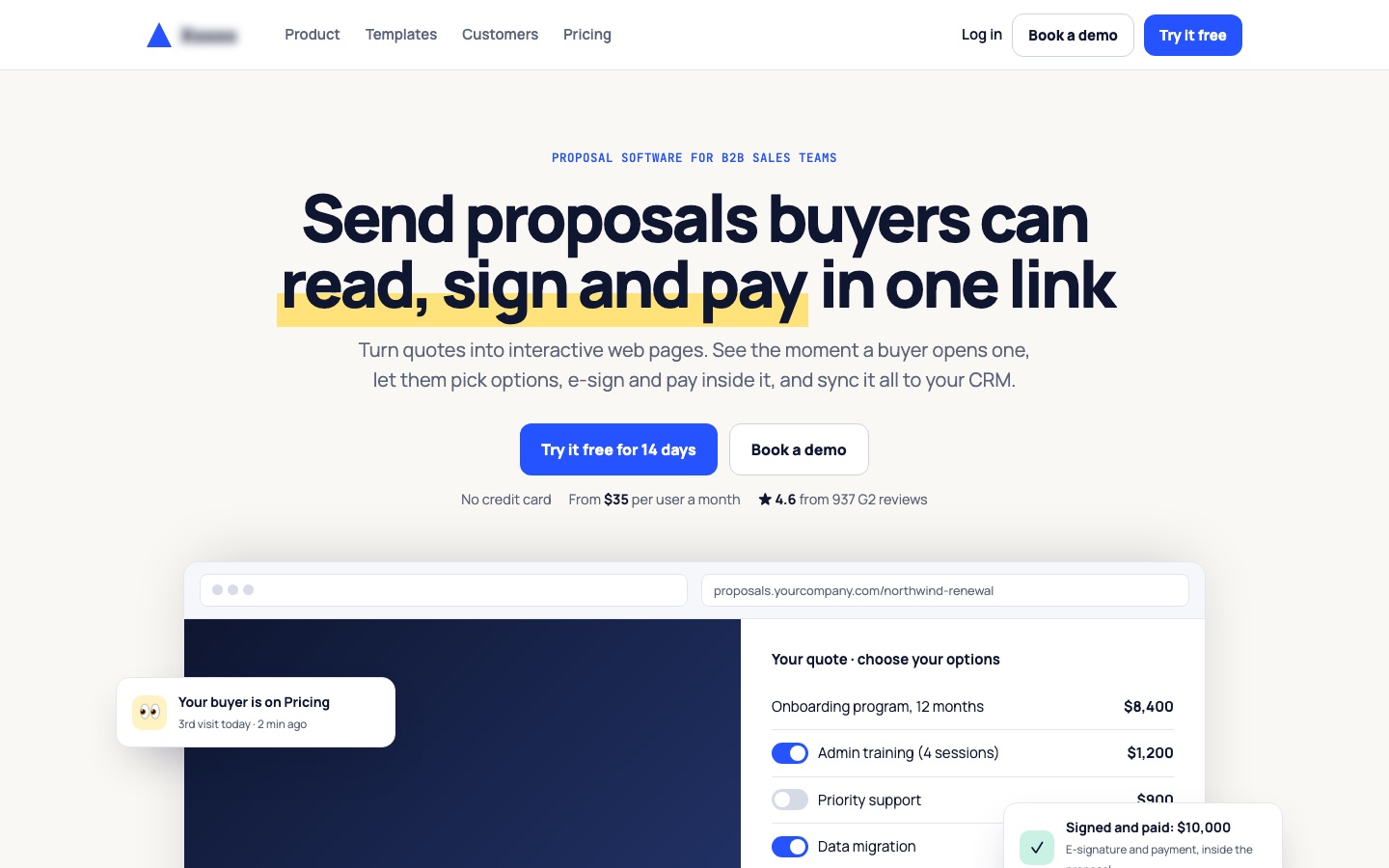
A proposal software homepage said "Make it interactive" in a rotating carousel. The redesign rewrote the first screen to say what the product does, with a working example, the price and the rating. The same principle applies to stores: say what you sell, then show it.
See the interactive proposals case study3Let brand photography support the products, never replace them
Brand photos should show the products and link to them, not just set a mood.
✕ Avoid
A beautiful photo with no products in it
✓ Do this
Shop the kitchen ›
Why it matters
Beautiful brand imagery sets the tone, but when the homepage is all atmosphere and no products, shoppers have to dig to find anything to buy, and many don't.
How to do it
- Pair every brand image with products: show the products in the photo and link them.
- Keep brand storytelling below the categories and products, or on an About page.
- Use your best product photography on the homepage too.
On ShopifyTheme setting
Use "Image with text" sections that link to collections, and keep "Rich text" brand sections short.
Quick test: Do brand images on the homepage show and link to products?
4Avoid autoplay carousels, and give carousels visible controls
Skip autoplay carousels. Use one clear hero, or give a carousel visible controls and no autoplay.
✕ Avoid
Slides change every 3 seconds
✓ Do this
Shop by category
Why it matters
Carousels hide all but one slide, and many shoppers never see the others. Autoplay moves the slide while people read, and on phones it often moves as they try to tap. A single strong banner usually does more.
How to do it
- Prefer one static hero banner over a carousel.
- If you use a carousel, turn autoplay off (at least on phones), show clear arrows and dots, and let swipe work.
- Pause any movement when shoppers hover, tap or focus it, and provide a pause button if it moves.
- Never put critical information only on slide two or three.
On ShopifyTheme setting
Slideshow sections have an "Auto-rotate slides" setting; turn it off, or replace the slideshow with an image banner.
Quick test: Is the homepage free of autoplay carousels, with any carousel easy to control?
5Make every image and tile obviously clickable, and say where it goes
Make every tile one big link, with a label that says where it goes.
✕ Avoid
Comfort, reimagined
Let there be light
learn more
✓ Do this
Why it matters
Shoppers tap images expecting them to lead to products. Images that aren't links, or tiles where only a small button is clickable, frustrate them. Vague labels ("Discover") don't say where the link leads.
How to do it
- Make the whole tile (image and text) one link.
- Label tiles with where they go: "Shop women's boots", not "Explore".
- Show a hover state on desktop and a clear button or arrow on phones.
On ShopifyTheme setting
Set a link on every image banner and collection tile. In some themes, the image only links when a button label is empty; test it.
Quick test: Is every homepage image a link with a label that says where it goes?
6Keep ads and other brands' promotions off the homepage
Keep ads for other brands off your store. They take shoppers away and make the store look cheap.
✕ Avoid
Sponsored
Get 50% off meal kits at another store
✓ Do this
Why it matters
Ad banners for other brands, or promotions that look like ads, make a store look cheap and send shoppers away. Even your own promos lose effect when they look like banner ads.
How to do it
- Don't run third-party ads on your store.
- Style your own promotions as part of the page, with real products, not as banner ads.
- Limit the homepage to one promotion at a time.
On ShopifyBuilt in
Nothing to set up. Check apps that add banners or announcement bars.
Quick test: Is the homepage free of third-party ads and banner-style promos?
7Offer a guided way in: shop by need, room, occasion, or a quiz
Give shoppers who don't know what to pick a guided way in: by room, need, occasion, or a short quiz.
✕ Avoid
Shop
✓ Do this
Shop by room
Not sure what fits?
Take the 1-minute room quizWhy it matters
Not every shopper knows what they want. "Shop by skin concern", "Gifts under $50" or a three-question quiz gives them a starting point and leads them to the right products faster than browsing categories.
How to do it
- Add one or two guided entry points that match how your customers think: by problem, use, room, occasion, recipient, budget.
- If you have a product quiz, start it on the homepage, not behind a link.
- Show a few results immediately, with a link to see all.
On ShopifyApp
Guided collections are normal collections; product quizzes need a quiz app or custom section.
Quick test: Does the homepage offer a guided way in for shoppers who don't know what they want?
8Pick the shopper's country, currency and language for them, and let them change it
Pick the shopper's country, currency and language automatically, and let them change it easily.
✕ Avoid
✓ Do this
Why it matters
International visitors who see the wrong currency, language or shipping information assume the store doesn't serve them. Asking every visitor to choose with a pop-up is an interruption.
How to do it
- Detect the shopper's country and show the matching currency, language and shipping information.
- Show a small, clear country and currency selector in the header or footer.
- If you suggest switching to another country site, do it with a small banner, not a blocking pop-up.
On ShopifyBuilt in
Shopify Markets handles local currencies and languages. The free Shopify Geolocation app suggests the right country, and themes add a country and language selector.
Quick test: Do international visitors see their currency and language, with an easy way to change it?
FAQ
What should be on an ecommerce homepage?
A first screen that says what you sell and why buy here, your main categories with photos, best sellers, a guided way in (by need or a quiz), proof like reviews and guarantees, and clear delivery and returns information.
Are carousels bad for ecommerce homepages?
They usually underperform: most shoppers only see the first slide, and autoplay gets in the way. One strong banner is usually better.
How important is the homepage for an online store?
Less than many think: many visitors arrive on product and collection pages. But for new visitors and returning browsers, it sets the first impression and the path to products.
Sources

Conversion designer. I design, redesign and build online stores, product pages and landing pages, A/B test them and show what each change earned. CXL certified in Conversion Optimization and Ecommerce Marketing, and a guest speaker on ecommerce UX at NYU School of Professional Studies.