Collection pages and filters · Article 1 of 6
Collection page layout: 10 tips for product listing pages
Show one card per product with its colors as swatches, add breadcrumbs and the number of products, and use a grid for visual products and a list for spec-heavy ones. Keep cards compact on phones, keep ads out of the grid, bring shoppers back to the same spot, and load more products with a button rather than endless scrolling.
In this article · 10 tips
- What collection pages are for
- 1Show one card per product, with its colors as swatches
- 2Add breadcrumbs that follow the category path
- 3Show the number of products
- 4Use a grid for visual products and a list for spec-heavy ones
- 5Don't split one collection into separate mini-lists
- 6On phones, separate cards clearly and keep them short enough to see more than one
- 7Keep ads and big promos out of the product grid
- 8Add columns on large screens instead of stretching cards
- 9Bring shoppers back to the same spot when they return from a product
- 10Use "Load more" (or clear pagination) instead of endless scrolling
- FAQ
In short
- The collection page is where shoppers compare. Its job is to make comparing easy.
- One card per color clutters the grid; swatches on one card keep it clean.
- Shoppers go back and forth between list and product. Losing their place costs patience.
What collection pages are for
Collection pages (product listing pages, category pages) are where shoppers scan, compare and shortlist. Most of their time is spent scrolling and opening products. The layout should make each product easy to judge at a glance and make moving between the list and products painless.
1Show one card per product, with its colors as swatches
Show each product once, with its colors as swatches. Separate cards for every color bury the other products.
✕ Avoid
Mugs
36 products
Stoneware mug, Sand
$17
Stoneware mug, Black
$17
Stoneware mug, Blue
$17
Stoneware mug, Clay
$17
✓ Do this
Mugs
9 products
Stoneware mug
$17
Espresso cup
$14
Travel bottle
$29
Tall latte mug
$19
Why it matters
When every color gets its own card, the grid fills with the same product five times, pushing other products out of view and making the range look smaller than it is.
How to do it
- Show each product once, with color swatches on the card (see swatches on cards).
- If colors are separate products for SEO or stock reasons, group them on the card anyway.
- When a color filter is on, show the matching color on the card.
On ShopifyBuilt in
Shopify variants show as one product card. If colors are separate products, the Combined Listings app (Plus) or a swatch app groups them.
Quick test: Does each product appear once in the grid, with its colors as swatches?
2Add breadcrumbs that follow the category path
Breadcrumbs show where the shopper is and let them step up a level, especially after landing from Google.
✕ Avoid
Boots
Ridge boot
★★★★★ 4.7 (212)
$189
Summit boot
★★★★★ 4.5 (96)
$210
✓ Do this
Home › Women › Shoes › Boots
Boots
Ridge boot
★★★★★ 4.7 (212)
$189
Summit boot
★★★★★ 4.5 (96)
$210
Why it matters
Shoppers landing on a subcategory from search need to know where they are and how to go up a level. Breadcrumbs answer both.
How to do it
- Show the path above the heading: Home › Women › Shoes › Boots.
- Make each level a link.
- Use breadcrumb structured data.
On ShopifyCode
Shopify collections have no built-in hierarchy; breadcrumbs need a theme that builds them from the menu, or metafields.
Quick test: Do collection pages show a breadcrumb path?
3Show the number of products
The number of products tells shoppers how big the collection is and whether their filters went too far.
✕ Avoid
Boots
Ridge boot
★★★★★ 4.7 (212)
$189
Summit boot
★★★★★ 4.5 (96)
$210
✓ Do this
Boots
12 of 48 boots
Ridge boot
★★★★★ 4.7 (212)
$189
Summit boot
★★★★★ 4.5 (96)
$210
Why it matters
"86 products" tells shoppers how big the list is and whether to filter. The count also confirms that filters worked.
How to do it
- Show the product count near the heading or above the grid.
- Update it when filters are applied.
On ShopifyTheme setting
Most Shopify themes show the product count next to the filters; check it's turned on.
Quick test: Is the number of products shown and updated with filters?
4Use a grid for visual products and a list for spec-heavy ones
Use a photo grid for products chosen by look, and a list with specs for products chosen by numbers.
✕ Avoid
Air purifiers
14 products
Pure 300
$249
Pure 500
$349
Mini 100
$129
Max 700
$499
✓ Do this
Air purifiers
14 products
Pure 300
Rooms up to 40 m² · 24 dB · HEPA 13
$249
Pure 500
Rooms up to 65 m² · 28 dB · HEPA 13
$349
Mini 100
Rooms up to 18 m² · 20 dB · HEPA 12
$129
Why it matters
Clothes, furniture and decor are chosen by looking, so a grid of large photos works best. Laptops, tools and parts are chosen by specs, which a list view can show side by side.
How to do it
- Use a photo grid for visual products.
- Use a list view (photo, name, key specs, price in a row) for spec-heavy products.
- For mixed collections, pick the layout that suits most of the products, or switch by category.
On ShopifyTheme setting
Most Shopify themes offer a grid; some have a list view setting. Show key specs on cards with metafields.
Quick test: Does the layout suit the products: a grid for visual products, a list for spec-heavy ones?
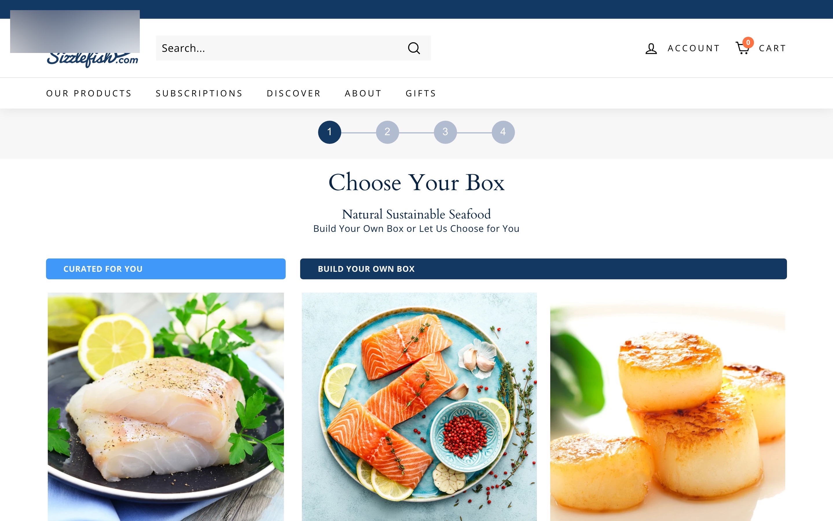
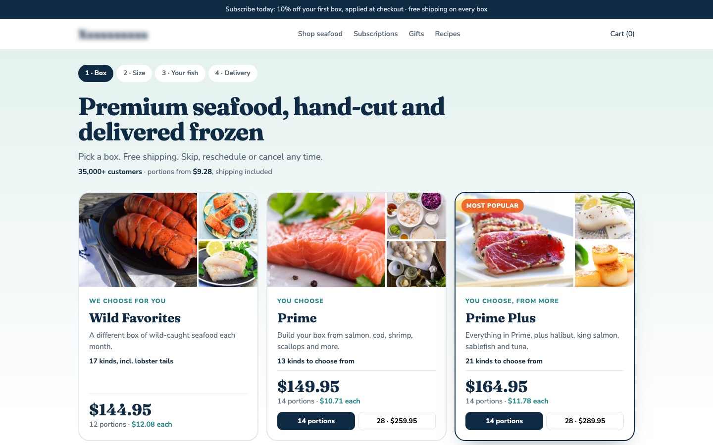
From my work · +11.7% subscriptions started
A seafood subscription asked shoppers to choose a box from cards with no price, portion count or fish shown. The redesign put all three on every card, so boxes could be compared without opening each one.
See the seafood subscription case study5Don't split one collection into separate mini-lists
Keep one continuous list per collection. Splitting it into mini-lists hides most products behind "See all".
✕ Avoid
Boots
Best sellers
See all ›
Ridge boot
$189
Summit boot
$210
Chelsea boot
$165
New in
See all ›
Ridge boot
$189
Summit boot
$210
Chelsea boot
$165
✓ Do this
Boots
48 products
Ridge boot
$189
Summit boot
$210
Chelsea boot
$165
Trail mid
$149
Why it matters
Collections divided into sections ("Featured", "Classic", "New") each with their own few products make shoppers scroll several lists, and filters and sorting don't work across them.
How to do it
- Show one continuous list per collection.
- Use filters and sorting for groups, not separate sections.
- Link to subcollections above the grid if you need them.
On ShopifyTheme setting
Use one product grid section per collection template.
Quick test: Is each collection one continuous, filterable list?
6On phones, separate cards clearly and keep them short enough to see more than one
On phones, give each card clear edges and keep it short, so shoppers see two or more products per screen.
✕ Avoid
Boots
Ridge boot
Waterproof leather boot with a grippy sole, made for long walks in wet weather and…
$189
✓ Do this
Boots
48 products
Ridge boot
★★★★★ 4.7 (212)
$189
Summit boot
★★★★★ 4.5 (96)
$210
Chelsea boot
★★★★★ 4.8 (340)
$165
Trail mid
★★★★☆ 4.4 (58)
$149
Why it matters
On phones, cards without clear separation make it hard to tell which name belongs to which photo. Cards so tall that one fills the screen make comparison impossible.
How to do it
- Use clear spacing or borders between cards.
- Show two columns on phones for most products, so several are visible at once.
- Keep card text short: name, price, rating, swatches.
On ShopifyTheme setting
Set the number of columns on mobile (usually 1 or 2) in the collection page's product grid settings.
Quick test: On phones, are cards clearly separated, with more than one visible at once?
7Keep ads and big promos out of the product grid
Keep the grid for products. Ads and promo tiles inside it look like products and push real ones down.
✕ Avoid
Boots
48 products
Ridge boot
★★★★★ 4.7 (212)
$189
40% OFF
EVERYTHING
Summit boot
★★★★★ 4.5 (96)
$210
Chelsea boot
★★★★★ 4.8 (340)
$165
✓ Do this
Boots
48 products
40% off selected boots until Sunday
Ridge boot
★★★★★ 4.7 (212)
$189
Summit boot
★★★★★ 4.5 (96)
$210
Chelsea boot
★★★★★ 4.8 (340)
$165
Trail mid
★★★★☆ 4.4 (58)
$149
Why it matters
Banners mixed into the grid look like products, break the scanning rhythm, and push products down. Shoppers on collection pages came to compare products.
How to do it
- Keep the grid for products only.
- If you need a promotion, use a slim banner above the grid.
- Mark sponsored or featured products clearly if you show any.
On ShopifyTheme setting
Remove promotional blocks from the grid; some themes and apps add them.
Quick test: Is the product grid free of ads and big promo tiles?
8Add columns on large screens instead of stretching cards
On wide screens, add columns instead of stretching cards. More products per row, same readable card.
✕ Avoid
Boots
48 products
Ridge boot
★★★★★ 4.7 (212)
$189
Summit boot
★★★★★ 4.5 (96)
$210
Chelsea boot
★★★★★ 4.8 (340)
$165
✓ Do this
Boots
48 products
Ridge boot
★★★★★ 4.7 (212)
$189
Summit boot
★★★★★ 4.5 (96)
$210
Chelsea boot
★★★★★ 4.8 (340)
$165
Trail mid
★★★★☆ 4.4 (58)
$149
Winter boot
★★★★★ 4.6 (120)
$199
Ridge boot
★★★★★ 4.7 (212)
$189
Summit boot
★★★★★ 4.5 (96)
$210
Chelsea boot
★★★★★ 4.8 (340)
$165
Trail mid
★★★★☆ 4.4 (58)
$149
Winter boot
★★★★★ 4.6 (120)
$199
Why it matters
On a big monitor, a three-column grid stretched to full width makes huge cards and long scrolls. More columns show more products at once.
How to do it
- Add columns as the screen gets wider (four or five on large desktops).
- Keep photos large enough to judge the product.
On ShopifyTheme setting
Set the number of desktop columns in the product grid settings.
Quick test: Does the grid use more columns on large screens?
9Bring shoppers back to the same spot when they return from a product
When shoppers come back from a product, return them to the same spot with the same products loaded.
✕ Avoid
Back from product 37 → the page starts again at product 1
Boots
48 products
Ridge boot
★★★★★ 4.7 (212)
$189
Summit boot
★★★★★ 4.5 (96)
$210
Chelsea boot
★★★★★ 4.8 (340)
$165
Trail mid
★★★★☆ 4.4 (58)
$149
✓ Do this
Back where you were
Showing 48 of 48
Ridge boot
★★★★★ 4.7 (212)
$189
Summit boot
★★★★★ 4.5 (96)
$210
Chelsea boot
★★★★★ 4.8 (340)
$165
Trail mid
★★★★☆ 4.4 (58)
$149
Why it matters
Shoppers open a product, go back, and land at the top of the list. They have to scroll and reload to find where they were, often many times per visit.
How to do it
- Make the back button return to the same scroll position, with the same products loaded.
- Keep filters and sorting when returning.
On ShopifyCode
Pagination keeps position naturally. With load more or infinite scroll, store the position and loaded pages so back restores them.
Quick test: Does going back from a product return the shopper to the same place in the list?
10Use "Load more" (or clear pagination) instead of endless scrolling
Load products in batches with a "Load more" button and a clear count, rather than endless scrolling.
✕ Avoid
Ridge boot
★★★★★ 4.7 (212)
$189
Summit boot
★★★★★ 4.5 (96)
$210
Chelsea boot
★★★★★ 4.8 (340)
$165
Trail mid
★★★★☆ 4.4 (58)
$149
Loading more…
The footer, contact and returns links can never be reached
✓ Do this
Ridge boot
★★★★★ 4.7 (212)
$189
Summit boot
★★★★★ 4.5 (96)
$210
Showing 24 of 48
Load moreWhy it matters
Endless scrolling makes the footer unreachable, loses the shopper's place, and gives no sense of progress. A "Load more" button keeps the flow and the control.
How to do it
- Load a good number of products at first, then add more with a "Load more" button that shows progress ("Showing 48 of 210").
- If you use pagination, make the page links large, clear and easy to tap.
- Make sure search engines can reach every product through crawlable links.
On ShopifyTheme setting
Shopify themes use pagination by default and let you set products per page. Load more needs an app or theme code.
Quick test: Does the list load more with a button or clear pagination, not endless scrolling?
FAQ
Is infinite scroll or pagination better for ecommerce?
"Load more" usually works best: shoppers keep their place and can reach the footer. Plain pagination is fine if the links are clear.
How many products should a collection page show?
Enough to fill a few screens before "Load more": often 24 to 48. Too few means constant loading; too many slows the page.
Sources

Conversion designer. I design, redesign and build online stores, product pages and landing pages, A/B test them and show what each change earned. CXL certified in Conversion Optimization and Ecommerce Marketing, and a guest speaker on ecommerce UX at NYU School of Professional Studies.