Short answer
Buyer psychology is how people decide whether to buy: what they notice, what they doubt, and what makes them trust you enough to act. On a product page it means answering the shopper's doubts (will it work for me, is it worth the price, what if it goes wrong) in the order they come up, with proof they can check.
Key takeaways
- Shoppers skim. Most decisions are made fast, from the headline, the images, the price and a few reviews.
- Every visitor brings the same few doubts. Pages that answer them where they arise sell more.
- Losses feel about twice as strong as gains, so risk reversal (returns, guarantees) does more than another benefit.
- Specific proof beats big claims. Numbers, names and details people can check build trust.
- Find your buyers' real doubts in reviews, support tickets and session recordings before you design anything.
Most product pages are designed around the product: photos, features, a buy button. People don't buy that way. They buy when the doubts in their head are answered, in roughly the order they come up. That's what buyer psychology is for in ecommerce, and it's the starting point of every product page I redesign.
Below are the nine principles I use most, what each one looks like on a real page, and a self-check you can run on your own store.
How shoppers actually decide
Daniel Kahneman describes two modes of thinking: a fast, intuitive one and a slow, effortful one. Shopping online is mostly the fast one. Nielsen Norman Group found that people read at most about 28% of the words on a page during an average visit, and more likely around 20%. So the page has to make its case to someone who is skimming.
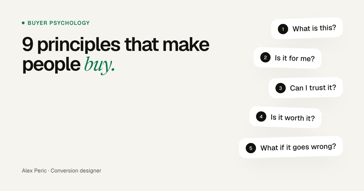
When I watch session recordings, shoppers move through five questions, usually in this order. If one goes unanswered, they leave or go back to Google.
The five questions every shopper asks
And the doubt behind each one
- What is this?The headline and first image."Is this what I'm looking for?"
- Is it for me?Who it's for, sizes, variants."Will it work for my problem?"
- Can I trust it?Reviews, proof, the brand."Does it actually work?"
- Is it worth it?Price, comparison, value."Could I get this cheaper?"
- What if it goes wrong?Delivery, returns, guarantee."What am I risking?"
9 buyer psychology principles, and how to use each one
1. Clarity beats cleverness
People trust what they understand quickly. Psychologists call this cognitive fluency: information that's easy to process feels more true and more likeable. A clever headline makes the shopper work. A clear one tells them, in their own words, what the product does for them.
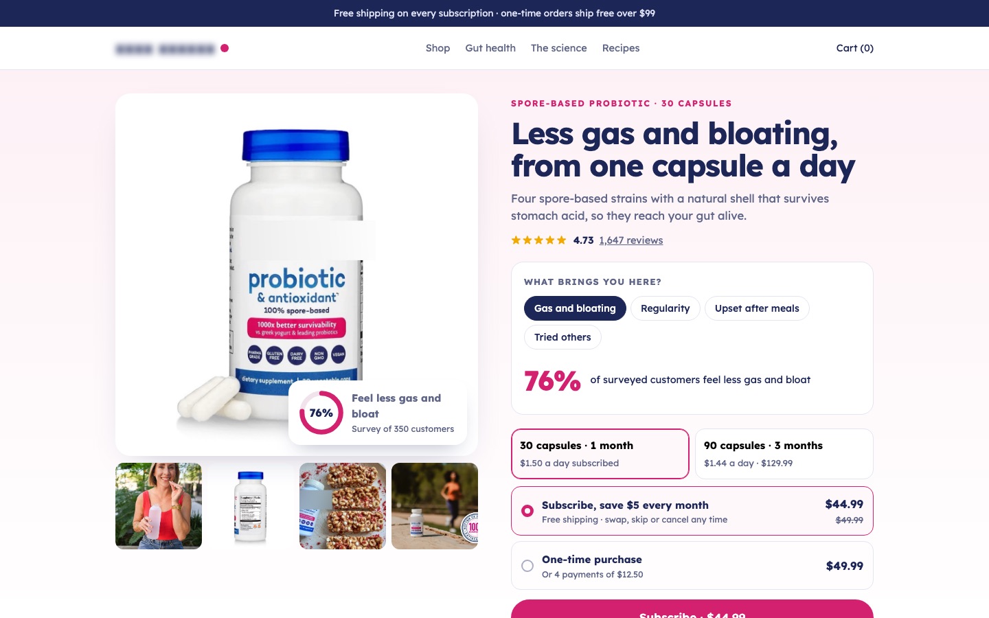
2. Answer doubts where they come up
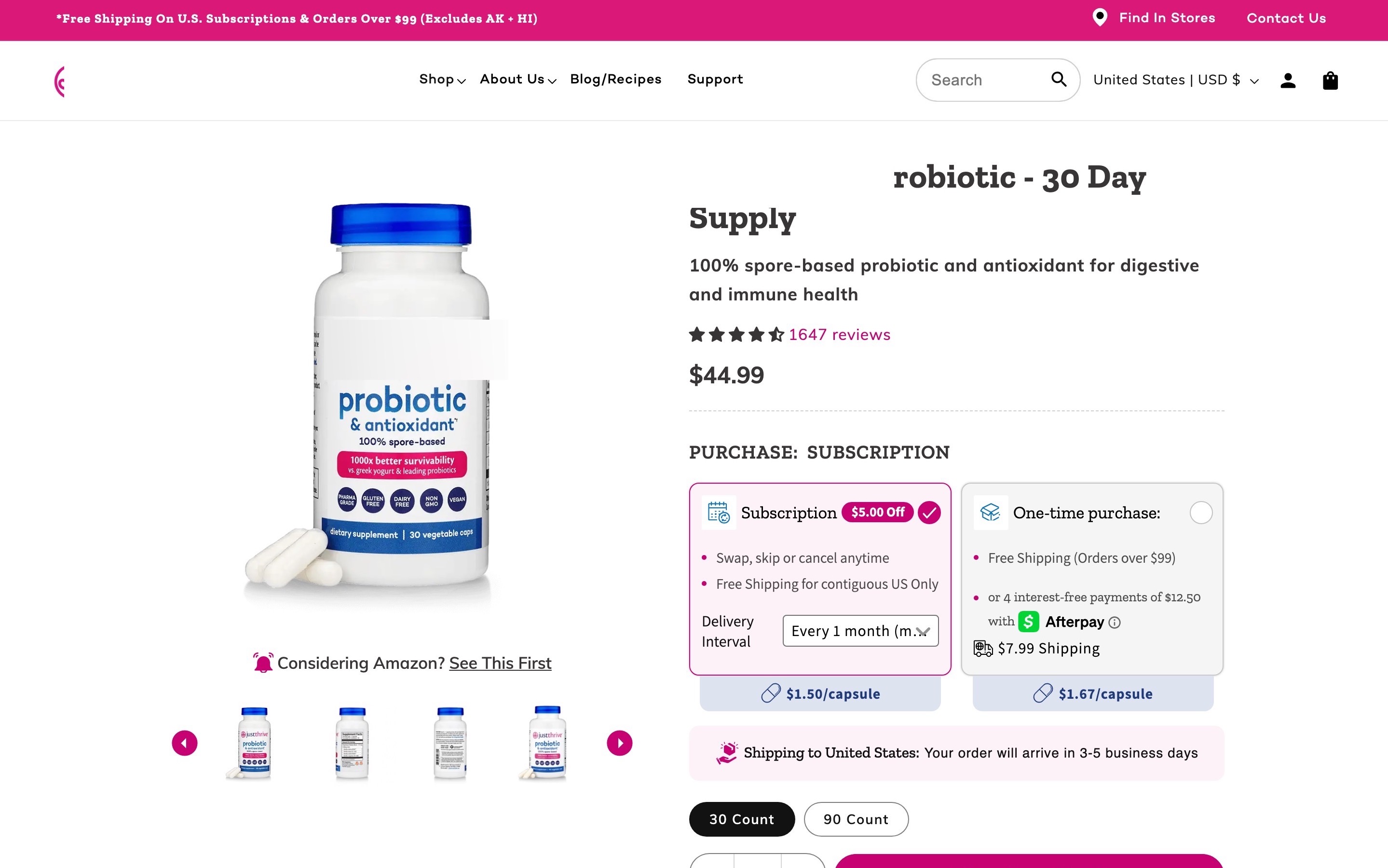
An FAQ at the bottom of the page is too late. Answer each doubt next to the thing that triggers it: shipping cost next to the price, sizing next to the size picker, ingredients next to the claim. Baymard Institute found that 64% of shoppers look for shipping costs on the product page before they add to cart, and that 27% missed free shipping when it only appeared in a site-wide banner.
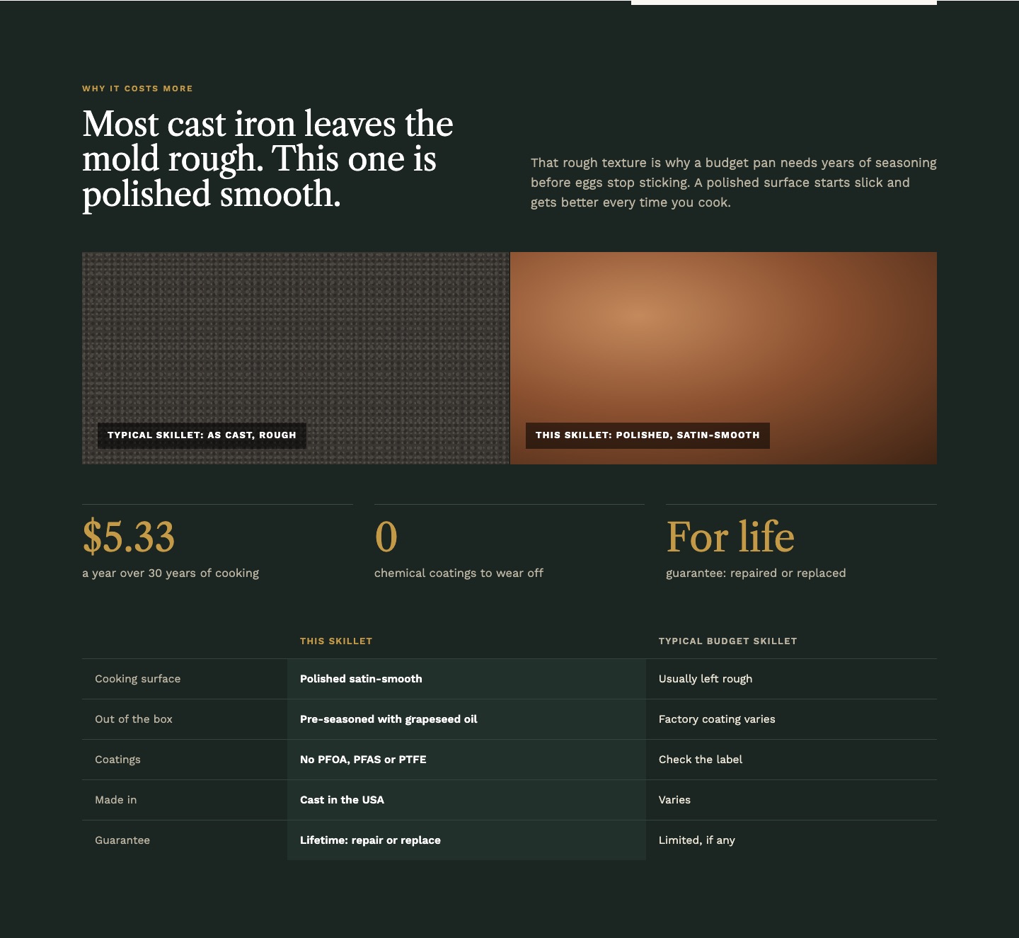
3. A price needs a reason
A high price without an explanation reads as expensive. The same price with a reason reads as fair. Put the reason right under the price: what it's made of, how long it lasts, what it saves over time, how it compares with the cheap alternative.
4. Losses hurt more than gains feel good
Kahneman and Tversky showed that losing something feels roughly twice as strong as gaining the same thing. For a shopper, the possible loss is the money and the hassle if the product disappoints. Risk reversal shrinks that loss: free returns, a trial period, a guarantee, stated plainly next to the buy button.
Why a guarantee works: losing $50 hurts more than gaining $50 feels good
The value people feel from gains and losses of the same size (Kahneman and Tversky's prospect theory)
5. Social proof works when it's specific
Baymard saw up to 95% of test participants use reviews to decide. But "Loved by thousands" does little. What works: the number of reviews and the rating near the title, reviews that mention the doubt this shopper has, photos from real customers, and the option to read the negative reviews. Being able to see the bad reviews makes the good ones believable.
6. Fewer choices, with help choosing
In the famous jam study by Sheena Iyengar and Mark Lepper, a display with 24 jams drew more people in, but only 3% of them bought. With 6 jams, 30% bought. Too many options, sizes or bundles stall the decision. Recommend one option, label it ("Most popular", "Best for a family of four"), or ask one question and route the shopper to the right product.
7. Make the first step feel small
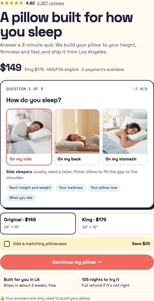
Once people start something, they tend to finish it (Robert Cialdini calls this commitment and consistency). A quiz that opens with an easy question, a bundle builder that starts with one choice, or a form that asks for the ZIP code before the email all use it. The first step should take a second and feel risk-free.
8. Show expertise, not adjectives
"Premium quality" is a claim. "Hand-poured, 6-hour seasoning, 3 layers of flaxseed oil" is evidence. Specific details signal that the brand knows what it's doing, even to shoppers who don't read all of them. Frictionless Commerce reports a +46% lift for Baking Steel after adding the technical story the founder assumed nobody cared about.
9. Remove uncertainty about what happens next
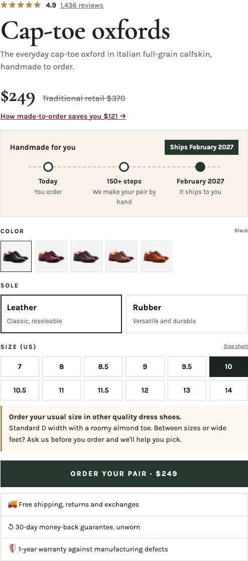
People avoid options they don't fully understand. When will it arrive? What happens after I pay? Can I cancel? A clear delivery date, a short "what happens next" list and the cancellation terms near the button remove that uncertainty.
Self-check: how well does your product page use buyer psychology?
Open your best-selling product page on your phone and tick what's true. Be strict: "it's somewhere on the page" doesn't count if a shopper wouldn't see it at the moment they need it.
Free tool
Product page buyer psychology check
How to find your buyers' real doubts
The principles tell you how to answer doubts. Research tells you which doubts your buyers actually have. Before I design, I go through:
- Reviews, yours and your competitors'. Three-star reviews are the most useful: they say what almost stopped people.
- Support tickets and chat logs. Every repeated pre-purchase question is a gap on the page.
- Session recordings of people who reached the product page and left. Watch where they hesitate, zoom or scroll back up.
- A one-question survey on exit or after purchase: "What almost stopped you from buying today?"
I list every doubt, count how often it comes up, and map each one to the spot on the page where it should be answered. That objection map becomes the brief for the redesign. If you want help with that, it's what my product page design work starts with.
FAQ
What is buyer psychology?
Buyer psychology is the study of how people decide what to buy: the mental shortcuts, doubts and emotions behind a purchase. In ecommerce it's used to design product pages that answer those doubts and make the decision easier.
Which psychological principles work best on product pages?
The most reliable are clarity, answering doubts where they arise, justifying the price, risk reversal (returns and guarantees), specific social proof and reducing choice. They work because they remove reasons not to buy.
Is using psychology in ecommerce manipulative?
It is when it relies on fake urgency, hidden costs or pressure. The principles here do the opposite: they give shoppers clearer, more honest information so they can decide faster and feel sure about it.
How do I know which principle to apply first?
Start with research: reviews, support questions and session recordings show your buyers' real doubts. Fix the doubts closest to the buy button first (price, shipping, returns), then test the rest.
Sources
- Kahneman, D. (2011). Thinking, Fast and Slow.
- Kahneman, D. and Tversky, A. (1979). Prospect Theory: An Analysis of Decision under Risk. Econometrica.
- Iyengar, S. and Lepper, M. (2000). When choice is demotivating. Journal of Personality and Social Psychology.
- Nielsen Norman Group: How Little Do Users Read?
- Baymard Institute: Product pages need to show estimated shipping costs
- Baymard Institute: Free shipping shouldn't only be in a site-wide banner
- Baymard Institute: Product page UX research
- Influence at Work: Cialdini's principles of persuasion

Conversion designer. I design and build product pages, landing pages and websites, A/B test them and show what each change earned. CXL certified in Conversion Optimization and Ecommerce Marketing, and a guest speaker at NYU School of Professional Studies.