Short answer
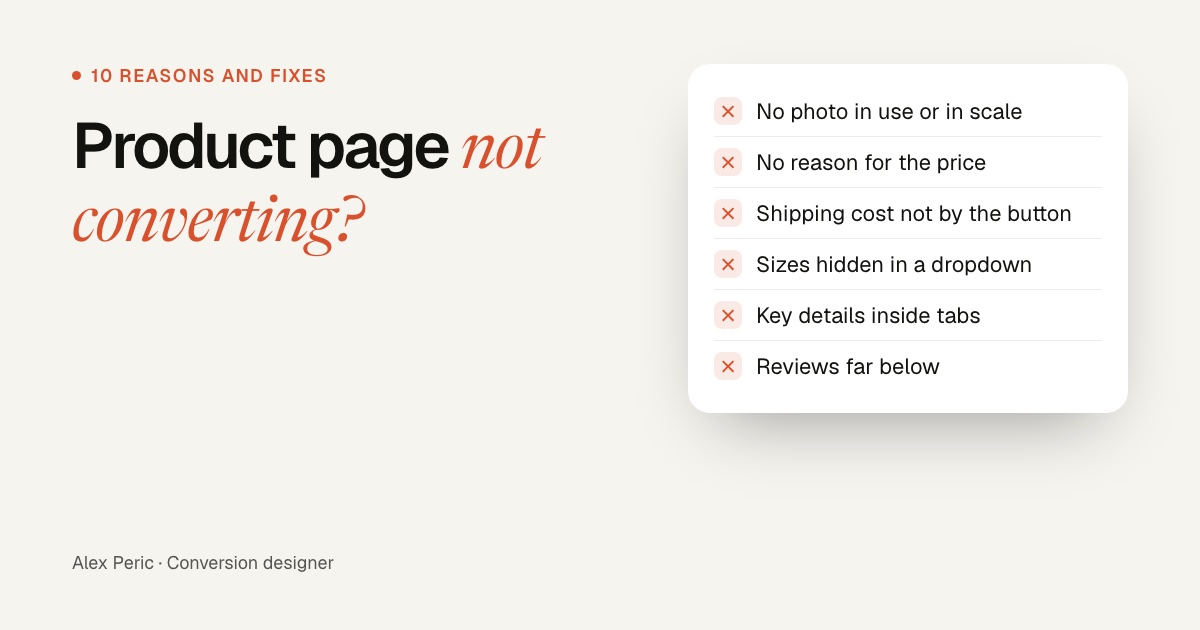
A product page usually doesn't convert because shoppers can't find what they need to decide: the images don't show the product in use or in scale, the price has no reason behind it, shipping cost and delivery date are missing near the button, variants are hard to choose, or key details hide in tabs. Fix those first, then add the reasons to buy from you, and check the first screen on a phone.
Key takeaways
- Most product pages that don't convert are missing information, not persuasion. Shoppers leave when they can't find an answer.
- Images do the most work: many shoppers look at them first, and some judge only from the default image.
- Shipping cost, delivery date and returns belong next to the Add to cart button, not only in a banner.
- A higher price needs a reason on the page: materials, lifespan, cost per use or a comparison.
- Check the page on a phone. The first screen should show the product, the price and Add to cart.
Your product page gets traffic, but few people add to cart. In my experience redesigning product pages, the cause is rarely the button color. It's almost always a question the page doesn't answer: what it's like in real life, why it costs that much, when it arrives, or which size to pick. Below are the 10 reasons I see most often, how to check each one on your own page, and how to fix it. The checklist at the end lets you score your page.
How to find out why your product page isn't converting
- Compare add-to-cart rates across your products. A page far below the others has a page problem; if all are low, look at the template.
- Watch 10 to 20 session recordings of people who left the page. Note where they stop scrolling and what they tap.
- Read your reviews and support emails. The questions people ask after buying are the questions the page didn't answer.
- Open the page on your phone. Most shoppers will see it there first.
What usability research says shoppers look for
How shoppers use product pages
Share of participants in Baymard Institute's product page usability testing
Show the numbers as a table
| Item | Value |
|---|---|
| Used reviews to decide (up to) | 95% |
| Struggled to find thumbnails hidden behind arrows or “+3” links | 81% |
| Looked for shipping costs on the product page | 64% |
| Started with the images before anything else (desktop) | 56% |
| Tried to judge size from the images | 42% |
| Judged the product only from the default image | 31% |
| Overlooked content inside horizontal tabs | 27% |
| Missed free shipping shown only in a site-wide banner | 27% |
1. The images don't show what it's really like
Shoppers can't touch the product, so the images have to answer "what is it, how big is it, how does it look in use?" In Baymard's testing, 31% judged the product only from the first image, and 42% tried to judge size from the images.
Fix: use at least 5 images, with one in use and one next to something people know for scale. Make the default image the best one, and show all thumbnails instead of hiding them behind arrows.
2. The price has no reason behind it
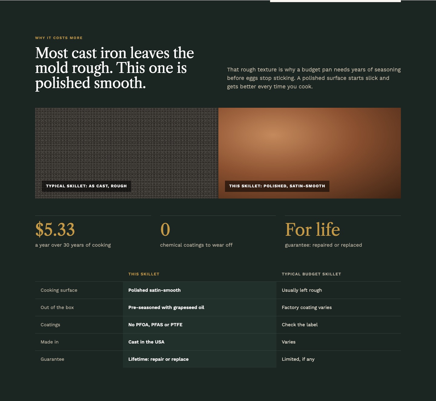
When your product costs more than the alternatives shoppers know, they look for why. If the page doesn't say, they assume it isn't worth it, or go compare on Amazon.
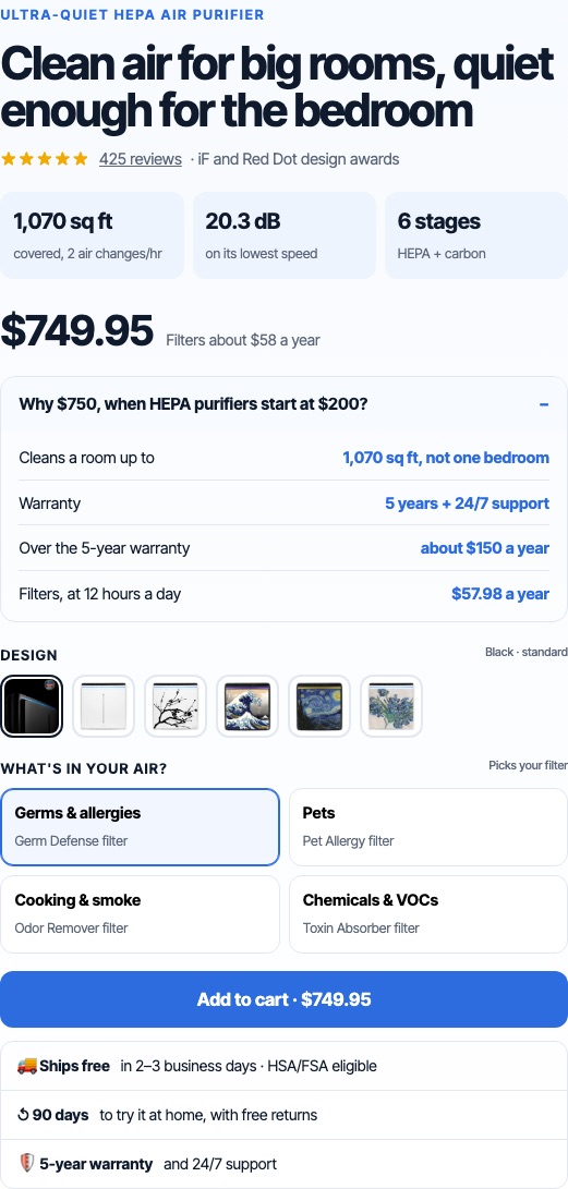
Fix: answer "why this price?" right under the price: materials, how long it lasts, cost per use, or a short comparison with the cheap option.
3. Shipping, delivery and returns are missing near the button
In Baymard's testing, 64% of shoppers looked for shipping costs on the product page, and 27% missed free shipping when it was only in a site-wide banner. If they can't find it, many leave to check it in the cart, and don't come back.
Fix: put the shipping cost or free shipping threshold, an estimated delivery date and the returns policy in one or two short lines right under Add to cart.
4. Choosing a variant is hard
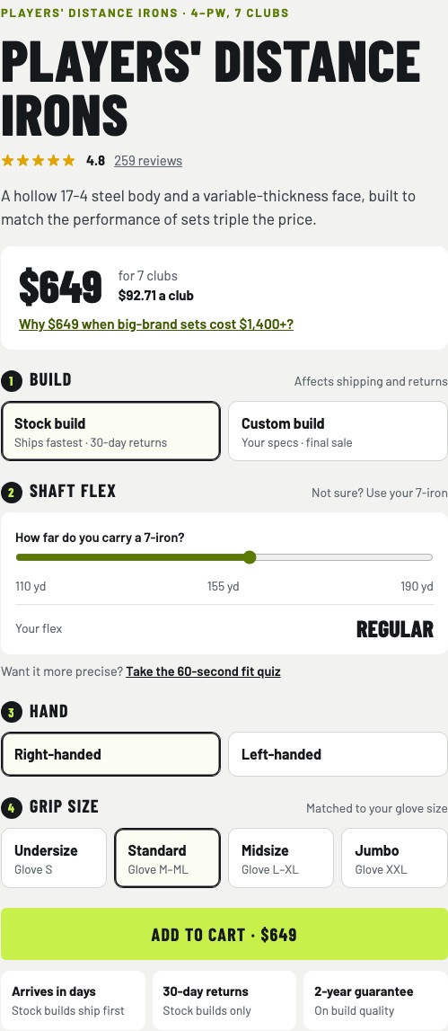
Dropdowns hide options, technical names mean nothing to most buyers, and sold-out sizes appear only after a click. When shoppers can't tell which option is right for them, they wait.
Fix: show colors as images and sizes as buttons, mark sold-out options, and help people choose in their own terms: "Not sure? Most people pick 60 ml", or a simple question they can answer.
5. Key details are hidden in tabs
Horizontal tabs were the worst-performing layout in Baymard's testing: 27% of shoppers overlooked content inside them. Sizing, materials and care often sit in exactly those tabs.
Fix: use stacked sections, or accordions that open the most important parts by default. Explain each spec in plain words.
6. Reviews are hard to find or hard to trust
Reviews are the content shoppers use most: up to 95% of participants in Baymard's testing used them to decide. A page with reviews buried at the bottom, or only five-star ones, loses that help.
Fix: show the rating and review count near the title, linking down to the reviews. Let people filter by their concern (skin type, fit, use) and by stars, show customer photos, and keep negative reviews visible.
7. The page doesn't say who it's for
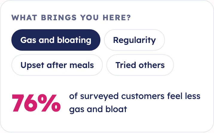
Shoppers come with a specific problem. A page that lists features but never says "this is for you if…" makes them do the matching.
Fix: open with the problem the product solves, in the buyer's words. If people come for different reasons, let them pick theirs and show the proof for it.
8. The buy box is full of distractions
An Amazon button under Add to cart, four different offers, a popup over the product, a chat bubble covering the button: each one gives shoppers a reason to stop or leave.
Fix: keep the buy box to one product, one main offer and one button. A men's face wash page I redesigned had an Amazon button under Add to cart; taking it out of the buy box and showing every size to scale with its cost per month raised revenue per visitor by 16,1%.
9. The first screen on a phone shows almost nothing
Many themes fill the first mobile screen with a big image and the product name, and push the price and the button below. Shoppers have to scroll before they know what it costs.
Fix: on a phone, the first screen should show the image with its thumbnails, the name, rating, price and Add to cart. Then keep a sticky Add to cart bar once the main button scrolls away.
10. The traffic doesn't match the page
If your ad promises a bundle deal and the page shows a single item at full price, or an ad for one use case lands on a generic page, people leave because it isn't what they clicked for.
Fix: check your main traffic sources. Repeat the ad's promise in the first screen, and send different ads to the page or variant that matches them. More on this in landing page vs homepage for ads.
What a product page that converts shows first
What goes on the first screen
Desktop layout; on mobile the same parts stack in this order
- Images carry the first impression. Show the product in use and next to something for scale.
- Headline in the buyer's words, with a line of facts under it.
- Rating and review count near the title, linking to the reviews.
- Price with any discount stated once, plus a reason it's worth it.
- Variants shown as images or clear labels, with the most popular one marked.
- Add to cart: one clear button, sticky on mobile.
- Shipping, delivery and returns right under the button.
What to fix first
Fix missing information before persuasion. Images, price, shipping, variants and reviews (reasons 1 to 6) are usually fixes you can ship without an A/B test, because the page simply lacks something shoppers look for. Changes to the story, the offer and how you present the proof (reasons 7 and 8) are worth testing. For that layer, read buyer psychology in ecommerce.
Product page checklist
Tick what's true for your best-selling product page, on a phone.
Free tool
Product page checklist
FAQ
Why is my product page not converting?
Usually because shoppers can't find what they need to decide: images that show the product in use and in scale, a reason for the price, shipping cost and delivery date near the button, easy variant choice, and reviews. A distracting buy box or traffic that doesn't match the page are the next most common causes.
What is a good add-to-cart rate?
It varies a lot by product, price and traffic source, so compare your product pages with each other and with your own past numbers rather than with a general benchmark. A page far below your others has a page problem.
How many product images should a product page have?
At least five, including the product in use and one that shows scale. Visual or technical products like furniture, electronics or apparel benefit from more.
Should I use tabs on my product page?
Avoid horizontal tabs for important content. In Baymard's testing, 27% of shoppers overlooked content inside tabs. Use stacked sections or accordions instead.
Where should shipping information go on a product page?
Next to the price and the Add to cart button, including the cost or free shipping threshold and an estimated delivery date.
Sources

Conversion designer. I design and build product pages, landing pages and websites, A/B test them and show what each change earned. CXL certified in Conversion Optimization and Ecommerce Marketing, and a guest speaker at NYU School of Professional Studies.