Short answer
Above the fold, a SaaS homepage needs five things: a headline that says what the product fixes and for whom, a line on how it works, one main call to action plus a lower-commitment option, a real view of the product, and a proof line people recognize. Visitors decide in seconds whether to stay, so if they can't tell what you do and who it's for, nothing below the fold matters.
Key takeaways
- Visitors decide in the first 10 seconds whether to stay on a page.
- Lead with the problem you fix, in the buyer's words, not your category or a slogan.
- Show the real product, not abstract illustrations.
- Offer two paths: a trial or demo, and something lighter like a product tour.
- In five SaaS homepage redesigns, these changes lifted trial starts 12–20%.
Most SaaS homepages I audit have the same problem: they describe the category ("the all-in-one platform for revenue teams") instead of the problem the product solves. Visitors can't tell in a few seconds what it does or whether it's for them, so they leave. Here's what to put above the fold instead, with five homepages I redesigned and tested.
You have about 10 seconds
Nielsen Norman Group's analysis of page visits found that people often leave within 10 to 20 seconds, and that the first 10 seconds are the most critical for the decision to stay. Pages with a clear value proposition hold attention longer. For a SaaS homepage, that first screen has to answer three questions: what is it, is it for me, and what do I do next?
The five parts of a SaaS hero section
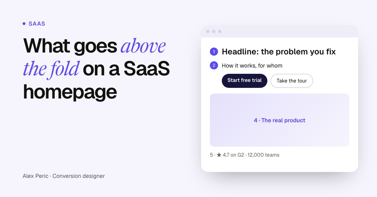
A SaaS homepage first screen
The five parts, in reading order
- Headline: the outcome or the problem you fix, in your buyer's words.
- Subline: how it works and who it's for, in one sentence.
- Two calls to action: the main one (trial or demo) and a lighter one (tour, video, pricing).
- Product visual: a real screen, ideally showing the result, not the settings.
- Proof line: a rating, a number of customers or logos your buyers know.
Write the headline around the problem
A good SaaS headline names an outcome the buyer wants, or a pain they want gone. It uses their words, not your internal ones. Try a few versions with the builder below, then test the best one against your current headline.
Free tool
SaaS headline builder
Pick the one that sounds most like your customers, then check it with a 5-second test: show the first screen for five seconds and ask people what the product does.
Five SaaS pages, redesigned and tested
Trial starts and demo bookings after the redesign
Main result of each redesign against the original page. Each one ran as an A/B test.
Show the numbers as a table
| Item | Value |
|---|---|
| Proposal Software (trial starts) | +19,8% |
| Salon Software (demo bookings) | +16,8% |
| Interactive Proposals (trial starts) | +14,2% |
| Product Adoption SaaS (demo requests) | +12,6% |
| Small Business CRM (trial starts) | +12,1% |
The changes that showed up again and again:
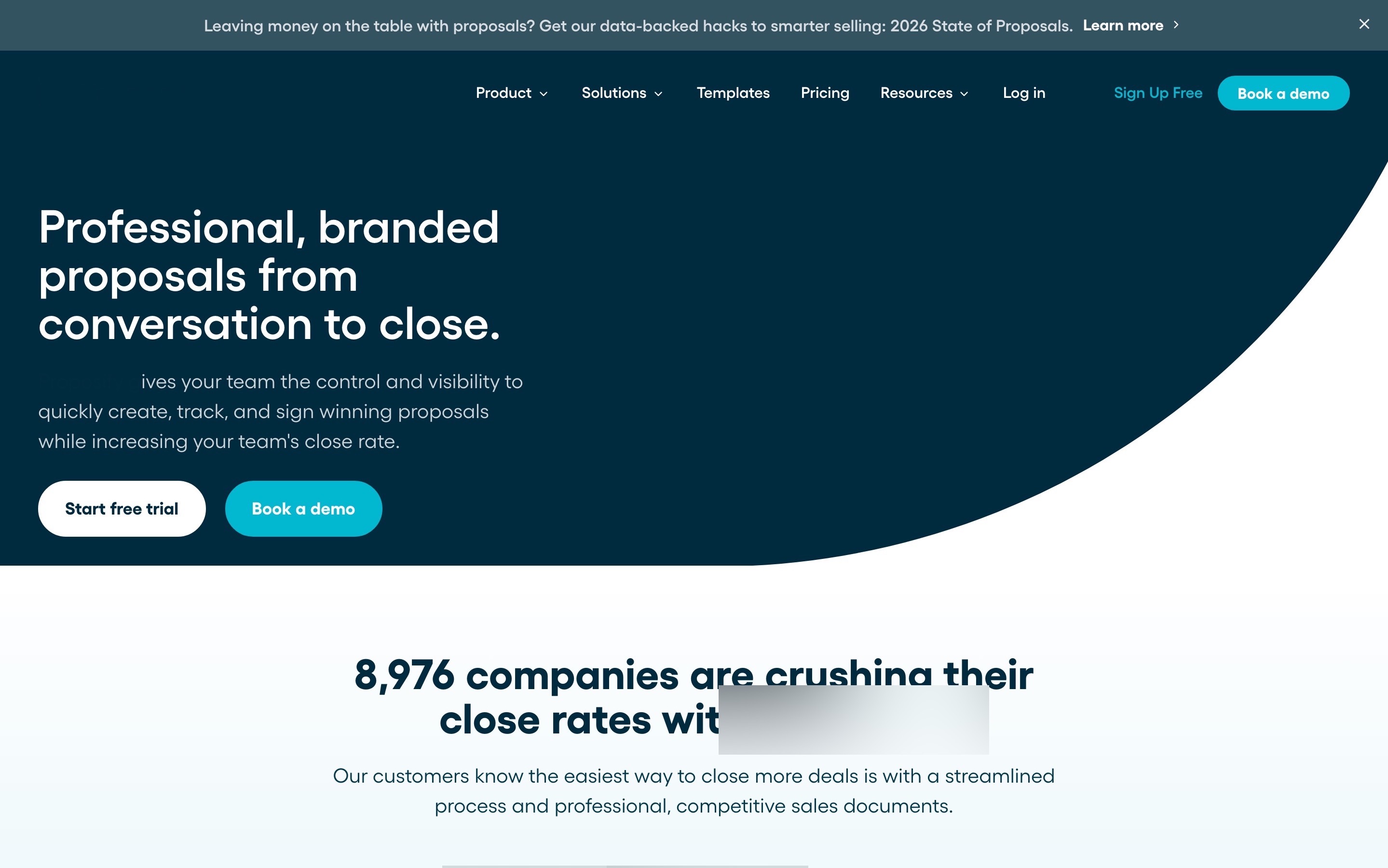
- Problem-first headlines. The proposal software homepage switched from features to the manager who buys it: +19,8% trial starts.
- Making switching feel safe. The salon software homepage led with the outcome, the price and free switching, and its demo booking became four labeled steps: +16,8% demo bookings.
- Selling the call, not just asking for it. The product adoption demo page said exactly what you get from the 30 minutes, and won a three-way test: +12,6% demo requests.
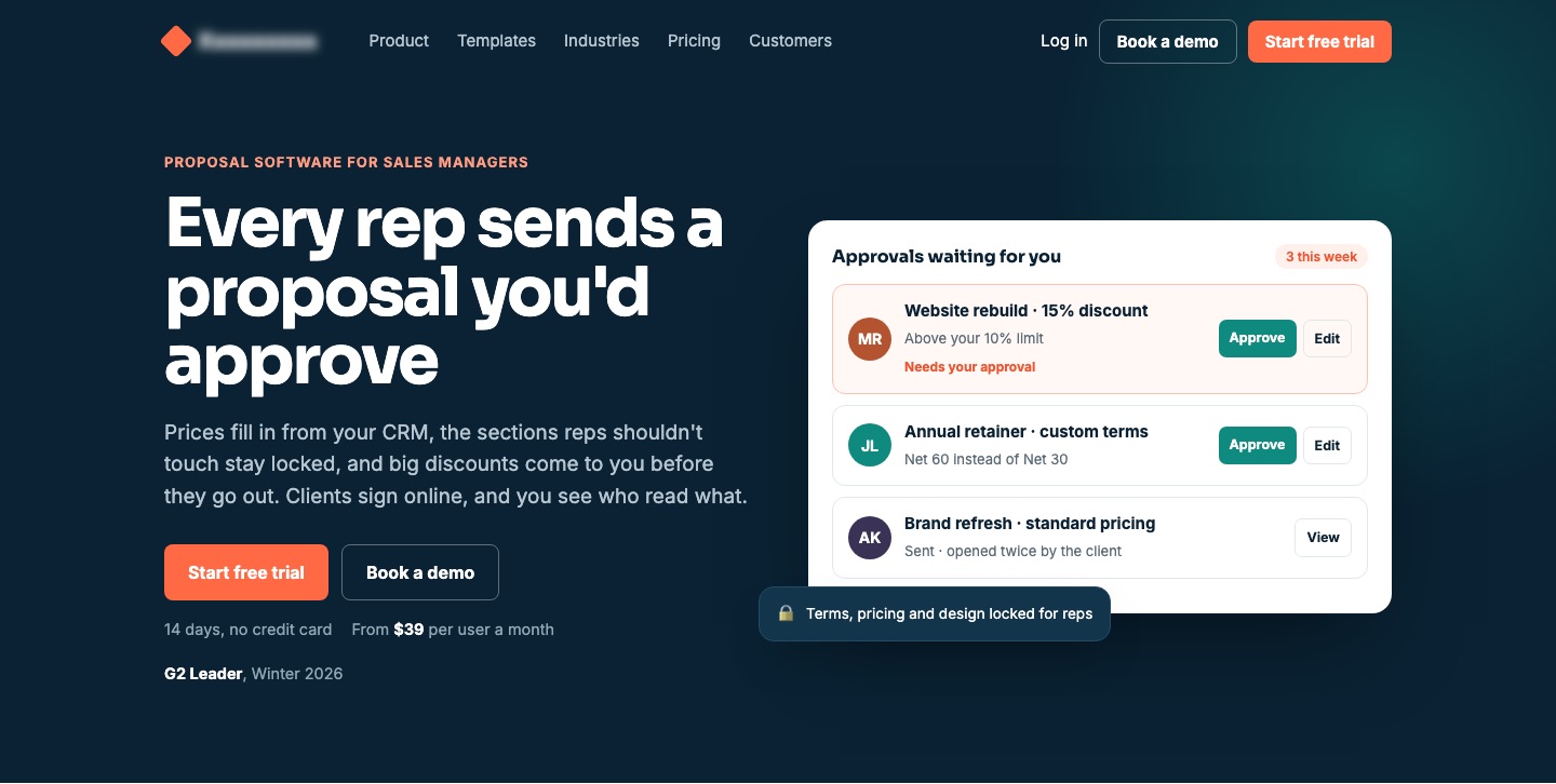
Common SaaS homepage mistakes
- Category headlines. "The AI-powered platform for modern teams" fits a thousand products.
- Only "Book a demo". Many visitors aren't ready to talk. Give them a lighter next step.
- Abstract illustrations instead of the product. People want to see what they'd use.
- Logos with no context. A result or a rating says more than a row of grey logos.
- Hidden pricing. If you can show it, show it. If you can't, say who it's for and how pricing works.
Need a homepage that explains your product faster? See CRO for SaaS.
FAQ
What should be above the fold on a SaaS homepage?
A headline that states the problem you solve or the outcome you deliver, a one-line explanation of how, a main call to action plus a lighter option, a real product visual and a short proof line.
Should a SaaS homepage use 'Book a demo' or 'Start free trial'?
Use the one that matches how most of your customers buy, and add a lower-commitment option next to it, like a product tour or video, for visitors who aren't ready yet.
How long should a SaaS homepage headline be?
Short enough to read in a glance, usually under 10 words. Put the detail in the subline under it.
How do I test a SaaS homepage headline?
Run a 5-second test with people who match your buyer, then A/B test the best version against your current headline, measuring trial or demo starts.
Sources

Conversion designer. I design and build product pages, landing pages and websites, A/B test them and show what each change earned. CXL certified in Conversion Optimization and Ecommerce Marketing, and a guest speaker at NYU School of Professional Studies.