Product page · Article 4 of 10
Price, Add to cart and stock: how to design the buy box
Make Add to cart the most distinct button on the page and keep the price right next to it. Show discounts honestly, show unit prices where amounts differ, and keep the buy box to what's needed to choose and buy. When a product is out of stock, offer a later delivery or a back-in-stock alert; when it's discontinued, point to the replacement.
In this article · 8 tips
- What the buy box has to do
- 1Make Add to cart the most distinct button on the page
- 2Make the price easy to find, right by the button
- 3Show discounts clearly and honestly
- 4Help shoppers compare value with a price per unit
- 5Keep the buy box to what's needed to choose and buy
- 6Hide the quantity field where people almost always buy one
- 7Let shoppers save a product for later
- 8When a product is sold out, offer a later delivery or an alert; when it's discontinued, point to the replacement
- FAQ
In short
- The buy box is where the decision turns into an action. Anything that isn't needed to choose and buy makes it harder.
- Shoppers should never have to look for the price or the button.
- Discounts work when they're clear and believable. Fake "was" prices break trust and, in many countries, the law.
- "Out of stock" doesn't have to end the sale: a later delivery date or an alert keeps the shopper.
What the buy box has to do
The buy box is the area around the price, the options and the Add to cart button. On most product pages it's what shoppers see first, next to the photos. It has to answer "how much?", "which one?" and "can I get it?", and then get out of the way so they can buy.
Delivery and returns belong right next to it too; they're covered in the next article. Options like color and size have their own article.
1Make Add to cart the most distinct button on the page
Shoppers ready to buy should find Add to cart instantly. Make it the one button that looks different.
✕ Avoid
Trail runner
$140
✓ Do this
Trail runner
$140
Size guide
Add to cart♡ SaveWhy it matters
When Add to cart looks like every other button (wishlist, size guide, "Notify me", newsletter), shoppers have to read labels to find it. A button that stands out by color, size and position is found instantly, which matters most on phones and for shoppers who are ready to buy.
How to do it
- Give Add to cart a color no other button on the page uses, and make it the largest button in the buy box.
- Style secondary actions (save, size guide, share) as outlines or links so they clearly rank lower.
- Keep its label plain: "Add to cart" or "Add to bag". Avoid clever wording.
- On phones, consider a sticky Add to cart bar once the main button scrolls out of view, especially on long pages.
- Keep payment-wallet buttons (like "Buy with Shop Pay") visually below Add to cart if you show them at all.
On ShopifyTheme setting
Set the primary button color in theme settings, and check that no other element uses it. Dynamic checkout buttons can be turned off in the product information section if they compete with Add to cart.
Quick test: Is Add to cart the most noticeable button on the product page, on desktop and phones?
2Make the price easy to find, right by the button
Put the price where shoppers look for it: large, dark and right next to the button.
✕ Avoid
Air purifier
$750
Add to cart✓ Do this
Air purifier
★★★★★ 4.8 (640)
$750
or 4 payments of $187.50
Why it matters
Price is one of the first things shoppers check. When it's small, light grey or separated from the button by options and promotions, they have to hunt for it, and a hidden price makes people suspicious.
How to do it
- Show the price in large, high-contrast type, near the product name and close to Add to cart.
- Update the price immediately when a variant with a different price is chosen.
- Show the price for what's selected: if the default is a bundle, say so.
- Show tax and duties as they'll be charged where it matters for your markets ("incl. VAT").
On ShopifyBuilt in
Themes show the price under the title and update it with the variant. With Shopify Markets, prices show in the shopper's local currency.
Quick test: Is the price large, easy to read and right next to the Add to cart button?
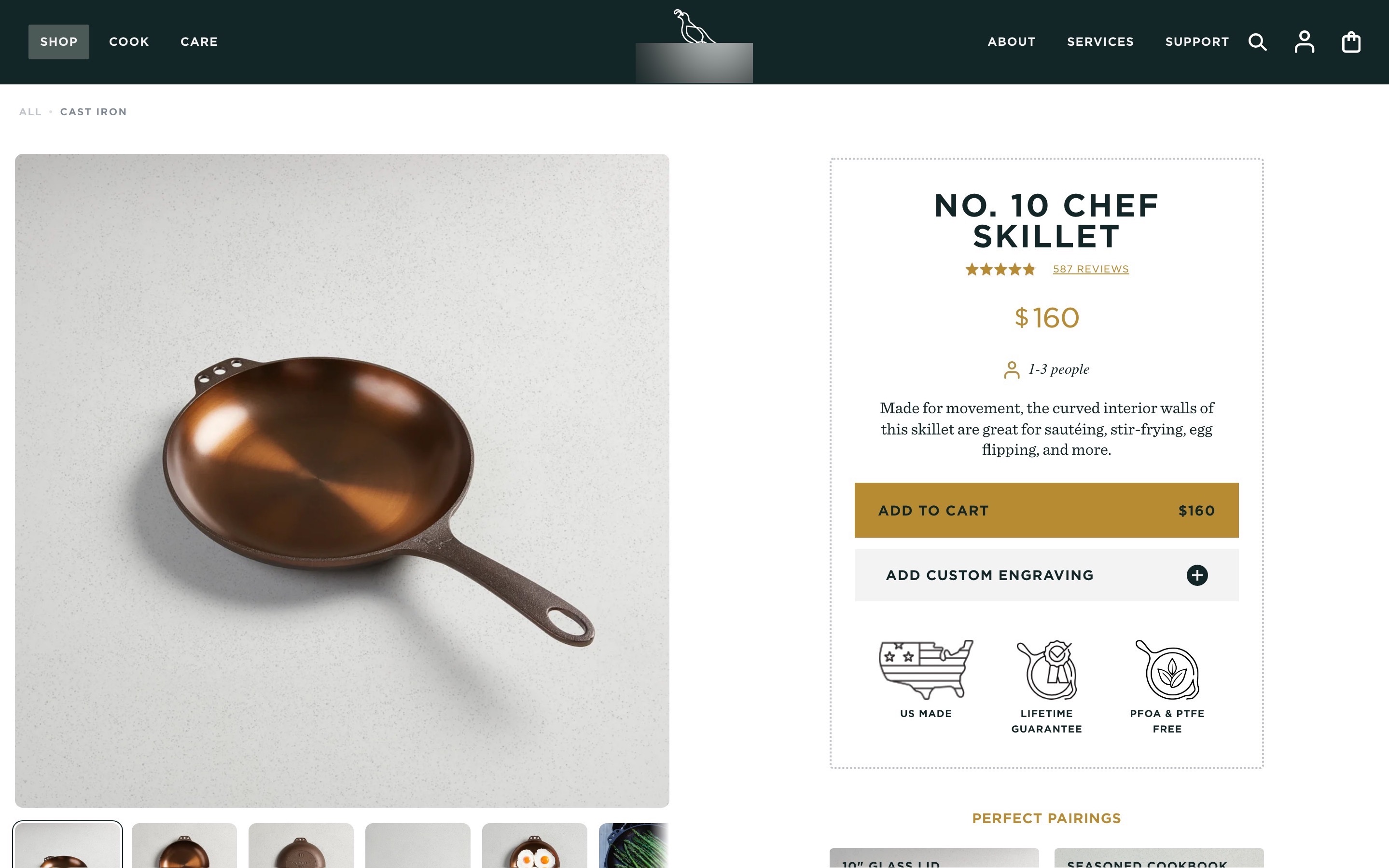
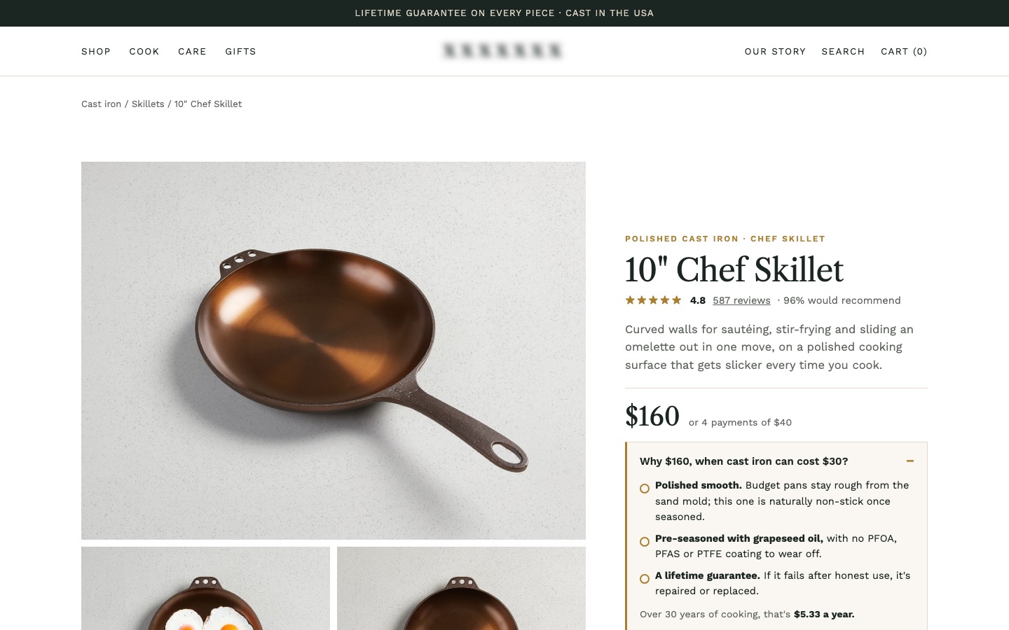
From my work · +10.4% conversion rate
A $160 cast iron skillet sat next to $30 alternatives with no reason for its price. The redesign answered "why $160?" right under the price, and put delivery, returns and the guarantee by the button.
See the cast iron skillet case study3Show discounts clearly and honestly
Show the real old price, the saving, and an end date only if the sale really ends.
✕ Avoid
Down jacket
$179 $299
Ends in 00:59:12 (resets every hour)
Add to cart✓ Do this
Down jacket
$179 $229 Save $50
Sale ends Sunday, Nov 30
Add to cartWhy it matters
A clear discount ("$79, was $99, save $20") helps shoppers see value. A confusing one (three badges, a percentage that doesn't match the prices, a sale that never ends) makes them distrust the price entirely. In the EU and UK, a "was" price must reflect what you really charged before, and fake reviews and fake urgency are illegal in many markets.
How to do it
- Show the current price first and most prominently, the previous price crossed out next to it, and the saving in money or percent.
- Use a real previous price: in the EU, the lowest price you charged in the 30 days before the reduction.
- If a sale really ends on a date, say when. Don't show countdown timers that reset.
- Explain multi-buy offers in plain words near the price ("Buy 2, get 10% off both").
- Use one discount badge at most.
On ShopifyBuilt in
Set a compare-at price on the product or variant and the theme shows it crossed out next to the price. Automatic discounts and volume offers need the theme or an app to show them on the product page.
Quick test: Are discounts shown with the real previous price, the saving, and an end date only if it's real?
4Help shoppers compare value with a price per unit
When sizes differ, a price per unit lets shoppers see which one is the better deal.
✕ Avoid
Face wash
✓ Do this
Face wash
Lasts about 3 months
Why it matters
When a product comes in 100 ml and 300 ml, or packs of 6 and 24, shoppers want to know which is better value. Doing the maths in their head is a chore, and in some countries showing a unit price is required.
How to do it
- Show the price per unit (per 100 g, per litre, per item, per serving, per month) next to the price for each size or pack.
- Use the same unit across sizes so they compare directly.
- For subscriptions and consumables, a cost per use or per month can be more meaningful than per gram.
On ShopifyBuilt in
Shopify supports unit prices on variants in some countries; enter the total amount and base unit on the variant. Elsewhere, show it with a metafield or text.
Quick test: Do products sold in different amounts show a price per unit?
5Keep the buy box to what's needed to choose and buy
The buy box should hold what's needed to choose and buy, and nothing else.
✕ Avoid
Chef skillet
$160
Join our newsletter for 10% off!
Add to cartVISA MC AMEX PAYPAL KLARNA APPLE GPAY
f x p ✉ share
✓ Do this
Chef skillet
★★★★★ 4.9 (587)
$160
Add to cart✓Free delivery by Thu, Nov 20
✓Free 30-day returns · lifetime guarantee
Why it matters
Every badge, upsell, promo banner, payment logo strip and social button in the buy box competes with the price and the button. The more there is, the slower the decision. The buy box should hold the essentials and nothing else.
How to do it
- Keep: name, rating, price, options, quantity if needed, Add to cart, a short delivery and returns line.
- Move everything else further down the page: long descriptions, multiple promo banners, cross-sell rows, payment logos.
- Show one short benefit line at most, and make it specific.
- Check the buy box on a phone: Add to cart should appear within the first screen or just below it.
On ShopifyTheme setting
Reorder and remove blocks in the product information section of the theme editor. Apps often inject blocks here; turn off the ones that don't help shoppers decide.
Quick test: Does the buy box hold only what's needed to choose and buy?
6Hide the quantity field where people almost always buy one
For products people buy one of, a quantity field adds a decision and occasional mistakes.
✕ Avoid
Oslo 3-seat sofa
$1,290
Qty
✓ Do this
Oslo 3-seat sofa
$1,290
Fabric: Rust
Why it matters
For a sofa, a laptop or a mattress, a quantity field is noise and occasionally an error ("I ordered two?"). For consumables and low-cost items, it's useful. Match the field to how people buy.
How to do it
- Remove the quantity field for products people rarely buy more than one of; they can change quantity in the cart.
- Keep it for consumables, small items and gifts, with large plus and minus buttons that are easy to tap.
- If you offer multi-buy discounts, show them next to the quantity field.
On ShopifyTheme setting
The quantity selector is a block in the product information section that you can remove. To show it only for some products, use a product template without it.
Quick test: Is the quantity field shown only for products people buy in multiples?
7Let shoppers save a product for later
Many shoppers aren't ready to buy on the first visit. Let them save the product, even as a guest.
✕ Avoid
Lounge chair
$740
Add to cartWant to think about it? Nothing here helps you come back.
✓ Do this
Lounge chair
$740
Add to cart♡ Save for laterNo account needed
Why it matters
Many shoppers aren't ready to buy on the first visit. They want to compare, wait for payday, or ask someone. A save or wishlist button gives them a way to come back to the product, and gives you a reason to remind them.
How to do it
- Add a save or wishlist button near Add to cart, styled as a secondary action (an outline or an icon with a label).
- Let guests save without creating an account; offer to save the list to an account later.
- Show a clear confirmation and where to find saved items (a heart icon in the header with a count).
On ShopifyApp
Shopify has no built-in wishlist. Use a wishlist app that supports guest wishlists and loads without slowing the page.
Quick test: Can shoppers, including guests, save a product to come back to it later?
8When a product is sold out, offer a later delivery or an alert; when it's discontinued, point to the replacement
Sold out shouldn't end the visit. Offer a later delivery, an alert, or the replacement.
✕ Avoid
Arc floor lamp
$189
Sold out✓ Do this
Arc floor lamp
$189
Pre-orderShips from Mar 12
Email me when it's backWhy it matters
"Out of stock" with a greyed-out button ends the visit. Many shoppers would still buy if they knew when it would ship, and others would happily take the newer model. Dead-end pages also waste the search traffic they still get.
How to do it
- If restock is coming, keep selling with the expected delivery date shown clearly ("Ships from March 12"), or offer pre-order.
- If you can't sell it yet, offer a back-in-stock alert by email or text.
- Show the variants that are in stock, so a sold-out size doesn't hide available ones.
- For discontinued products, keep the page, say it's discontinued, and link the replacement or the closest alternatives prominently.
On ShopifyTheme setting
Turn on "Continue selling when out of stock" for products you can restock, and show the expected date with a metafield. Back-in-stock alerts need an app.
Quick test: Do sold-out and discontinued products offer a way forward (later delivery, alert or replacement)?
FAQ
What color should the Add to cart button be?
One no other button on the page uses. The exact color matters less than contrast and being unique on the page.
Should I use a sticky Add to cart button on mobile?
On long product pages, yes: once the main button scrolls out of view, a slim sticky bar with the price and Add to cart keeps the action within reach. Make sure it doesn't cover content or the chat button.
Should I show out-of-stock products?
Yes, with a clear status and a way forward: a delivery date if you can take orders, a back-in-stock alert if you can't, or the replacement for discontinued items.
Sources

Conversion designer. I design, redesign and build online stores, product pages and landing pages, A/B test them and show what each change earned. CXL certified in Conversion Optimization and Ecommerce Marketing, and a guest speaker on ecommerce UX at NYU School of Professional Studies.