
Shopify CRO Guide · Part 4 of 7
Product page design: 80 tips for product pages that sell
Photos, price, options, delivery, description, reviews and cross-sells: how to design every part of an ecommerce product page so shoppers can decide and buy.
Page layout
Stacked sections, accordions or one long page: how to organize everything below the buy box.
Read the articleProduct photos
Which photos every product needs and in what order: angles, size, details, in use and on a person.
Read the articleImage gallery and video
Thumbnails, zoom, video and the phone view: how the image gallery itself should work.
Read the articlePrice, Add to cart and stock
The Add to cart button, price, discounts, unit prices and what to do when a product sells out.
Read the articleShipping, delivery and returns
Delivery dates, shipping cost, free shipping, returns and pickup, right next to Add to cart.
Read the articleVariants, sizes and personalization
Color swatches, size buttons, sold-out options and personalization with a live preview.
Read the articleDescription and specs
How to write and structure descriptions and spec sheets shoppers can scan and trust.
Read the articleReviews
How to collect, show, filter and sort reviews so they help shoppers decide.
Read the articleQuestions, guides and extra content
Product FAQs, customer Q&A, manuals, care guides and expert content that answer doubts.
Read the articleCross-sells and breadcrumbs
Alternatives, add-ons, protection plans and breadcrumbs, without distracting from the sale.
Read the articleStart with these
- Make the first photo show the product clearly and at its bestProduct photos
- Make Add to cart the most distinct button on the pagePrice, Add to cart and stock
- Show a delivery date or date range next to Add to cartShipping, delivery and returns
- Show what shipping costs before the cartShipping, delivery and returns
- Summarize the return policy on the page and link the full oneShipping, delivery and returns
- Use color swatches for colors and buttons for sizes, not dropdownsVariants, sizes and personalization
Almost every online purchase passes through a product page. It's where shoppers decide whether this product, at this price, from this store, is right, and it's usually the page with the most room to improve. This section covers every part of it, in the order shoppers meet them.
The tips apply to any platform. Each one has a note on how to do it on Shopify. If you're not sure where your page is losing people, start with why a product page isn't converting, then come back to the articles that match.
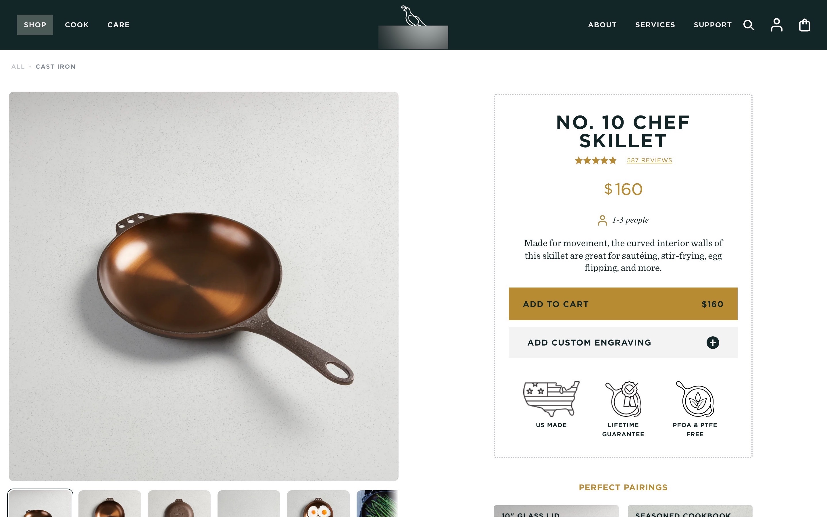
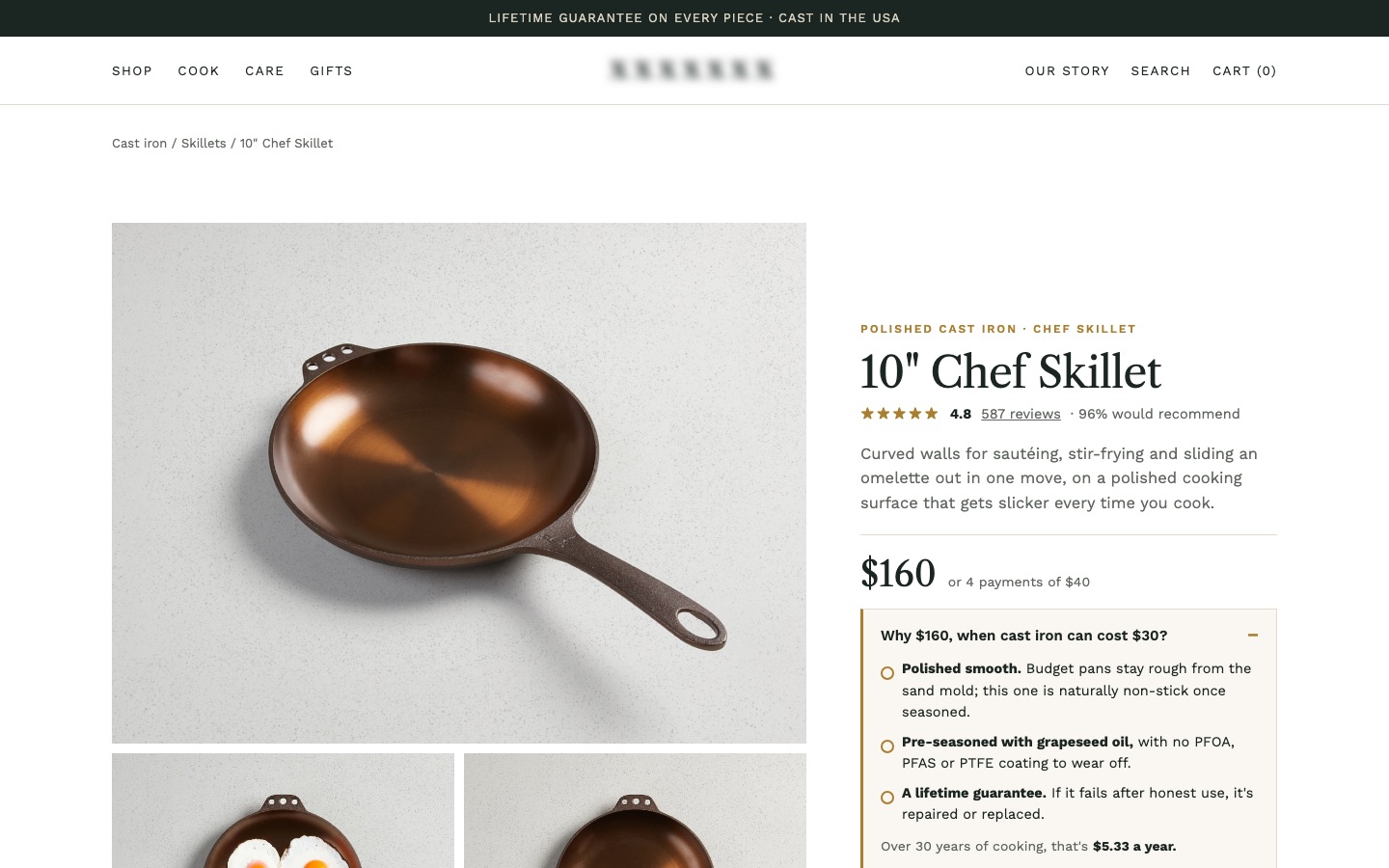
From my work · +10.4% conversion rate
A $160 skillet in a category that starts around $30 had beautiful photos and hundreds of reviews, but no reason for its price and no delivery or returns near the button. The redesign answered "why $160?" under the price and put delivery, returns and the guarantee by Add to cart.
See the cast iron skillet case studyFAQ
What makes a good product page?
One that answers shoppers' questions before they have to ask: clear photos, an easy-to-find price and button, delivery and returns information, simple options, a specific description and honest reviews.
What should be above the fold on a product page?
The main photo, product name, rating, price, the options, Add to cart, and a short delivery and returns line. On phones, aim to show at least the photo, name, price and the start of the options.
How do I improve my Shopify product page?
Start with the articles on the buy box and shipping (the cheapest fixes), then photos and descriptions. Most improvements fit inside your current theme.
How many elements should a product page have?
As many as needed to answer the questions shoppers ask, organized so they can find each answer. Remove anything in the buy box that doesn't help them choose or buy.
Sources
Let's talk
Let's find out why your visitors aren't buying.
Send me the page. On the call I'll tell you what I'd fix first, what it could move, and whether I'm the right person for it.