Product page · Article 2 of 10
Ecommerce product photos: 10 tips for photos that sell
Your product photos have to do the job a shopper's hands and eyes do in a shop. Show the product clearly first, then from every useful angle, at its real size, with its key details up close, in use, with everything that comes in the box, and on a real person if it's worn. Most products need 8 to 12 photos to cover those jobs; simple products need fewer.
In this article · 10 tips
- Why product photos decide the sale
- 1Make the first photo show the product clearly and at its best
- 2Show the product from every angle that adds something new
- 3Show the size with a hand, a person or a familiar object
- 4Add a dimensions image wherever you list dimensions
- 5Add labeled close-ups of the features that sell the product
- 6Show the product in use, in a real setting
- 7Show everything that comes in the box
- 8Show clothing, accessories and makeup on real people
- 9Add one image with every color or version side by side
- 10Show customer photos of the product
- How to put the photos in order
- FAQ
In short
- Many shoppers look at the photos before they read a word, and some never read at all. Anything that only appears in the text can be missed.
- Every photo should answer a question the last one didn't. Ten photos of the same front view count as one.
- Size is the question photos most often leave unanswered. Show the product next to a hand, a person or a familiar object.
- Photos that explain (labeled close-ups, a dimensions image) do as much selling as photos that look good.
Why product photos decide the sale
Online, photos stand in for picking a product up. In a shop, a shopper turns the box over, holds the pan, feels the fabric. Online they do all of that with your photos, and most of them do it before reading anything. They scroll the gallery first and decide whether the product is worth reading about.
That changes what a photo is for. A beautiful photo makes someone want the product. A useful photo answers a question they'd otherwise have to find in the description, ask support about, or guess. When they can't find the answer, most don't guess in your favor: they leave, or buy and return it.
So plan photos the way you'd plan a description: list the questions shoppers ask, then give each one a photo.
| Photo | Answers | Needed for |
|---|---|---|
| Main photo | "What is it, and is it for me?" | Every product |
| Other angles | "What do the back, side and inside look like?" | Every product |
| Size in context | "How big is it really?" | Every product |
| Dimensions | "Will it fit?" | Anything where measurements matter |
| Labeled close-ups | "What's special about it?" | Every product, more for complex ones |
| In use | "What will it look like in my life?" | Most products |
| In the box | "What do I get for the price?" | Sets, kits, anything with accessories |
| On a person | "How will it look on me?" | Clothing, shoes, jewelry, bags, makeup |
| All versions | "Which color or version do I want?" | Products with several colors or versions |
| Customer photos | "Does it really look like that?" | Every product with buyers |
1Make the first photo show the product clearly and at its best
The first photo is all many shoppers see. It must show the product clearly, exactly as the price describes.
✕ Avoid
Chef skillet
$160
✓ Do this
Chef skillet
$160
Why it matters
The first photo is the one everyone sees: in the collection grid, in Google Shopping, in link previews, and at the top of the product page. For some shoppers it's the only photo they look at. If it's unclear, dark, oddly cropped or shows something other than what the price buys, they decide the product isn't for them without opening the gallery.
How to do it
- Show the whole product, sharp and well lit, filling most of the frame, on a plain background or a simple setting that doesn't compete with it.
- Show exactly what the price below it buys. If the price is for one item, don't lead with the two-pack or the bundle.
- Pick the angle that shows what makes this product different from the ones next to it in the grid.
- Keep text, badges and sale stickers off the main photo; put them in the page design. Google Merchant Center rejects main images with promotional overlays anyway.
- If you're not sure which shot works best, A/B test it. The first photo is one of the easiest things on a product page to test.
On ShopifyBuilt in
The first image in the product's media list is the main image everywhere: product page, collections, search and the Google & YouTube channel. Drag to reorder.
Quick test: Does the first photo show the whole product, clearly, exactly as the price describes, with no text on it?
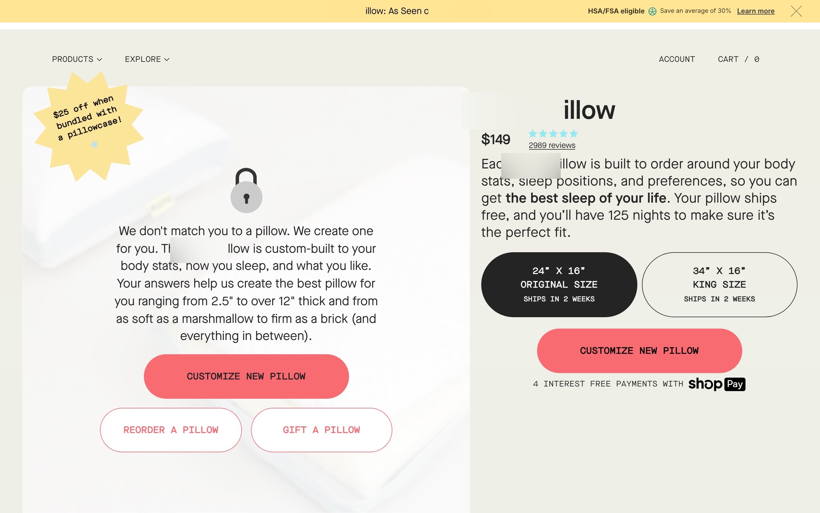
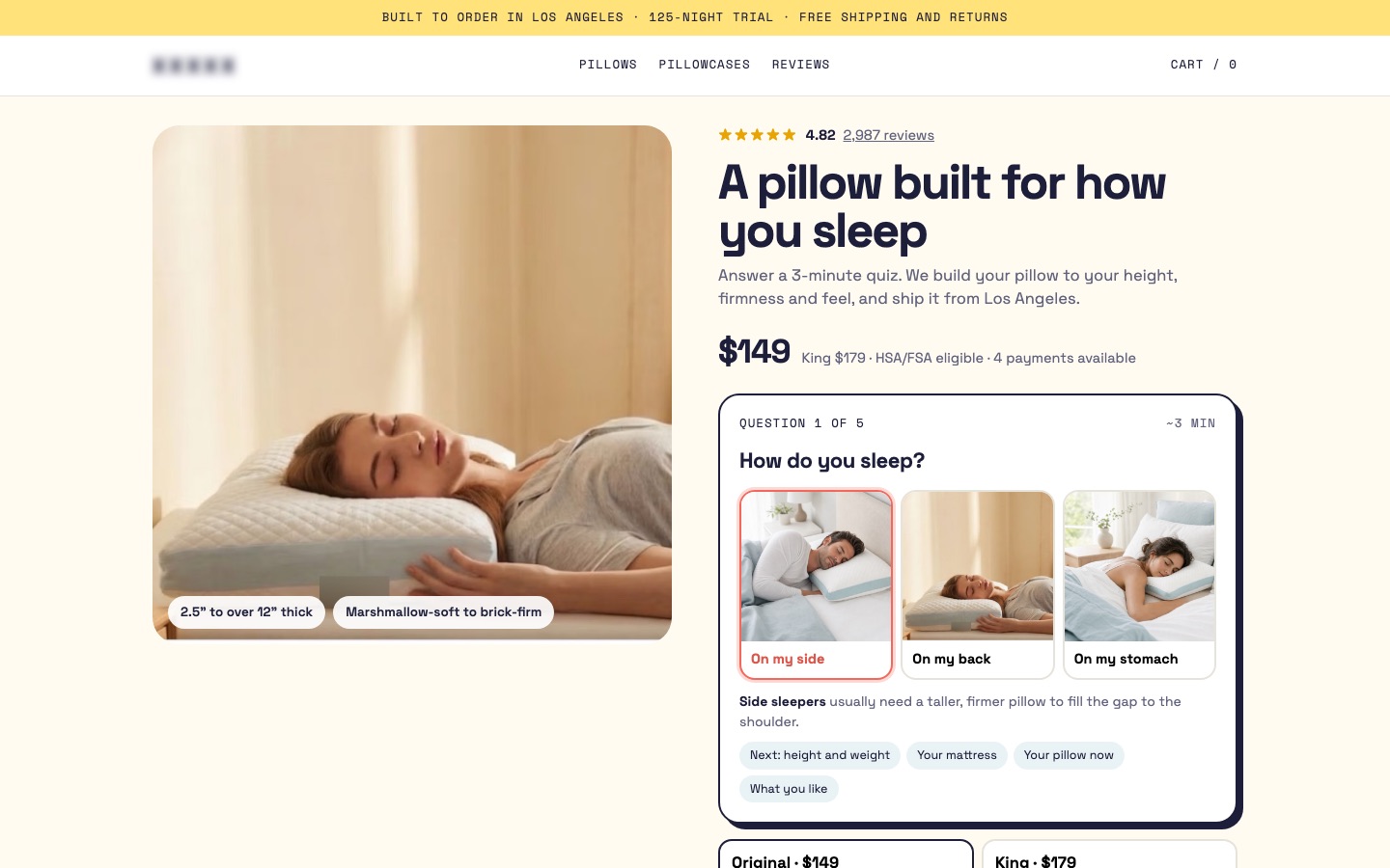
From my work · +9.2% conversion rate
A custom pillow brand had put a text card with three buttons where the product photo should be; the pillow only appeared after a click. The redesign put the pillow back in the first photo and moved the quiz into the buy box. With the other changes on the page, it won the A/B test.
See the custom pillow case study2Show the product from every angle that adds something new
Every photo should show something new: the back, the side, the sole, the inside.
✕ Avoid
5 photos, all of the same side
✓ Do this
Why it matters
A front view tells a shopper what the product looks like from one side. In a shop they'd turn it around: the back, the sole, the inside, the ports, the lid. When the photos only show one side, everything else is a question mark, and question marks make people hesitate.
How to do it
- Shoot the angles a shopper would look at if they held it: front, back, side, top or inside, and underneath where it matters (soles, bases, connectors).
- Every angle must show something new. A front view and a front view at a slight angle count as one photo.
- Keep the same light and background across the angles, so the set reads as one product.
- With a big catalog, start with best sellers and the products with the most returns.
On ShopifyBuilt in
Add the angles as product media, in the order you'd turn the product in your hand.
Quick test: Can a shopper see every side of the product they'd look at in a shop?
3Show the size with a hand, a person or a familiar object
Show the product next to a hand, a person or a familiar object, so shoppers can judge its real size.
✕ Avoid
Mini crossbody bag
$95
✓ Do this
Mini crossbody bag
$95
Why it matters
On a white background, a ring box and a storage chest can look the same size. Shoppers try to judge size from photos, and when they can't, they guess. A wrong guess means a lost sale or a return. Numbers alone don't fix it: few people can picture "32 cm" accurately.
How to do it
- Add at least one photo with something whose size everyone knows: a hand holding it, a person using it, a phone, a mug, a sofa next to the side table.
- Show it where it's normally used: the pan on a stove, the backpack on a back, the lamp on a desk.
- If you sell several sizes, show them side by side, to scale, with the size on each.
- With a big catalog you can't shoot, a generated image of the product next to a standard object, built from its dimensions, beats nothing.
- A video can show size too, but don't rely on it alone. Many shoppers never press play.
On ShopifyBuilt in
Add it as normal product media. For sizes sold as variants, see showing every version side by side.
Quick test: Is there at least one photo where a shopper can tell the real size without reading anything?
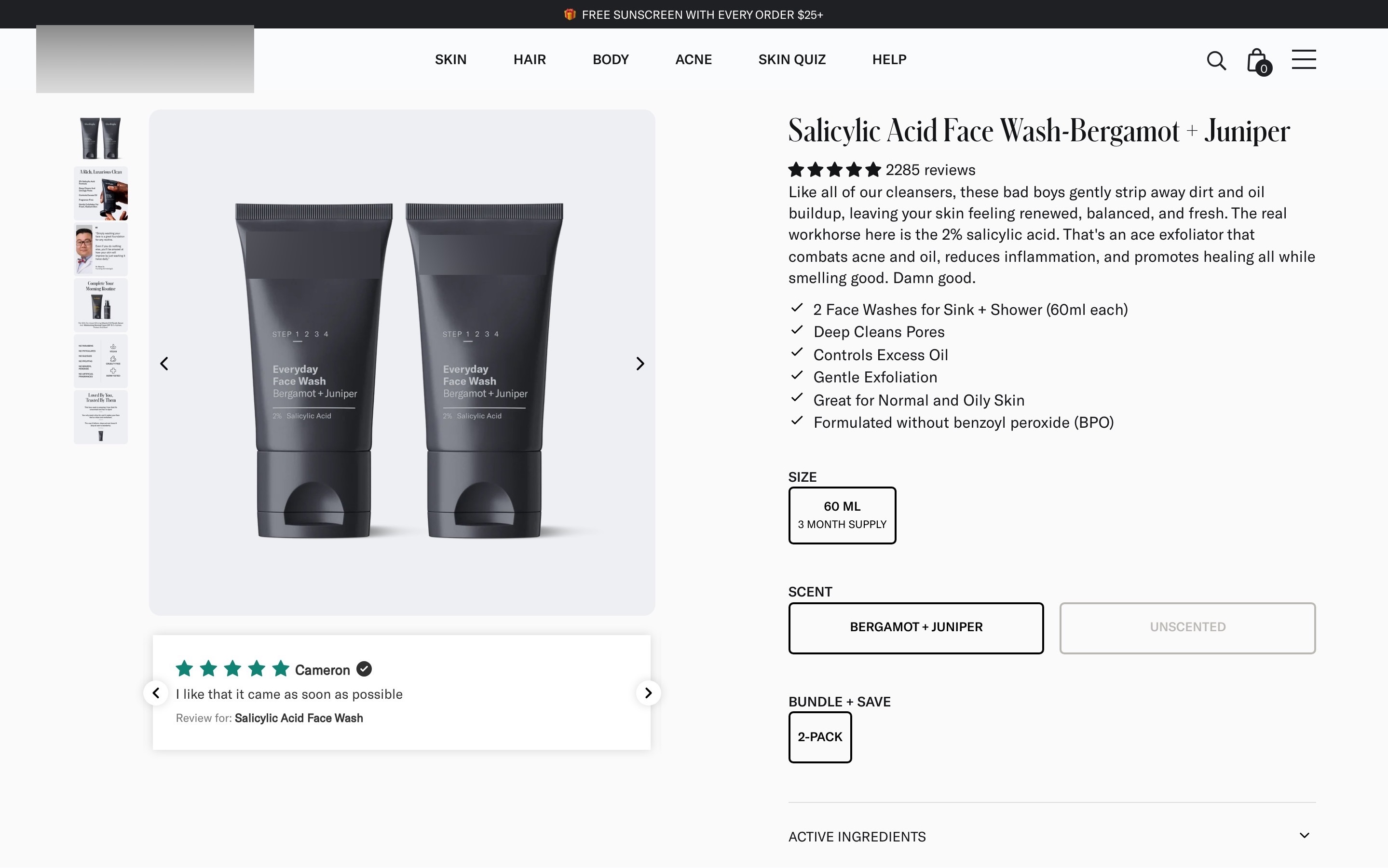
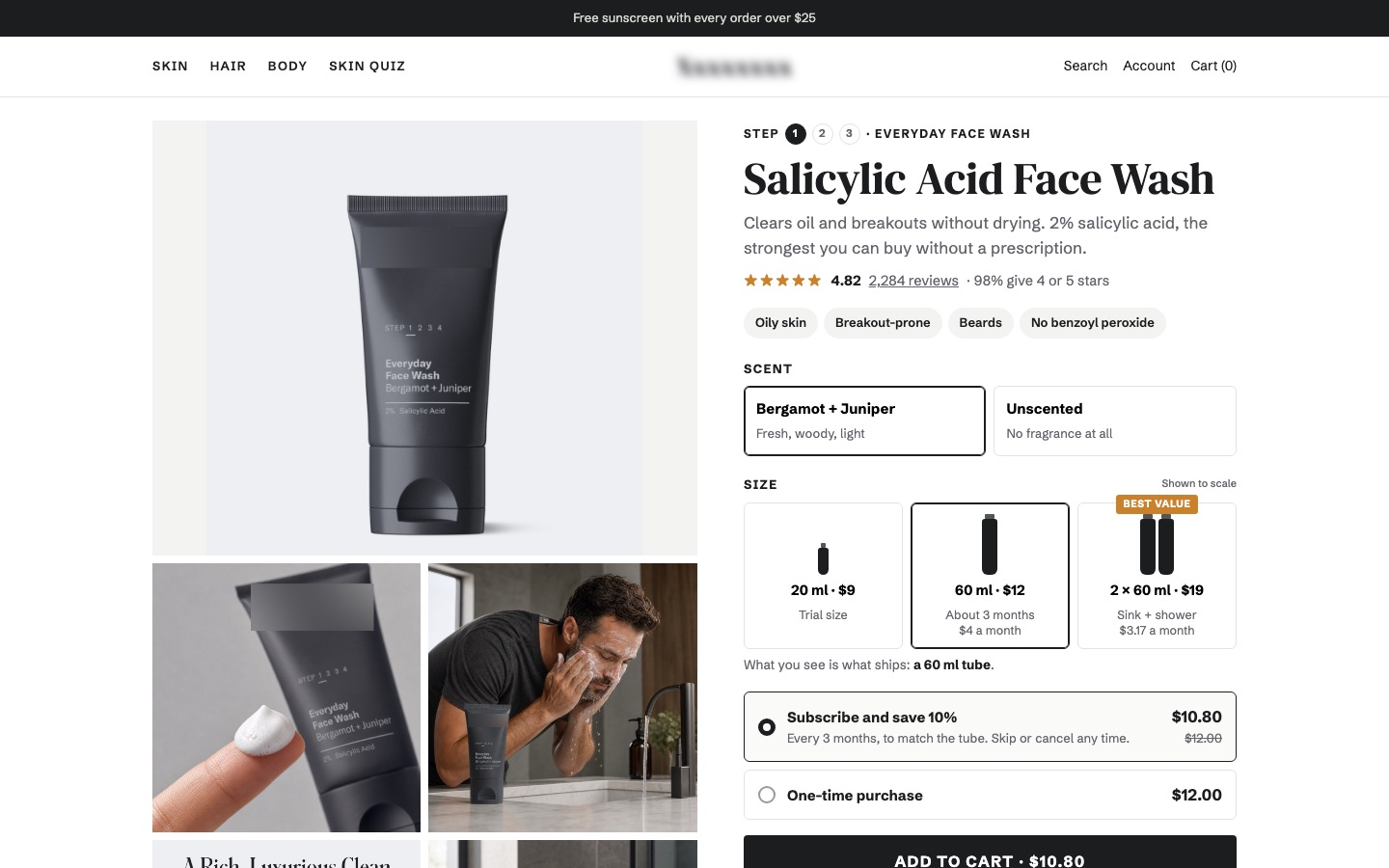
From my work · +16.1% revenue per visitor
A men's face wash page showed two 60 ml tubes in the main photo, with the $9 price of a 20 ml trial tube under it, and nothing showed how big each size was. The redesign showed every size to scale, each with its price and cost per month.
See the men's face wash case study4Add a dimensions image wherever you list dimensions
A drawing with the measurements on it answers "will it fit?" far better than a line of numbers.
✕ Avoid
Oslo 3-seat sofa
Dimensions: W 210 × D 95 × H 85 cm, seat 45 cm
✓ Do this
Oslo 3-seat sofa
Seat height 45 cm · Seat depth 58 cm
Why it matters
"W 80 × D 45 × H 120 cm" leaves shoppers guessing which number is which, and whether the height includes the legs or the handle. When people aren't sure a product fits, they don't buy it. A drawing with the measurements on it removes the guesswork.
How to do it
- Show the product (a clean photo or a line drawing) with each measurement drawn on it, pointing at exactly what it measures.
- Include the measurements that decide the fit: overall size, inside size for bags and storage, seat height for chairs, strap length.
- Put the image in the main gallery and next to the written dimensions. Shoppers look in both places, and many who don't find it in one assume it doesn't exist.
- Make the numbers readable on a phone without zooming, and show both units if you sell internationally.
On ShopifyTheme setting
Add the image to the media list. To show it next to the specs too, store it in a file-type product metafield and show that metafield in the specs block (a theme setting in most current themes, a small code change in older ones).
Quick test: Is there a dimensions image in the gallery and next to the written measurements, readable on a phone?
5Add labeled close-ups of the features that sell the product
Label close-ups of the features that make the product worth buying. Shoppers skip the text; they don't skip photos.
✕ Avoid
Shell jacket
$240
✓ Do this
Shell jacket
$240
Why it matters
Shoppers who look at photos and skip the text miss every feature that's only in the text. Zoom doesn't solve it: zoom lets them look closer, but they still have to know what to look for. A close-up with a short label ("Waterproof zip", "Removable, washable cover") points straight at the reason to buy.
How to do it
- Pick the features that set the product apart and that shoppers ask about. Reviews, support emails and return reasons tell you which.
- Give each one a close-up with a short label or arrow. One feature per image reads better than five arrows on one photo.
- Write labels that inform, not hype: "3-layer base heats evenly" helps; "Premium quality" doesn't.
- Use graphics for what a photo can't show: how a filter cleans air, what's inside a mattress, how parts fit together.
- Complex products (appliances, tools) need more of these than simple ones (a T-shirt, a candle). Keep the text readable on a phone.
On ShopifyBuilt in
Design the close-ups as images and add them to the media list after the angles.
Quick test: Does every key feature have its own close-up with a short, specific label that's readable on a phone?
6Show the product in use, in a real setting
Show the product being used in a real setting, so shoppers can picture it in their own life.
✕ Avoid
Linen throw pillow
✓ Do this
Linen throw pillow
Why it matters
Plain photos show what a product is. Photos in use show what it's like to own: the throw on the sofa, the jacket on a wet street. They help shoppers imagine the product in their own life, and they answer practical questions too: how it's held, where it goes, what it looks like next to other things.
How to do it
- Add at least one in-use photo for anything people buy partly on feeling: home, fashion, outdoor, kitchen, gifts.
- Keep the product the hero. If shoppers have to search for it in the photo, it's a mood shot, not a product photo.
- Show it used the way your buyers really use it.
- Put these photos on the product page, not only on the homepage and in ads.
- For technical products, spend the photo budget on close-ups and "in the box" photos first.
On ShopifyBuilt in
Add in-use photos as product media. For Google Shopping you can also send them as lifestyle images in your product feed.
Quick test: Is there at least one photo of the product in use, where the product is still clearly the subject?
7Show everything that comes in the box
One photo of everything in the box settles "is the charger included?" before anyone has to ask.
✕ Avoid
Compact camera kit
$649
✓ Do this
Tripod sold separately
Compact camera kit
Why it matters
"Does it come with the charger?" "Is the lid included?" When photos show extras that aren't included, or don't show the ones that are, shoppers either distrust the price or don't see the value. One photo of everything in the box answers it at a glance.
How to do it
- Lay out everything that comes in the box in one photo, labeled if the pieces aren't obvious.
- Say clearly what's not included when other photos show it: "Stand sold separately" in the image or right below the gallery.
- For sets and bundles, show the count ("12 pieces") and match it to the title and price.
On ShopifyBuilt in
For bundles sold as variants, assign the matching image to each variant so the photo always matches what's selected.
Quick test: Can a shopper see exactly what's in the box, and what isn't, from the photos?
8Show clothing, accessories and makeup on real people
For anything worn, shoppers need to see it on a real person, with the model's height and size.
✕ Avoid
Oversized tee
✓ Do this
Model is 178 cm and wears M
Oversized tee
Why it matters
For anything worn, the real question is "how will it look on me?". A flat garment doesn't answer that, and neither does a lipstick swatch on an arm. Shoppers need to see fit, drape, length and color on a body or a face, ideally one a bit like theirs.
How to do it
- Show every worn product on a real person, from the front, back and side. Mannequin shots can be extras, not the only photos.
- State the model's height and size next to the photos ("Model is 178 cm and wears M").
- For makeup and skin care, show the product where it's used (lips, eyes, face) on several skin tones.
- Photos on more than one body type help many shoppers; start with best sellers.
- Keep colors true. Returns over "the color looked different" start here.
On ShopifyTheme setting
Add model height and size as a short text line under the gallery, or as a product metafield shown in the theme.
Quick test: Is every worn product shown on a real person, with the model's height and size stated?
9Add one image with every color or version side by side
Put every color or version side by side in one image, so shoppers compare at a glance.
✕ Avoid
6 colors
Tap each swatch to see it
✓ Do this
Color: Sand
Why it matters
Clicking through ten colors one by one is slow, and shoppers miss options they never click. One image with every version side by side lets them compare at a glance. For close shades (makeup, paint, wood finishes) it's the only practical way to compare.
How to do it
- Add one image with every color or version together, in the same light, each labeled.
- Use the same idea for sizes (to scale) and versions that differ in features (with and without a lid).
- Every variant still needs its own photos; the comparison image is an addition. Changing the color should change the photos (see variants).
On ShopifyBuilt in
Each variant can have only one image of its own, so add every variant's photos to the product media and assign one to each variant. Many themes can show only the selected variant's media. Switching a whole group of photos per variant needs a theme that groups media by variant, an app, or Shopify's Combined Listings app on Plus.
Quick test: Is there one image that shows every color or version side by side?
10Show customer photos of the product
Customer photos show the product as it really is, and shoppers trust them more than studio shots.
✕ Avoid
Reviews
★★★★★ 4.7 (312)
Love it, looks great in our kitchen.
Mia K.Exactly like the pictures.
Tom R.✓ Do this
Reviews
★★★★★ 4.7 (312)
Customer photos (86)
Love it, looks great in our kitchen.
Mia K. · Verified buyerWhy it matters
Shoppers know your photos were taken by professionals in perfect light. Customer photos show the product as it really is, in ordinary homes and on ordinary people. Seeing that other people bought it and photographed it makes the product more believable.
How to do it
- Ask for photos in your review request email, and make uploading easy (see photo reviews).
- Show customer photos as their own row near the gallery or at the top of the reviews, not only inside individual reviews.
- Add social posts of the product if people post it, with the poster's permission.
- Only show photos of this product. A feed of general brand content on a product page is noise.
- Don't edit or filter customer photos to look better. That defeats the point.
On ShopifyApp
Most review apps collect and show photo reviews; social photo feeds need a UGC app. Check that the app loads its photos after the main content so it doesn't slow the page.
Quick test: Can shoppers see real customer photos of this product near the top of the page?
How to put the photos in order
- The main photo
- The most important other angles
- Size in context
- Labeled close-ups
- In use
- Dimensions, what's in the box and all versions side by side
- Video, if you have one, wherever it adds most (see product videos)
Customer photos sit in their own row, not in the main gallery. For clothing, on-model photos come before flat shots.
Then check the result on a phone: swipe through the gallery with your thumb only and ask whether a stranger would know what they're buying. Photos also appear on product cards in collections, and every photo needs alt text that describes the product.
FAQ
How many product photos should a product page have?
Enough to answer every question a shopper would answer by holding the product. For most products that's 8 to 12: the main photo, a few angles, a size photo, labeled close-ups, one in use, and dimensions or "in the box" where they apply. Simple products need fewer; complex or expensive ones need more.
What size should Shopify product images be?
Shopify recommends square images of 2048 × 2048 px. Use the same aspect ratio for every product so the collection grid lines up, and compress files before upload. Shopify serves resized versions to each screen automatically.
Should product photos have a white background?
The main photo should have a plain, uncluttered background, and white is the safe default, especially if you advertise on Google Shopping, which doesn't allow text or overlays on the main image. The other photos should show the product in context.
Are lifestyle photos or product photos more important?
Both have a job. Clear product photos answer "what exactly is it?"; lifestyle photos answer "what will it be like to own?". For technical products, put the budget into close-ups first. For home, fashion and gifts, in-use photos matter more.
Sources

Conversion designer. I design, redesign and build online stores, product pages and landing pages, A/B test them and show what each change earned. CXL certified in Conversion Optimization and Ecommerce Marketing, and a guest speaker on ecommerce UX at NYU School of Professional Studies.