Product page · Article 3 of 10
Product image gallery and video: how the gallery should work
Show thumbnails so shoppers know there are more photos, keep every photo and video in one gallery, fit the main photo, thumbnails and color swatches in one phone screen, and make photos sharp enough to zoom. Give visual products a big gallery, and keep product videos short, fast and clearly titled.
In this article · 9 tips
- Why the gallery design matters
- 1Show thumbnails so shoppers know there are more photos
- 2Keep every photo and video in one main gallery
- 3On phones, fit the main photo, thumbnails and color options in one screen
- 4Use photos sharp enough to zoom into
- 5Zoom on hover on desktop, and open full-screen photos that use the whole screen
- 6Give visual products a big gallery
- 7Place thumbnails below or beside the main photo, and keep them visible
- 8Keep photos in proportion when a phone is turned sideways
- 9Use short, fast product videos with clear titles, and 360° views where shape matters
- FAQ
In short
- Great photos don't help if shoppers never see them. A gallery that hides how many photos there are loses most of its value.
- Photos, videos and 360° views belong in one gallery. Shoppers don't look for media anywhere else.
- Zoom is for checking details, so photos must be sharp enough to reward it.
- Video helps when movement, texture or how a product works is hard to show in photos, but it has to load fast and say what it shows.
Why the gallery design matters
The previous article covered which photos to take. This one covers how shoppers get to see them. A gallery can hold twelve excellent photos and still fail if it shows one at a time with no sign that more exist, if zoom shows a blurry mess, or if the video sits in a separate tab nobody opens.
1Show thumbnails so shoppers know there are more photos
Thumbnails show how many photos there are and let shoppers jump to the one they want.
✕ Avoid
Lounge chair
✓ Do this
Lounge chair
Why it matters
A big main photo with only arrows or tiny dots gives no sense of what else is in the gallery. Many shoppers never click an arrow. Thumbnails show at a glance how many photos there are and what they show, so shoppers can jump straight to the one they want.
How to do it
- Show thumbnails for every photo and video, below or beside the main photo.
- If there are too many to show at once, show as many as fit and make the overflow obvious ("+4" on the last thumbnail, or a visible scroll).
- Never cut a thumbnail in half at the edge so it looks like decoration. Either show it fully or clearly signal more.
- Mark video thumbnails with a play icon.
On ShopifyTheme setting
In most themes, the product section has a media layout setting (thumbnails, thumbnail carousel, stacked). Choose a thumbnail layout for desktop, and check that phones show thumbnails or a clear counter, not just dots.
Quick test: Can shoppers see how many photos there are and jump to any of them?
2Keep every photo and video in one main gallery
Photos and videos belong in one gallery. Shoppers don't look for media anywhere else.
✕ Avoid
▶ Watch the product video
✓ Do this
Studio headphones
Why it matters
Shoppers look for media in the gallery. Photos placed further down the page, videos in a separate tab or a "Watch video" link in the description often go unseen. One gallery means one place to look.
How to do it
- Put every product photo, video and 360° view in the main gallery.
- You can repeat a photo further down the page (next to the dimensions, for example) but it must also be in the gallery.
- Place the video where it adds most, often second or third, not always last.
On ShopifyBuilt in
Shopify product media holds images, videos, 3D models and YouTube or Vimeo links in one list. Themes show them all in the main gallery if the theme supports each media type.
Quick test: Are all photos and videos in the main product gallery?
3On phones, fit the main photo, thumbnails and color options in one screen
On a phone, the photo, the other photos and the color choice should fit on one screen.
✕ Avoid
Colors are two scrolls down
✓ Do this
Color: Cognac
$180
Why it matters
On a phone, when the main photo fills the screen and the color swatches sit two scrolls below, shoppers can't see the color change when they tap a swatch, and they can't see what other photos exist. Fitting the three together makes choosing visual.
How to do it
- Size the main photo so thumbnails (or a counter) and the color swatches are visible in the same screen, below it.
- When a color is chosen, update the main photo in view.
- Test on a small phone, not only a large one.
On ShopifyTheme setting
Check the mobile gallery setting (thumbnails or carousel) and the order of blocks in the product information section: move the variant picker block high, right under the title and price.
Quick test: On a small phone, can shoppers see the main photo, other photos and color options without scrolling?
4Use photos sharp enough to zoom into
Zoom exists for checking detail, so photos must be sharp enough to reward it.
✕ Avoid
✓ Do this
Why it matters
Shoppers zoom to check stitching, texture, finish and small text. A zoom that shows a blurry or pixelated image makes the product look cheap and answers nothing.
How to do it
- Upload photos at high resolution. Detail is what zoom is for.
- Make sure zoom reveals real detail: the weave of the fabric, the grain of the wood, the label text.
- Keep file sizes in check with good compression so high resolution doesn't slow the page.
On ShopifyBuilt in
Shopify recommends 2048 × 2048 px square images and serves smaller versions to smaller screens automatically, so upload large and let Shopify resize.
Quick test: Does zooming into any product photo show sharp, useful detail?
5Zoom on hover on desktop, and open full-screen photos that use the whole screen
Zoom on hover on desktop, and make full-screen photos actually fill the screen.
✕ Avoid
✓ Do this
Arc floor lamp
$189
Add to cartWhy it matters
On desktop, hover zoom lets shoppers inspect a detail without leaving the page or clicking into a separate viewer. When they do open a photo full-screen, a small box in the middle of a dark overlay wastes the point of opening it.
How to do it
- On desktop, offer zoom on hover (or click-to-zoom that stays in place) for products where detail matters.
- When a photo opens full-screen, make it fill most of the screen, with clear arrows, thumbnails and a close button.
- On phones, support pinch-to-zoom in the full-screen view.
- Let the Escape key and a tap outside close the full-screen view.
On ShopifyTheme setting
Many themes have an image zoom setting (open lightbox, click and hover, or no zoom). Choose hover zoom where your theme offers it, and test the lightbox size on desktop.
Quick test: Can desktop shoppers zoom without leaving the page, and do full-screen photos fill the screen?
6Give visual products a big gallery
For products bought on looks, the photos are the product. Give them room.
✕ Avoid
Lounge chair
$740
✓ Do this
Lounge chair
$740
Free delivery · 100-night trial
Why it matters
For products bought on looks (clothing, furniture, art, jewelry), the photos are the product. A small gallery squeezed next to a wide text column undersells them. Shoppers want to see these products large.
How to do it
- On desktop, let the gallery be the widest part of the page for visual products.
- Consider large photos stacked down the page or a large carousel with thumbnails, both of which show more of each photo.
- Keep the buy box sticky beside a long stacked gallery, so Add to cart stays reachable.
- For spec-driven products, a smaller gallery is fine; the specs need the room.
On ShopifyTheme setting
Most themes let you set media size (small, medium, large) and a stacked layout. Use large, and make the product info column sticky if the theme supports it.
Quick test: Does the gallery get enough space to show visual products large?
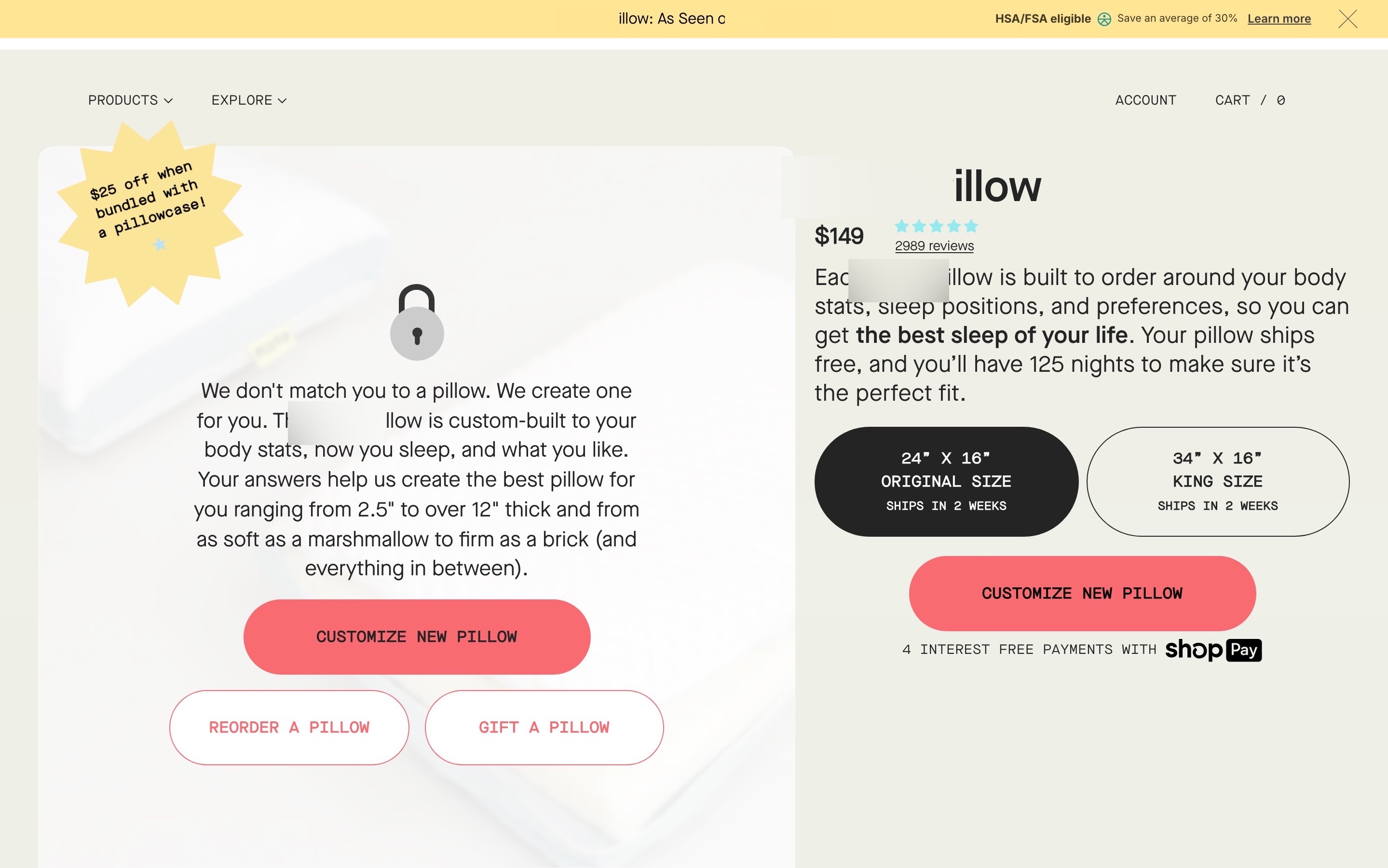
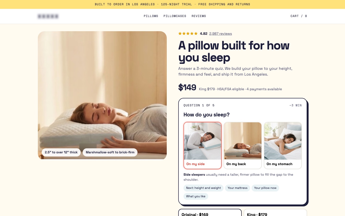
From my work · +9.2% conversion rate
On the custom pillow page, the redesign gave the photos room and started the sleep-style quiz right beside them, so choosing happened in the same view as the product.
See the custom pillow case study7Place thumbnails below or beside the main photo, and keep them visible
Keep thumbnails visible, mark the selected one, and keep the main photo the same size.
✕ Avoid
…
Photos jump in size when switching
✓ Do this
Why it matters
Both placements work. What matters is that thumbnails are visible without searching, that the selected one is clearly marked, and that the main photo doesn't shift around when a different photo is chosen.
How to do it
- Thumbnails below suit wide photos; thumbnails beside (left) suit tall photos and save vertical space.
- Highlight the selected thumbnail.
- Keep the main photo area a fixed size so the page doesn't jump between photos with different shapes.
On ShopifyTheme setting
Pick the thumbnail position in the product section's media settings, and use one image aspect ratio for all product media.
Quick test: Are thumbnails always visible, with the selected one highlighted and no layout jumping?
8Keep photos in proportion when a phone is turned sideways
When a phone is turned sideways, photos should scale to fit, not crop or stretch.
✕ Avoid
Landscape: the top of the chair is cut off
✓ Do this
Landscape: the whole chair fits
Why it matters
Some shoppers turn their phone sideways to see a photo larger. Galleries that stretch, crop off the top of the product or push it off screen in landscape make that move useless.
How to do it
- Scale photos to fit the screen height in landscape, without cropping or stretching.
- Keep swipe and pinch working in both orientations.
- Test the full-screen view turned sideways.
On ShopifyTheme setting
Shopify themes usually handle this, but check your theme and any gallery app on a real phone in landscape.
Quick test: Do photos stay whole and in proportion when the phone is turned sideways?
9Use short, fast product videos with clear titles, and 360° views where shape matters
Short videos that say what they show, load fast and work without sound.
✕ Avoid
Autoplays with sound
✓ Do this
Muted by default, with captions
Why it matters
Video shows what photos can't: how a product moves, folds, pours, fits or sounds. But a slow, long or unlabeled video gets skipped. A 360° view lets shoppers turn a product around themselves, which helps for products where shape and form decide the purchase.
How to do it
- Keep videos short and focused on one thing: how it works, how it fits, how big it is.
- Give each video a title or thumbnail that says what it shows ("How the stroller folds").
- Make videos load fast: a poster image first, the video only when played, and a scrubbing preview if your player supports it.
- Mute by default and add captions, so the video works without sound (see accessible video).
- Add a 360° view or 3D model for products where form matters (shoes, furniture, bags), as an extra, not a replacement for photos.
On ShopifyBuilt in
Upload MP4 videos, add YouTube or Vimeo links, or upload 3D models (GLB) as product media. Shopify shows 3D models with an AR view on supported phones if your theme supports it.
Quick test: Do product videos load fast, say what they show, and work without sound?
FAQ
Where should thumbnails go on a product page?
Below or to the left of the main photo both work. What matters is that they're always visible, show every photo and video, and mark the selected one.
Do product videos increase conversion?
They help when they show something photos can't: movement, scale, texture or how the product works. Short, clearly titled, fast-loading videos do best. Test them on your best sellers first.
Should the product gallery autoplay?
No. Let shoppers move through photos themselves, and never autoplay videos with sound.
Sources

Conversion designer. I design, redesign and build online stores, product pages and landing pages, A/B test them and show what each change earned. CXL certified in Conversion Optimization and Ecommerce Marketing, and a guest speaker on ecommerce UX at NYU School of Professional Studies.